A Culture Cut in Wood by Alec Dempster

Arbol
El Arbol Florido, woodcut. All images in the post © 2015 Alec Dempster

Out of the blue, Alec Dempster wrote to tell me about his new book, Lotería Huasteca. I know a good deal about Mexico, but never heard of the Huasteca. This book is both charming and illuminating. Its woodblock prints provide 54 little windows into the Huasteca culture of East-Central Mexico.

Screen Shot 2015-10-18 at 4.14.17 PMOddly enough, last week we had a master woodblock printer from Mexico on Kutztown’s campus, Alan Altamirano. He often advised our students “dibujar sin meido” to “draw without fear.” Alec Dempster draws without fear. His gutsy woodcuts are infused with a profound respect for Mexican culture. I have traveled some of the same highways as Dempster in the mountains of Vera Cruz, but Dempster has seen much more than I. It helps that he is an accomplished musician, and although he is Canadian, he was born in Mexico. It was an invitation to a musical event that launched his Huasteca project.

Carnival
Carnaval © Alec Dempster

The prints are boldly cut in the tradition of early Taller Grafica Popular prints or the drawings of Jean Charlot.

The text is accessible and informative. The prints are presented in alphabetical order. At one level this alphabetical construct seems odd, but Dempster gives a good introduction. He fashions his presentation after Mexican lotería cards, a deck used for a game something like BINGO. He manages to place the Huasteca creation myth near the beginning with the Arbol Florido pictured above. I love the image of the birds and beasts suckling at the tree’s many breasts.
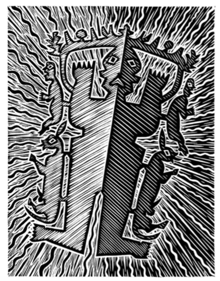
Amate
Alec Dempster’s Amate illustration seems to pulsate off the page.

‘A’ is also for amate. Anyone who visits Mexico will be approached by vendors selling naive prints done on cork-colored amate paper. Dempster chooses to portray a lesser-known use for the ancient paper.

“Today Otomı shamans continue to cut out small figures from amate paper to represent a pantheon of gods associated with agriculture, rain and mountains. In San Pablito, a community in the municipality of Pahuatlån, Puebla, famous for amate paper, the paper figures are used to intercede with the gods for purposes of healing, protection and spiritual purification.”
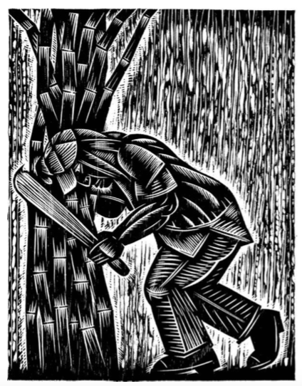
Cana
La Caña  (Sugar Cane) © Alec Dempster

Together with the introduction of cattle farming, sugar cane plantations severely transformed the Mexican landscape. Since the colonial era they have been the main cause of deforestation in the Huasteca.”
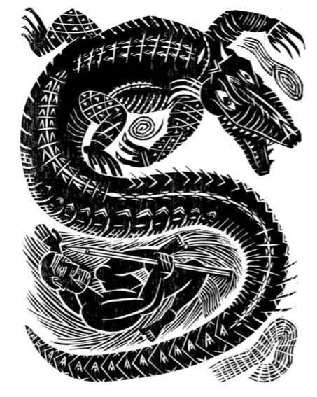
El Camåin
El Camåin

Dempster manages to convey much of the power and glory of Mexico. Every one of the images is flanked with a thoughtful descriptive essay, and Dempster’s words are as precise as his cuts.
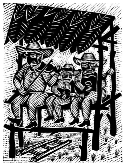
El Tarango
El Taronga by Alec Dempster

This temporary wooden structure is built for musicians to play on during huapangos. It is also known as cuauhtlapechtli, a Nahuatl word meaning ‘wooden bed’.”

Huasteca is just one of many pre-Hispanic cultures that survive in Mexico. Dempster’s chronicle of the Huasteca is a moving achievement. I learned a lot, and realize I have a lot more to learn about Mexico.

Clearly, a vital heritage is still being passed down in songs, recipes, folkways and art. You can see more sample images at Scribd, here. Lotería Hausteca is published in Erin, Ontario, Canada by Porcupine’s Quill. It can be ordered here through AbeBooks.com.

NOTE: A Book Launch Party for Lotería Huesteca will be held in Toronto, Nov. 2 at the Gladstone Hotel. Starts at 7:30pm. Tickets $10 at the door, or free admission with purchase of the book! Live musical performance by Tlacuatzin direct from Veracruz. 

Real American Prints

place
Comanche Kiowa, Jason Lujan, 2014, serigraphy on mylar stretchers.

Alan Altamirano, the printmaker from Oaxaca, and I visited IPCNY, International Center for the Prints, NY.  It can be hard to find the first time you look for it. If you walk the High Line in the Chelsea gallery district you might spot the signage in their 5th floor windows on the south side of 26th St.  Enter 508 W. 26th St and you can ride an old gated elevator with a human operator up to the gallery.

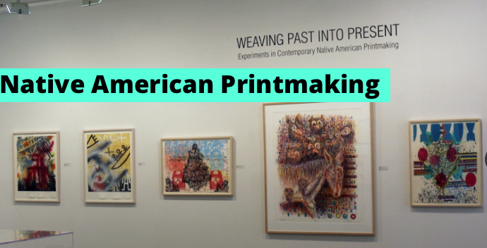
There is always something interesting there. One of the two current exhibitions is  “Weaving Past into Present: Experiments in Contemporary Native American Printmaking.” There are over 40 works by artists who identify as Native Americans: Mohawk, Seneca, Navajo, Flathead/Salish, Chiricahua Apache, Cree, and more.

The work pictured above is food for thought. Perhaps the naming of military helicopters was meant to pay the Kiowa and Comanche warriors a compliment. Seems Jason Lujan sampled the graphic images directly from the instruction sheets for Tamiya plastic model kits.

Assembly instruction sheet for Kiowa helicopter model.
Assembly instruction sheet for Kiowa helicopter model. (detail)

Earlier in the day I seen a room chuck full of Andy Warhol’s Campell soup cans at MOMA. I had forgotten his Cream of Asparagus. Warhol and Lujan remind us that appropriation is a given in the fine art world.

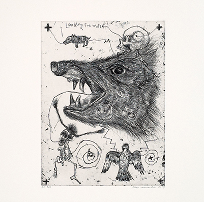
Brad Kahlhamer, Looking for Water, 2004, intaglio
Looking for Water, Brad Kahlhamer, 2004, intaglio

I especially liked the expressionistic etchings by Brad Kahlhamer. They seem quite original and energetic. For me they evoke animal totems, handmade maps, and sketchbook art.

Henry David Thoreau Cabin 2012 by Alan Michelson. Handmade paper over balsa wood.

My friend Alan Altamirano was most impressed by Alan Michelson‘s meticulously constructed paper houses. Altamirano is quick to admit he can’t read English, but he appreciated the tonal effect of the text and he presumed that the writing was a personal reflection on the concept of home. He noted that had seen prints transformed into three dimensions before, but these he found particularly well done.

Screenshot from ICPNY website.

There are over 40 works in the exhibition in a wide range of styles. The show runs until Nov.10 and then might travel. All of the prints can be seen on the ICPNY website. There is also a contextual essay by the curator, Sarah Diver, explaining some of the specific events in U.S. history referenced by these works.

My grandmother was an Indian, can you tell?
My Grandmother was an Indian. Can you tell? Lynn Allen Litho, chine collé

ICPNY’s website is worth a visit for its up-to-date list of NYC galleries specializing in prints. ICPNY is a nonprofit organization dedicated to the print, so they are not in competition with commercial fine art galleries. If you ask the staff will gladly point you in the direction of other worthwhile print exhibitions in the neighborhood. We would not have know about the Shepard Fairy show at the Pace Prints if we hadn’t asked.

Orale! Alan Altamirano esta en Kutztown.

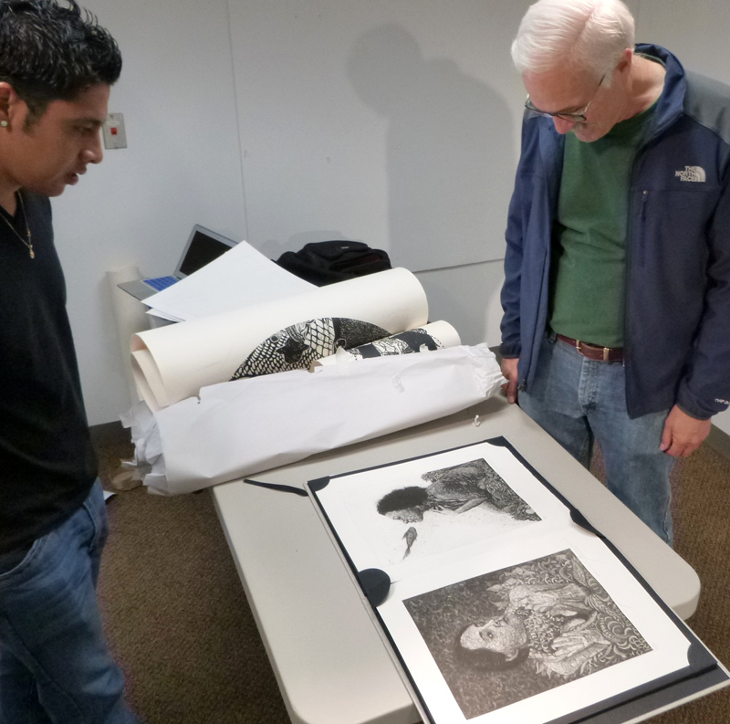
Alan Altamirano preparing his prints for display at Kutztown University. photo: K . McCloskey
Alan Altamirano preparing prints for display at Kutztown U. photos: K. McCloskey

Alan Altamirano makes art about women, beautiful women. The 27-year old artist is from Oaxaca, Mexico, a city famed for its food and visual arts. Like many of the best Oaxacan artists of his generation he studied with Maestro Shinzaburo Takeda at the School of Fine Arts at the University of Benito Juarez, Oaxaca.

Evan Summer admire a portfolio etchings.
Prof. Evan Summer admires a portfolio of etchings.

Today I spent the day with Alan hanging his large-scale wood block prints in the Student Gallery in Sharadin. When printmaking Prof. Evan Summer visited, Alan shared a portfolio of etchings based on indigenous Zapotec cosmology. Even these etchings portrayed the cardinal elements: Earth, Wind, Water, and Fire as women.

One of his grand-scale relief prints.
One of Alan Altamirano’s grand-scale relief prints.

Some of his models he has known for years. Others Alan met for as little as an hour. In many portraits he includes decorative geometry and elements from nature. The image above is of a Puerto Rican woman he met who told Alan about her memory of her beloved uncle. Her uncle, a fisherman, was swept away at sea and drowned. The drowned man appears to her left. Another male figure, the barefoot campesino, walking across the foreground represents her father. This artwork is a stunning example of relief printing, or xilographia, as it is called in Spanish. Here, Alan carved the image not into wood, but MDF, or multi-density fiberboard.

Alan working on print above. Photo from oaxacaculturalnavigator.com
Alan Altamirano working on print above. Photo from http://www.oaxacaculture.com

RECEPTION Oct 8 4pm Sharadin Student Gallery:

Alan Altamirano’s extraordinary prints will be on display in Sharadin October 6-12, with an artist’s reception at 4pm on Thursday, Oct. 8. This is remarkable work. He will be on campus the following week meeting with interested students. The exhibition and his 2-week residency at Kutztown is funded by the Fine Art and Communication Design Depts. and a generous grant from the Kutztown University Sesquicentennial Committee.

11921987_10207631550164792_1547332123_nKutztown students have a unique opportunity to study with Alan in Oaxaca as part of Kevin McCloskey’s Winterterm course. Alan invites visiting artists to work in his studio. He also offers frequent workshops for printmakers at any level at his Taller Chicharra. See Norma Shafer’s Oaxaca Cultural Navigator for more images from his studio.

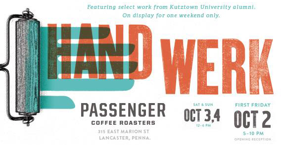
HANDWERK at Lancaster PA First Friday

hwerkI’ve only been to First Friday in Lancaster once, but I am going again on Oct 2. It should be great. Ryan Smoker and Ryan Martin of Infantree are putting together a pop-up show at Passenger Coffee Roasters. The posters are by grads of Kutztown’s Communication Design Dept. I got a preview of some of the work in Prof. Karen Kresge’s flat file. I wrote to handful of the artists, Brian Barto got back to me.

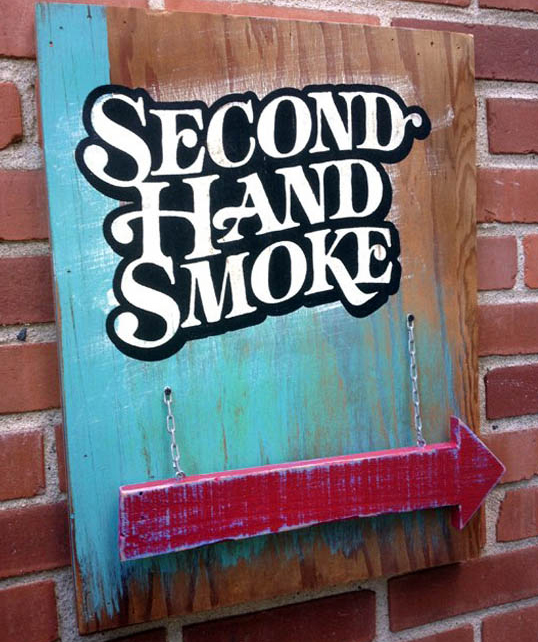
Second-Hand Smoke © Brian Barto

Brian has been a designer for over 10 years at Goodwin Design Group. When he steps away from the computer he likes to work with real stuff. He says he enjoys being in his home in his workshop making “pieces/fabrications/reinterpretations mixing found objects with vintage signage”  The work above is constructed of  reclaimed wood, acrylic silkscreen print, latex paint, and chain. Brian’s personal website, whiskeyandchocolate.com is overflowing with his work.

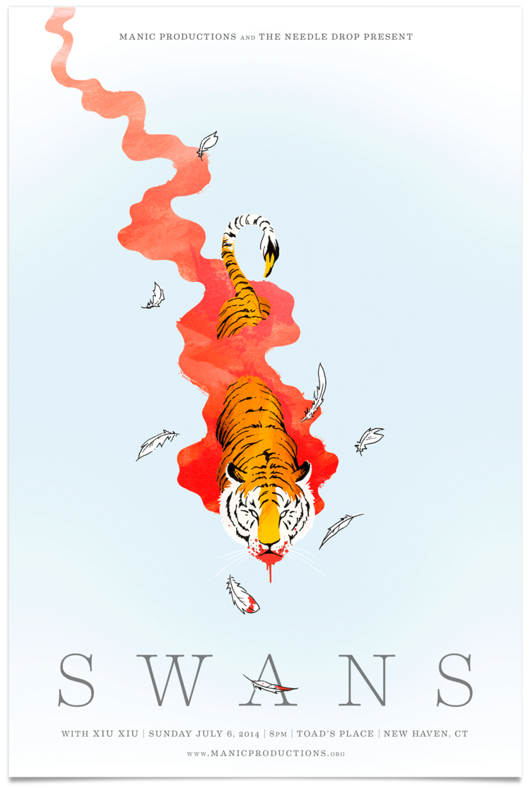
Swans gig poster © Mike Katits

There will be some impressive gig posters. The remarkable images above and below are by Mike Katits, who once traveled to Mexico with me. He is a wild man. Mike is now a senior art director at TracyLocke in Wilton, Connecticut. A good number of our best grads work there.

Neutral Milk Hotel gig poster © Mike Katits

Ryan Lynn was in a punk band called the Auroras while he was a student. He invited me to a gig once in a hall on Rt. 222 near Allentown. There was a sign on the wall: No smoking crack indoors.  A giant leather-clad bouncer blocked my entrance to the show. Ageism, I guess. The bouncer said, “What are you, somebody’s father?” 

Light and Shadow by Ryan Lynn

“Yes, I am somebody’s father,” I answered truthfully, “I want to see The Aurora.” The bouncer said,” Go away, come back in two hours, I’ll let you in. They don’t go on until midnight.” I came back. The bouncer seemed surprised. The band screamed well. I ‘d say Ryan is a better designer than guitarist. Below is his poster for Phish. Ryan sells his limited edition posters at ryanlynndesign.com for as little as $25.

Phish gig poster© Ryan Lynn

Tom Whalen is a superstar in the world of collectable prints. His limited editions have been known to sell out in minutes of their surprise debut. I’ve wrote more about him here. See much more at strongstuff.net

Toy Story poster for Mondo © Tom Whalen

Last time I visited Ross Moody’s website at 55hi’s, most of the work was purely typographic. Now he has a lot more illustration including a series of illustrated alphabet posters. Not sure what will be on the wall in Lancaster but I grabbed a sea themed print from his website.

Ocean Alphabet © Ross Moody.
Ocean Alphabet (detail) © Ross Moody.

Corey Reifinger has been doing some weird stuff for Johnny Cupcakes. Corey went to Mexico with me, too. I do think Mexico can expand one’s creative vision. Corey has developed a witty and graphic illustration style. Not sure I even understand the poster below, but it has rats and hot sauce and cupcakes, three of my favorite things.

Johnny's Sweet Heat © Corey Reifinger
Johnny’s Sweet Heat © Corey Reifinger

Corey has a lot of wild work at this site. Google the man, he has work all over the place. The image below was lifted from the web. I’m not sure exactly which works will grace the walls at the Handwerk show at Passenger Coffee in Lancaster Oct, 2 -4. But I am sure it will be delightful.

Day One Skate Shop © Corey Riefinger.
Day One Skate Shop © Corey Reifinger.
Postcard designed by Infantree.

Kathy Sue Does Graffiti in the Alley

Matthew Dawn at work in Graffitti Alley.
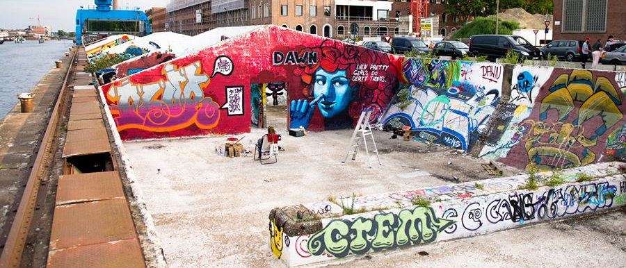
Graffiti Alley, Ghent, Belgium

Kathy Sue Traylor is the department secretary in the Communication Design Dept at Kutztown U. She doesn’t think of herself as an artist, but she loves to see creativity in bloom. She often pokes her head in the illustration studio to look over students’ shoulders. She always gushes over the artwork our students are creating.

paint

Earlier this month Kathy Sue got to visit Ghent, Belgium. Her husband Bruce, who works for Mack Trucks, was sent to visit a Mack facility there. One evening walking down an alley, Bruce and Kathy Sue saw a young man in a hoodie spraying a graffiti mural on the wall.

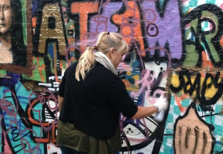
Kathy Sue Traylor tagging the wall in graffiti alley.

Not being shy, Kathy Sue asked what was going on. The young man Matthew Dawn was wrapping up a graffiti workshop. He invited Kathy Sue to learn how to tag the wall with her name and initials. Seeing his paint-covered hands, she wasn’t sure this was a good idea. Matthew lent her latex gloves and persuaded her to give it a try. He asked her to write her name in pink to get the hang of the nozzle. Then he set her up to paint her tag a bold red K.T.

Kathy Sue's tag: KT
Kathy Sue’s tag: KT

Kathy Sue tells us this was an experience she will never forget. She pointed out that the graffiti changes every night and by the next day someone had already painted over her initials. She recommends checking this blog for other examples of art on the alley’s walls.

Matthew Dawn and pals in the alley, Ghent, Belgium.
Matthew Dawn, left, and pals in Graffiti Alley, Ghent, Belgium.

More of Matthew Dawn’s work can be found at matthewdawn.com. If you visit his site you can view murals at other locations, like the example below. He is not only a fine graffiti artist, Matthew Dawn is a great cultural ambassador for the city of Ghent.

Image from Matthew Dawn's website.
Image from Matthew Dawn’s website. http://www.matthewdawn.com

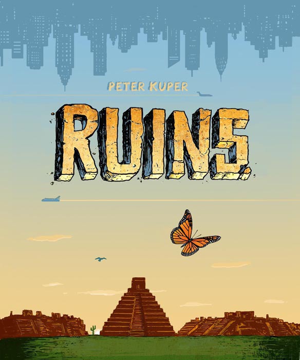
RUINS: Peter Kuper’s Masterpiece

4632861729

Peter Kuper’s Ruins is a magnificent graphic novel, the best I’ve read this year. I’d call it his masterpiece, but Kuper has already proved himself a master. Ruins succeeds on so many levels: great graphic art; remarkable storytelling, and stunning production values.

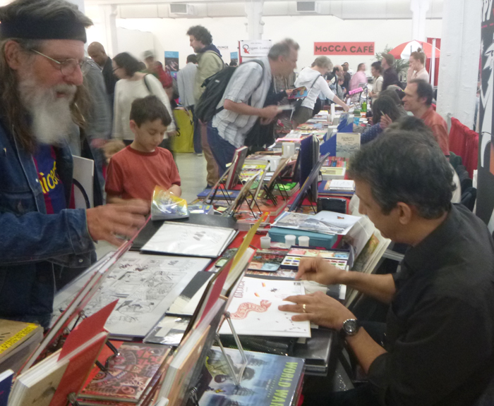
Peter Kuper adding a watercolor sketch to his signature for a fan at MOCCA.

I’ve met Peter Kuper a few times. In 2007, I was honored when he contacted me to identify Mexican graffiti for his graphic memoir, Diario de Oaxaca: A Sketchbook Journal of Two years in Mexico. I invited him to talk to Kutztown University illustration students. We were thrilled he took the Bieber bus to Kutztown for the modest fee we offer guests artists. Students knew his work from Spy vs. Spy for Mad Magazine.

From Ruins, © Peter Kuper, 2015

He shared his unique illustration technique for adding tone to black and white images. He called it “poor man’s airbrush” – using cans of black spray paint with paper and tape friskets. He warned students that even wearing a protective painter’s mask one loses brain cells to the technique. He joked he was living proof, and that his memory lapses were not the result of recreational drug use, but paint fumes.

VW cab, detail, from Ruins © Peter Kuper

Most recently I saw him at the MoCCA Fest last April in NYC. He showed me  pages of original art from Ruins, a new work about Oaxaca. I asked how Ruins differed from Diario de Oaxaca?  “It’s fiction, based on my experience, being in Oaxaca in 2006, but it’s fiction, ” he said. “See the VW beetle cab?  You and I know they don’t have VW cabs in Oaxaca, but they are so much fun to draw!”

Seeing a few pages out of context, I didn’t realize what a massive project Ruins was meant to be. I was impressed by what I saw, but presumed Ruins was going to a ‘floppy’ comic, 32 pages stapled together. I was completely blown away by the finished book. It weighs in at 328 pages. It was an embossed cover, impeccable printing, panoramic fold-out pages and a black satin ribbon bookmark, the sort one finds bound in missals. The story is multifaceted. Woven tight as Oaxacan tapete,  Ruins weaves together romance, grief, politics, migration, ecology, and lessons in Mexican history.

Detail from Ruins based on a the Codex Mendoza. © Peter Kuper.
Detail from Ruins based on the Codex Mendoza. © Peter Kuper.

I am sucker for movies set in exotic locals. Our hero races through the foreground. The eye-candy background is ‘the other.” Foreigners are interchangable secondary elements – villains and bombshells with accents thick as mud. We chase across the rooftops of Istanbul or Havana, or both. It doesn’t matter, as long as the locale exudes ‘otherness.’ Movies tend to offer meager social context and no entry into the deep cultural histories of place. Great books, such as Ruins, can do more.

From Ruins © Peter Kuper

Kuper does something quite amazing in Ruins. He successfully integrates his understanding of the culture of Mexico, -Oaxaca in particular, into his story. He has spent years in Mexico and it shows. He riffs on Malinche, Diego Rivera’s Rockefeller Center mural, machismo, and mescal. At times you can see the gears moving, but, by and large, Kuper somehow manages to advance the central story with grace and ground it all in the cultural geography of 21st century North America.

Melanie Cervantes, Dignidad Rebelde.

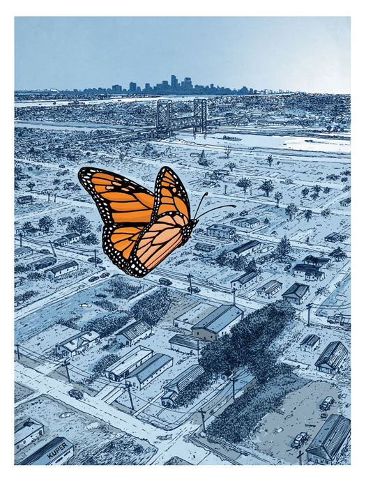
Taken alone Kuper’s suite of drawings of the Monarch butterfly’s annual migration could be a stunning book in itself. He is not the first to use the Monarch as a graphic metaphor for open migration and the unnatural concept of borders. Oakland’s Dignidad Rebelde and Pittsburgh’s JustSeeds have published posters in a similar vein. But Kuper composes a lyrical visual essay on the Monarch. It is a spectacular display of graphic art.

Another exquisite Monarch page from Ruins © Peter Kuper

Ruins is one extraordinary book. I am putting my copy on the same shelf with other great literary works about Mexico, Jessica Abel’s La Perdida and Graham Greene’s The Power and the Glory.

Monarch butterfly, one of the wondrous wordless pages from Ruins © Peter Kuper

Ruins will be published this month (9/2015) by SelfMadeHero, London.

……………………………………………………………….

Note by Kevin McCloskey. Speaking of Oaxaca: I am teaching a course for Kutztown students there in January. Also teaching a printmaking course, open to the public: Jan 10-15, 2016 through Oaxaca Cultural Navigator. Course includes an exhibition opportunity. More info here. Or drop me a line at mccloske(at)kutztown.edu.

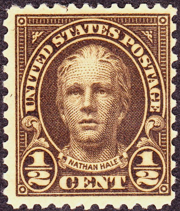
Not that Nathan Hale, Meet the Cartoonist.

Nathan Hale, no relation. USPS.

Nathan Hale is a fitting name for a graphic novelist specializing in historical biographies. I ran into him at the American Library Association convention in San Francisco. I asked if he was named for the hero of the American Revolution. He wrote One Dead Spy, about that hero. “No, I am named for my grandfather,” he said. Grandpa Nathan, born in Star Valley, Wyo, might have been named for the hero, though.

Nathan Hale with Matt Phelan, two masters of the historical graphic novel.
Harriet Tubman bio © Nathan Hale

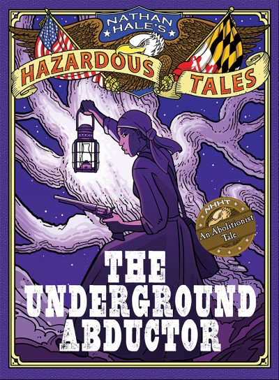
Nathan’s latest work, The Underground Abductor, is a bio of Harriet Tubman. He is hoping  rumors that Tubman’s portrait might grace the ten-dollar bill come true, as it will boost sales.

Nathan studied illustration at Cornish College of Art in Seattle. For a time he specialized in natural history illustration. Now his historical graphic novels, published by Abrams, keep him at the drawing board. He has completed 5 in the ongoing series, Nathan Hale’s Hazardous Tales. Abrams has lesson plans linking his books to middle grade history curriculum.

All art © Nathan Hale

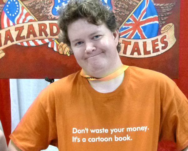
Besides his full-time job as an illustrator, Nathan tours the country teaching cartooning to youngsters in his Cartoon Boot Camp. Just prior to the ALA convention he taught a Boot Camp in Santa Rosa California at the Charles Schulz Museum. I just checked their website, looks dreamy. They have an ice rink and a Warm Puppy Cafe. You can watch Charlie Brown specials all day long and meet professional cartoonists. Oddly enough, the Boot Camp experience went south for Nathan, his wife, and eight-year old daughter, Lucy. Nathan was stunned when a thief smashed the windows of their rental car with a sledgehammer and stole their luggage. They got some Peanuts’ T- shirts at the gift shop. Nathan’s wife presented him with a nifty T-shirt she had custom printed, see below.

Nathan Hale's meanest Amazon review  commemorative T-shirt.
Nathan Hale’s meanest 1-star Amazon review commemorative T-shirt.

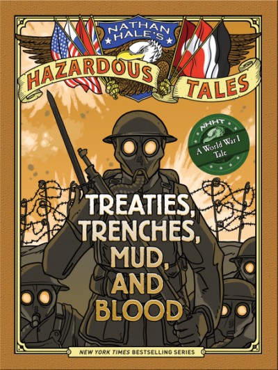
It should be noted that the Hazardous Tales series has gotten many splendid reviews. Booklist, for example, on Treaties, Trenches, Mud and Blood, “Students bored to death by textbook descriptions of WWI battle maneuvers should be engaged by this entertaining, educational glimpse at world history.”

School Library Journal praises his recent work as “lively, rigorously researched, visually engaging stories.”

Big Bad Ironclad! © Nathan Hale

I asked if he had ever learned something from reader feedback. After some thought, Nathan opened Big Bad Ironclad! to show me the illustrated endpapers. The first edition, 2012, had a mistake on the map; he had incorrectly colored Kansas gray, putting it in the Confederacy. He got a letter from an upset Kansas librarian, then more from school children. He did an apology tour of Kansas schools. “I let the kids yell at me, throw popcorn,” he joked. He took responsibility for the mistake, said he had referenced a map drawn prior to the Kansas-Nebraska Act. In January, 1861, Kansas was admitted to the Union as a free state. His publisher, Abrams, has first-rate editors who check every sentence for historical accuracy. Nathan, however, never sent the editors the illustrated endpapers to proofread, just the interior pages. The map was fixed for the current edition, pictured below. Let that be a (history) lesson for us all.

1861 Map from big Bad Ironclad! © Nathan Hale

Nathan writes a blog, Space Station Nathan. He admits to being too busy to keep it updated. He works hard and deserves his success. The blog archives have some nifty stuff. Look for the illustrated guide to inviting Nathan Hale to visit your school.

Roller Derby Artists by Bobby Dazzler (Robin Tatlow-Lord)

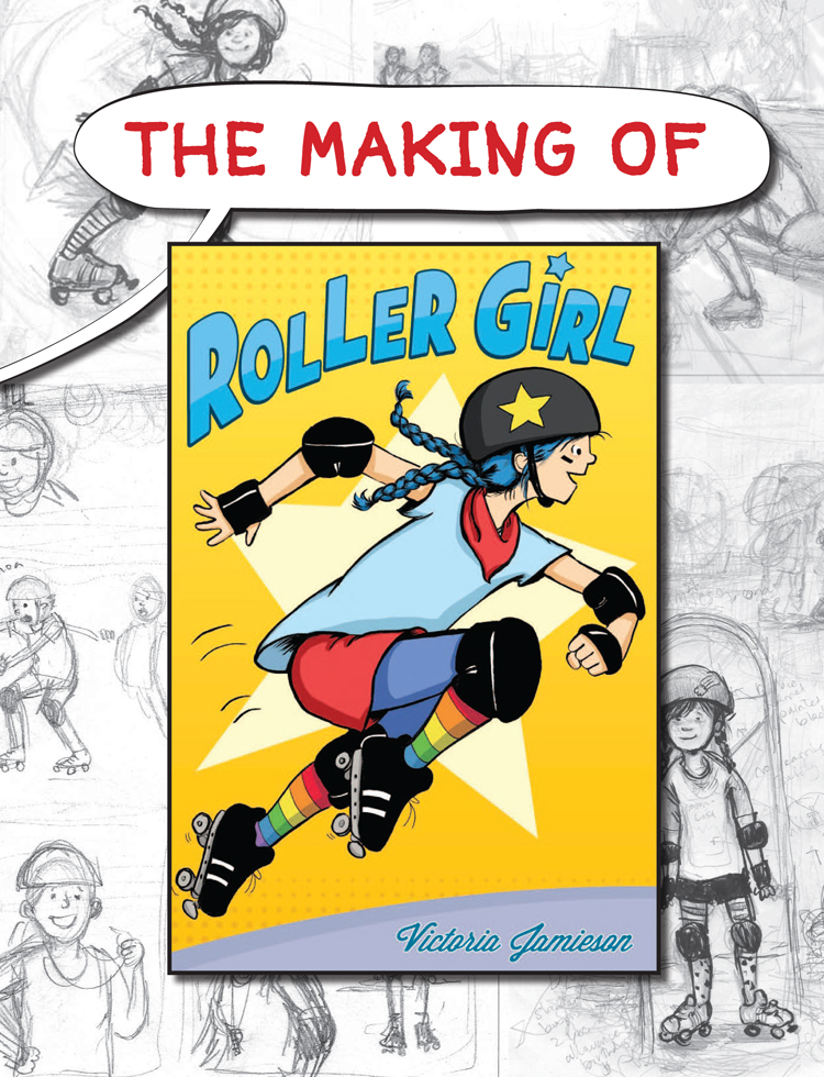
Kevin McCloskey recently asked me whether the handful of illustrators he had met who also play roller derby might be indicative of a larger trend – a connection between this growing sport and the world of illustration and comics – or if he was imagining that trend. I don’t think it’s imaginary at all: illustrators and comics artists have always ‘drawn from’ (haha) their own lives, so as roller derby becomes a huge part of so many lives worldwide, it’s going to burst out into our art and our stories. Perhaps the most exciting ‘roller derby illustrator’ at the moment is Victoria Jamieson.

Page from Roller Girl ©2015 Victoria Jamieson

After keeping a comics blog of her derby experiences, Jamieson – who skates under the derby name Winnie the Pow – recently created a graphic novel about a junior derby skater: ROLLER GIRL! ​There is an excellent free downloadable ebook about the making of Roller Girl on her site. ​Her work is lovely – it’s very human and warm, and escapes the simplistic ‘sexy amazon’ vibe that sometimes dominates art about derby girls by outsiders and fans. Not that there is anything wrong with being a sexy amazon (or feeling like one) but I think that real stories and personalities are far more interesting!

From the free ebook © Victoria Jamieson 2015

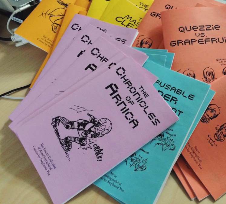
Jamieson is by no means the only derby player bringing the sport into her creative work, though. Stephanie Yue has released a hilarious autobiographical mini-comic featuring roller derby stories: The Chronicles of Arnica.

Selection of Stephanie Yue's zines.
Selection of Stephanie Yue’s zines.

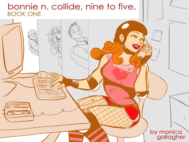
And Monica Gallagher’s ‘Bonnie n Collide: Nine to Five’, is ongoing strip webcomic, also collected in print form, about a derby girl working a desk job. It’s a funny, goofy and larger-than-life play on the idea of a double life (also featuring werewolves and in-office booty blocking) – but there are some lovely and very true to life interactions with Bonnie’s team and league, threaded through amongst the wacky hijinks.

 Bonnie N Collide ©2015 Monica Gallagher online or at Comixology.
Bonnie N Collide ©2015 Monica Gallagher online or at Comixology.

Some other semi-autobiographical derby artists I’ve been following are E*Phi, and Marissa Luna and Melissa Mariko Kieselburg, who collaborate on a roller derby yuri (“girls love”) manga comic, Collision Course.

From Ephi
From Tumblr comic by E*phi, link in text above.

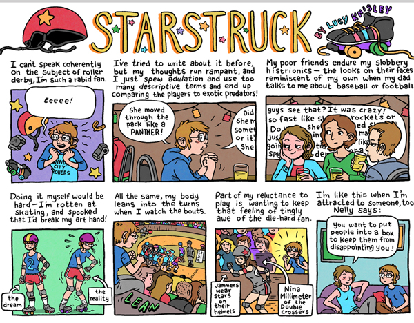
Here is a great illustrated article about roller derby culture. And acclaimed autobiographical cartoonist Lucy Knisley, while not a derby skater herself, perfectly captures the feeling of giddy fandom that characterizes many women’s first taste of the sport with her comic, Starstruck.

Starstruck (detail) ©2105 Lucy Knisley
Starstruck (detail) ©2105 Lucy Kinsley

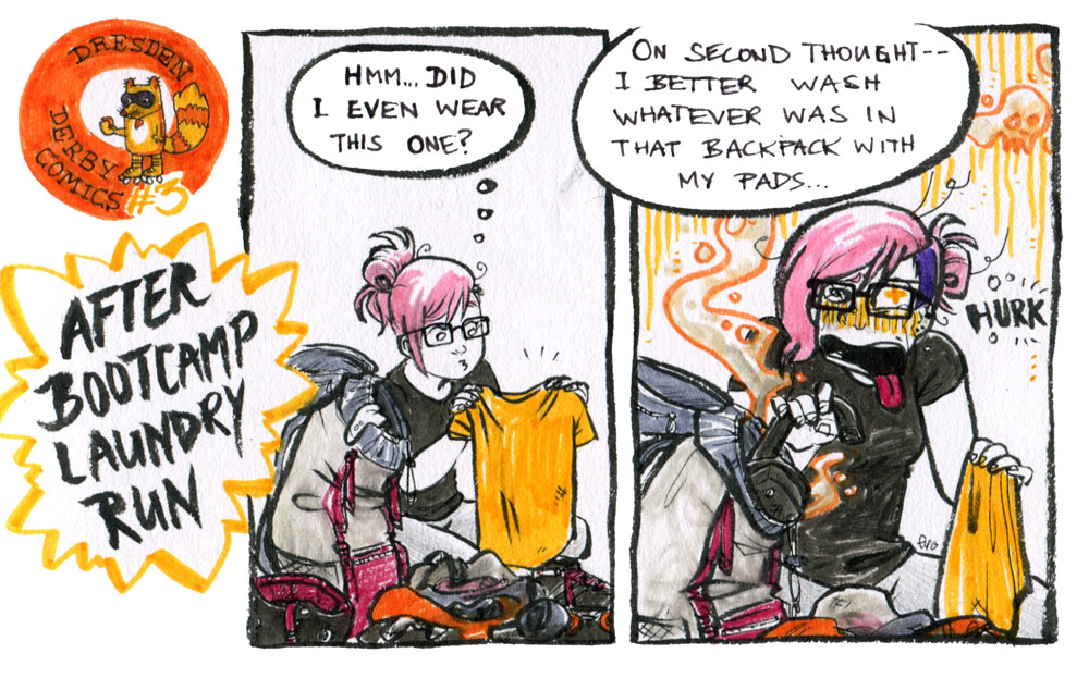
With all this inspiration, my buddy in roller derby AND comics, George Rex, and I have been plotting and planning to one day put together a roller derby comics anthology ‘by and for the skaters’. There have already been compilations on the theme, but they weren’t drawn by derby players themselves – and to our minds, weren’t as interesting or as true to life as the stories and art being created by real skaters​ (and officials, and supporters) inside the roller derby community. I’ve made a lot of roller derby drawings and little comics ‘moments’ that I’m working up into proper narratives – like this set of sketches (some of which appeared in the previous illustrationclass blog post) – drawn back when I was first getting into the sport.

We have tentatively named our derby comics project and tumblr: Wrist Stink Ink!  If you’re asking why, you probably don’t play roller derby – or date anybody who does.

From Wrist Ink Stink tumblr

Derby skaters wear a lot of protective gear, and we sweat a lot, and that leads to a certain stinkiness! You can lessen it by airing out and washing your gear, and as the game grows, so too does the cottage industry of products professing to remove smells, but it’s always going to be a feature of the sport, to some extent. For some reason, wrist guards are the worst culprits! It’s something we all share, and having a bunch of women with whom you’re comfortable being sweaty and stinky is actually pretty relaxing and funny – so there’s a certain feminist affection in the name, and a commitment to making art and comics about the true experience of roller derby rather than the hyped fantasy. Talking about wrist stink may not be for everybody, but then neither is roller derby, and that’s okay!

Phto by
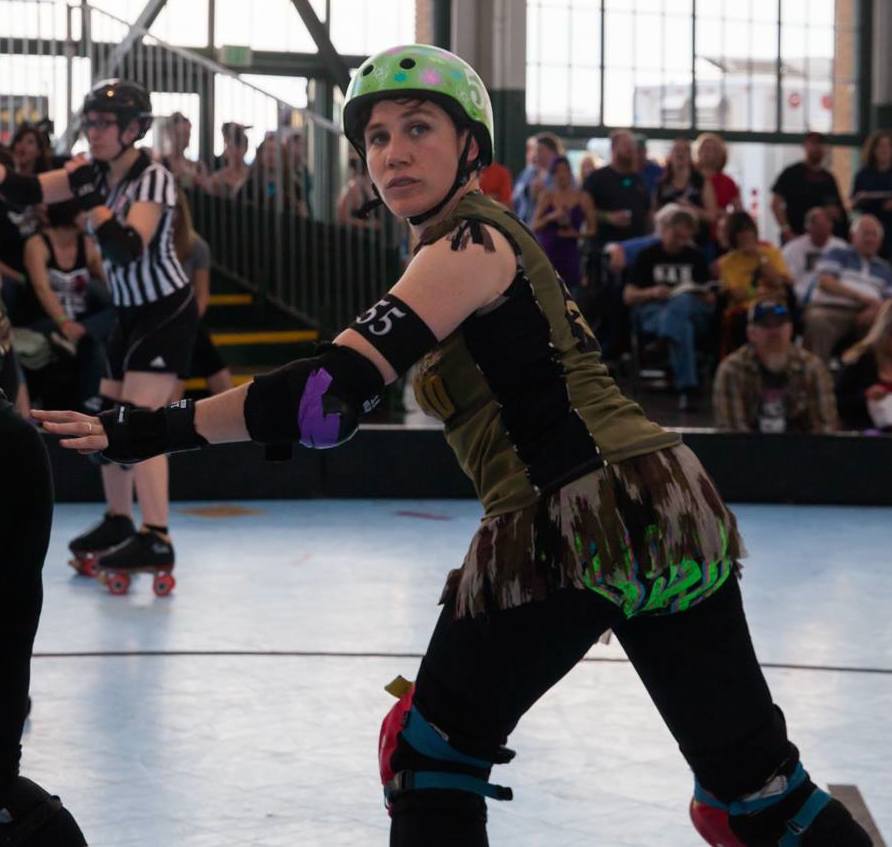
Robin Tatlow-Lord / Bobby Dazzler.  Image courtesy by Bryan Farley Photography, link below.

So, yes – I am very passionate about this ‘trend’ – thanks for giving me the opportunity to share it with you! There’s a whole lot of awesomeness going on at the intersection of art and roller derby, so get out there and support your local cartoonists …. AND derby girls! – Robin Tatlow-Lord  Bobby Dazzler of the Bay Area Derby Girls, 2015. (ROBINTATLOWLORD.COM)

Editor’s Note: Thanks a million to Robin for a splendid intro to the intersection of roller derby and comics. Get in touch with her if you are a roller derby artist and want to contribute to the anthology. Thanks also to Bryan Farley Photography for the portrait of Robin above.

Robin Tatlow-Lord: Roller Derby Artist on a Roll

“Go, Mum, Go!” © 2012 Robin Tatlow-Lord

Women’s roller derby was a national sensation in the 1950’s. Today roller derby is again a sporting and pop culture phenomenon. I met the Australian illustrator and roller derby athlete Robin Tatlow-Lord in San Francisco last week. Robin learned to skate in South Australia, with Adelaide Roller Derby and currently skates with the Bay Area Derby Girls. She taught me a bit about modern roller derby. Must admit, I had some misconceptions. For example, I called the athletes racers. Robin notes, “The sport is also not really a race, and is more akin to football, even though it’s on a looped track. Roller derby skaters call themselves and each other players, not racers.”

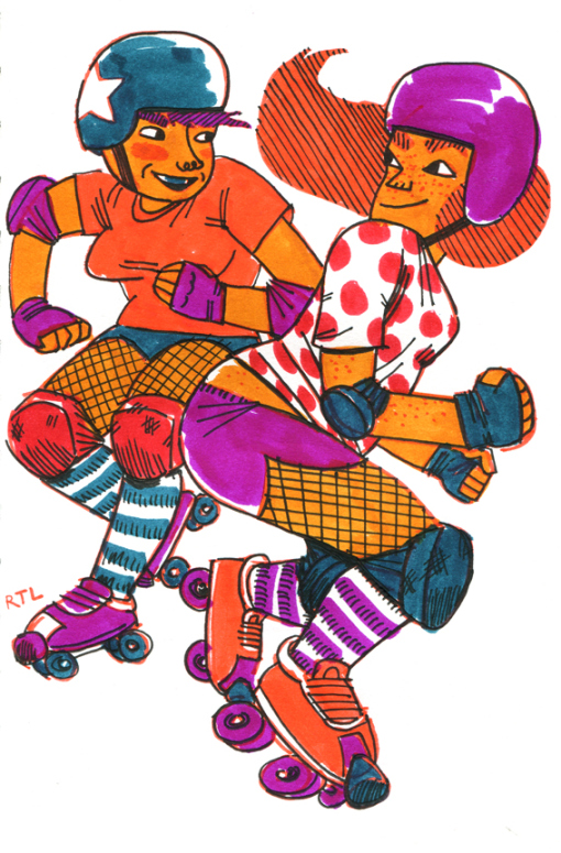
Skirmish, from the Fresh Meat series, © 2015Robin Tatlow-Lord
Skirmish, from the Fresh Meat series, © 2012 Robin Tatlow-Lord

Robin writes, “The kind of roller derby that has become really popular now is NOT a paid professional sport. It is a community-driven, unpaid ‘amateur’ sport (though played to an extremely high level of athleticism and competitiveness) and this has been a huge part of its popularity, because women can start up their own leagues and have full control over everything they do – from what they wear to which nights they train, etc. It’s also a real sport now – unlike 1950s and 60s roller derby, it’s not ‘staged’ or manipulated as an entertainment event. There are both flat-track and banked track incarnations of modern women’s roller derby – I play flat-track.”

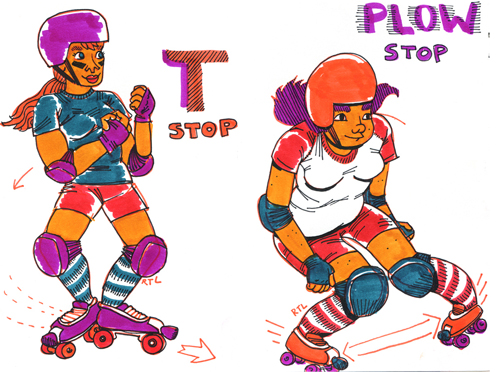
T-Stop and Plow Stop, from Fresh Meat ©2012 Robin Tatlow-Lord

I wondered is there some strange new intersection between roller derby and illustration?  I wrote about Kutztown grad and illustrator Kate Santee who plays for the Lehigh Valley Rollergirls. Jessica Abel’s epic Trish Trash Roller Girl from Mars has just been released in France. Her fans, myself included, are clamoring for the English edition.

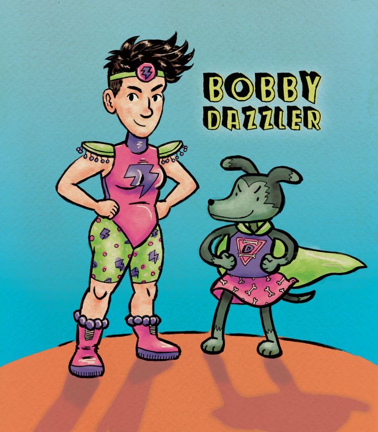
Bobby Dazzler © 2015 Robin Tatlow-Lord. Her Roller Derby persona.

I asked Robin, A.K.A. ‘Bobby Dazzler’  a few questions. First, is roller derby big in Australia?

Robin: “Yes, there is definitely roller derby in Australia. That’s where I started, and played for 2 years. In fact, an Australian team,Victorian Roller Derby League, recently beat many of the top USA teams, and are now ranked fourth in the world.”

Bonnie
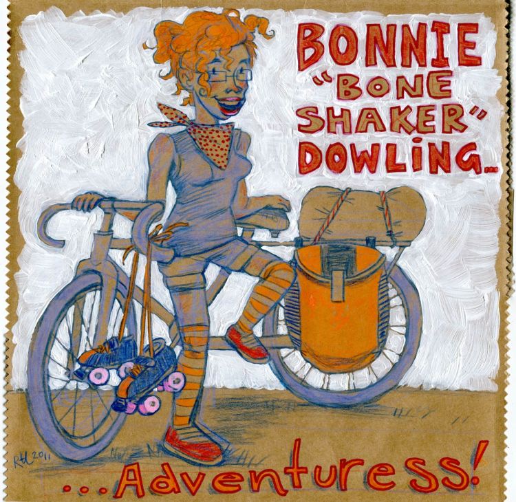
Bonnie “Bone Shaker” Dowling Australian Roller Derby star. ©2012 Robin Tatlow Lord

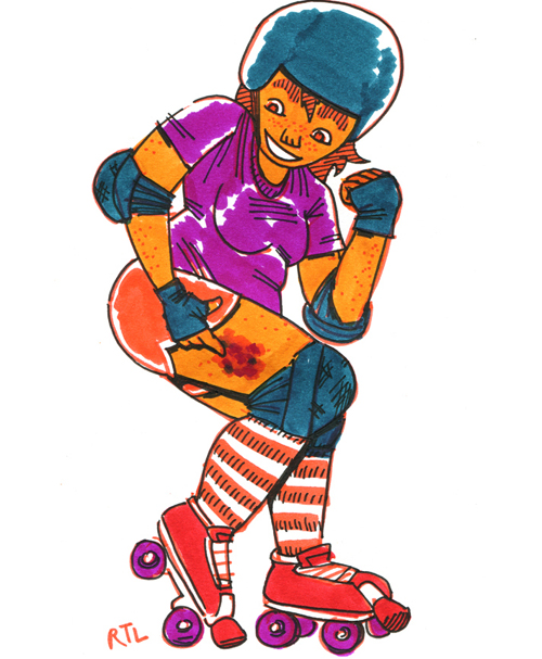
‘Bonnie Adventuress’ (above) is a portrait of her pal, skater Bonnie ‘Bone Shaker’ Dowling,  painted on recycled paper. Robin’s colorful Fresh Meat series is drawn entirely with brush pens. According to Robin’s website, the line art illustration below is from a few years back when lacy bras and fishnet stockings were more common.

“Fresh Meat” sketch © 2012 Robin Tatlow-Lord

Question: There seems to be a new wave of comics and illustration celebrating roller derby. I am imagining this trend?

Robin: “I don’t think it’s an imagined trend – in fact, a friend and I have been throwing around the idea of putting together a roller derby comics anthology for some time now. There have already been comics compilations on the theme, but to our minds these weren’t as interesting as the comics and illustrations actually being created by real skaters​ and other people involved in the roller derby community.”

Bruise from Fresm Mest Series, © 2012 Robin Tatlow-Lord
Bruise from Fresh Meat Series, © 2012 Robin Tatlow-Lord

Robin wrote a guest post about the current crop of roller derby players who are also comic artists. Seems like the stars are aligned for that skater/creator comics anthology she mentioned. If your artwork fits that double bill, get in touch via her website. Meanwhile, do check out Robin’s website to see the full range of her talent

Glimpse Inside a Video Game Artist’s Sketchbook

Michelle Davies with sister Christina at Kutztown Univeristy
Michelle Davies with sister Christina, president of the Sketchbook Club at Kutztown University.

Michelle Davies graduated from Edinboro University. Edinboro, like Kutztown is part of PASSHE, PA’s State System. State university facilities can’t compare to privates specializing in game design, but Michelle proves a dedicated student can launch a career from anywhere. She said her foundation art classes, life drawing and 2-D design, prove valuable everyday in her job as a concept artist on Camelot Unchained.

figurestudies
Sketchbook life drawings © Michelle Davies

Students may think a game concept artist does impeccably finished work. In truth, Michelle draws fast and furious against tight deadlines at City State Entertainment. She got a call from City State when she was teaching English and researching K-pop culture in Korea. They flew her back to their Fairfax, VA, headquarters. Her first task was to design a logo for the game.

6 variations for Camelot Unchained logo © 2105 City State entertainment
6 variations for Camelot Unchained logo © 2105 City State Entertainment

Michelle visited Kutztown thanks to KU’s AIGA chapter. Her sister Christine, also a stellar illustrator, is heading into her senior year here. Michelle spoke to the AIGA crowd in the Academic Forum. The next day she visited the Sketchbook Club to share her sketchbook with students.

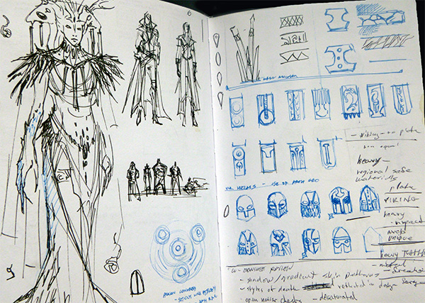
Sketchbook Detail © 2105 Michelle Davies
Sketchbook Detail: Character and Perspective Studies © 2105 Michelle Davies

Illustration is a big field, and many of our students say they want to be video game concept artists. I admit I know little about it. Michelle used unfamiliar phrases. Who knew a MMORPG is a Massively Multiplayer Role Player Online Game? When I asked what the phrase “Low Poly” meant, Michelle asked me if I was familiar with “Assassin’s Creed.”  Students laughed when I said I wasn’t.

Michelle shared her sketchbook at Sketchbook Club © Michelle Davies

Low poly means a simplified shape, – a low number of polygons. “Like an inflatable doll compared to a real person.” is the metaphor she used. Actually, her metaphor was saltier.

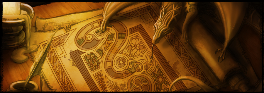
Concept art from camelotunchained.com © City State Entertainment
Concept art from camelotunchained.com © 2015 City State Entertainment

Michelle showed a slide of her coworkers at City State sitting around a conference table. They were mostly male. I asked if there is a glass ceiling in the gaming field. She said not in her experience, half of the staff artists are female. She said female programmers are “golden unicorns.” Her boss, Mark Jacobs, has tried hard to recruit female programmers, only to have them snatched away by Google.

From camelotunchained.com promo art ©City State Entertainment
From camelotunchained.com  Promo art © 2015 City State Entertainment

There is much more impressive art to see at camelotunchained.com  There is a free Fan Kit available to download. I grabbed some of the above art from there. I must admit some of the game lingo on the site is greek to me, but I did notice that City State Entertainment is hiring. Golden Unicorns please apply.