Prof. Josh Miller asked his students to create faces from type. Some of the results were quite fine. He’s hung a selection up outside the CD print lab. I asked him if I could share a few of the best here.
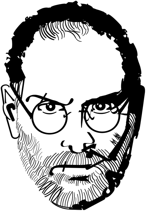
Steve Jobs by Caleb Oshefsky
The class is called Intro to Digital Design II. The exercise is meant to familiarize students with type-handling in Adobe Illustrator.
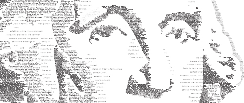
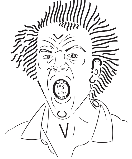
Here is the assignment brief: Create 3 portraits using the Illustrator’s type tools. The first portrait will emulate line. The line can be expressive, descriptive, implied, or directional. You can use contour or gesture. The second portrait represents Shape and Form. Try using negative and positive space in this portrait. The last portrait is Value. Use pattern, emphasis, and space to help create the tones.

These were the additional ground rules:
Students could the change text to outlines and manipulate the letterform, but it still had to resemble the original letter. They could rotate, change the leading, kerning, tracking, or change the direction of the text.

Interestingly, this week Printeresting.org had a link in their notebook section to the work of Italian artist Frederico Pietella. He does something similar with rubber stamps, but he takes it to a level approaching obsession. See Pietella’s work at This is Colossal.