

I love Frank Viva’s “Trip to the Bottom of the World with Little Mouse.” It is drawn digitally in Adobe Illustrator, yet it has a retro feel. I got to meet the Canadian author/illustrator at the American Library Association Midwinter Meeting in Boston.

He flew down from Toronto where he heads an award-winning graphic design agency, Viva & Co. I was blown away by his new book Sea Change. The book is getting sensational reviews for both its story and graphic design. Sea Change is a Toon Graphic title. That means it is geared toward middle-grade readers. The literary quality and the visual design is so fine that older readers will appreciate its genius.
The pages of Sea Change are filled with playful typography, -the sort we read about in Phil Meggs’ History of Graphic Design. I showed my copy to Prof. Karen Kresge, who teaches advanced typography at Kutztown. She was so impressed she went directly to her computer to preorder a copy.

School Library Journal says “Viva’s bold, simple illustrations are whimsical and bring to life the story’s unique characters. The unconventional format of this funny, poignant coming-of-age story will appeal to fans of comics and graphic novels.”

Graphic designer Chip Kidd is a fan: “In ‘Sea Change’ Frank Viva ingeniously weaves words and pictures to evoke that heartbreaking, strange, wonderful moment—when the very worst experience of your life somehow becomes the very best.”

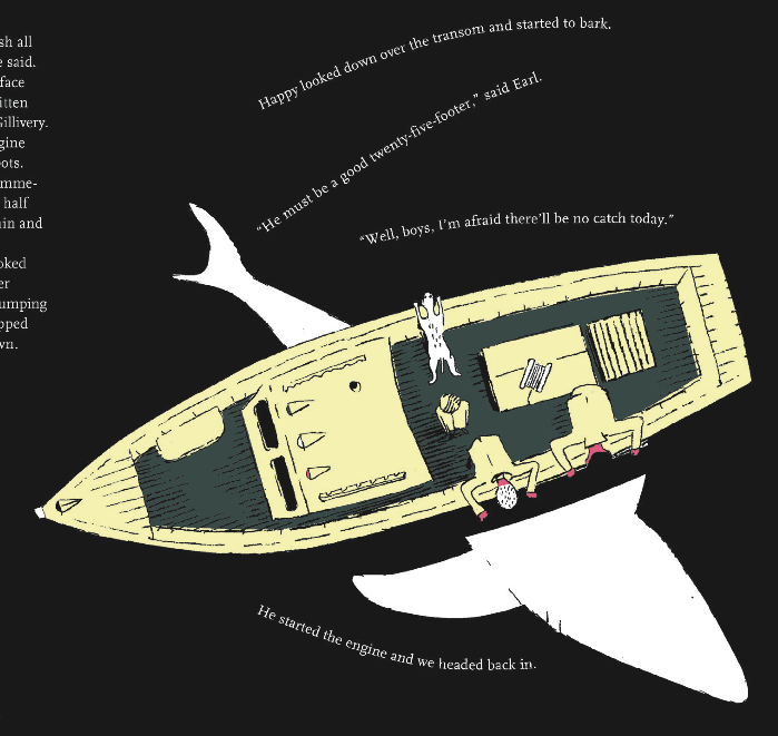
It would be a crying shame if the design was extraordinary and the story fell flat. That is not the case here. The story is quite moving, written with an understated grace. The narrative has a great sense of place, namely, a remote fishing village in Nova Scotia. The author’s voice reminded me of Jack Gantos’s popular Joey Pigsa novels, though Viva told me he was not familiar with those books.
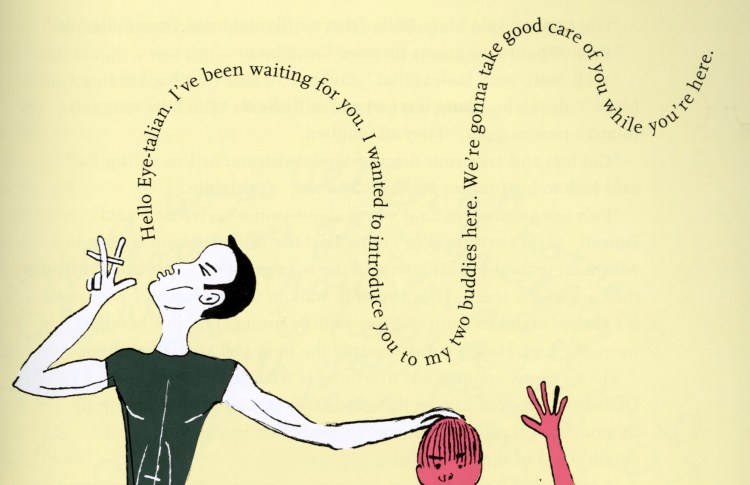
None of the great reviews I’ve seen touched on the chilling anti-Italian bias our young hero endures. The book is not a memoir, but I asked Frank Viva if he had experienced bigotry as an Italian kid in Canada. “Oh Yes” he said, “I grew up in a very Anglo neighborhood. It wasn’t hurtful, but it was memorable, and it was typical.”

The drawing style in Sea Change recalls Ben Shahn’s best graphic works. Viva explains that he sketches freely in pencil, then digitally colors the work in Photoshop.

A New Yorker cover by Frank Viva
Besides his children’s books Frank Viva is known for his elegant design work for fortune 500 companies and many New Yorker covers. He has come a long way. He told me about his college years delivering seltzer bottles to fifth floor walk-ups in Manhattan. Oddly enough, Ontario College of Art and Design allowed him to pursue his art studies in New York City.
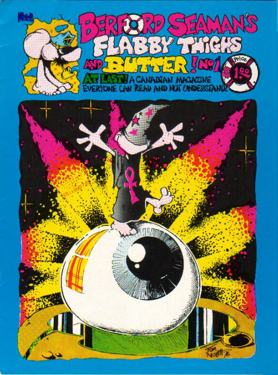
Young Frank once thought he was headed for a career in fine art, but found work as a junior art director when he returned to Toronto. In the 70’s, he was a contributing cartoonist to the short-lived Toronto-based underground comic, “Berford Seaman’s Fabby Thighs and Butter.” I found a cover of the comic online. It bills itself as “a Canadian Magazine Everyone Can Read and Not Understand.
Sea Change is an important work. It delivers a sea change from the typical design of ‘chapter books’ for young readers. I found myself totally immersed in the story, and I expect younger readers will, too.
Full disclosure: I got a free advance reader’s copy of Sea Change. Not only that, Frank Viva bought me a beer on a barge in Boston Harbor. Really! However, that one strong pint at the Barking Crab did not affect this review.
