
I showed my Digital Illustration class Frank Viva‘s illustrated book, Sea Change. The typography is wonderful. The Globe and Mail put it nicely, “With Sea Change, a graphic novel in the truest sense, author and designer Frank Viva blurs the lines between written word and illustration.”

Sea Change is published by Toon Books as part of their Toon Graphics series. Toon Books has a free teacher’s lesson plan for every one of their titles. The guide to Sea Change notes “Text can do much more than simply communicate the plot of the story. Text can be playfully designed, arranged, or organized to add another layer of visual meaning to the narrative.”

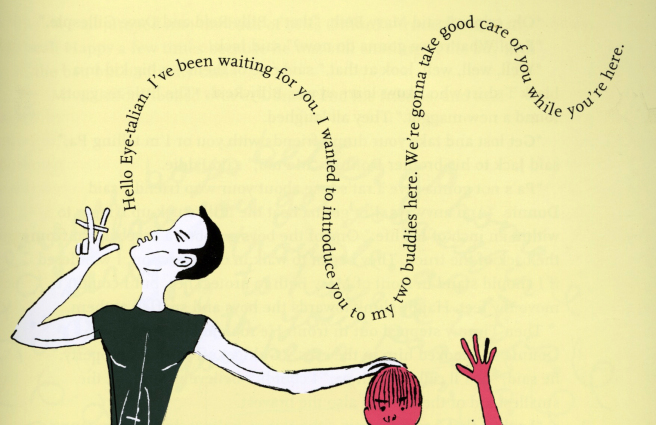
I asked my students to be inspired by Sea Change. They were to pick an evocative line of type and weave it into an illustration. They were to make type an integral element of the image. We also considered Viva’s use of a limited palette. They could pick their personal palette of 5 colors plus black. I usually find artwork about boredom, um, boring, but I was impressed by Christian Dubuque’s moody piece, above.


Rafael Nunez-Castaneda, Kylie O’Connor, and Julia Taft all illustrated inspirational quotations. Rafael and Kylie didn’t limit their palettes much, but worked the type in well.

Below is an image that looks like a Valentine card by Kaitlyn Reber. I should note the students are working in Adobe illustrator and Photoshop on Wacom tablets.

Most of the students in the class are far better with digital media than I am. I hope they continue to play with typography and some are inspired more work in this manner.

Type is a specialty of the Kutztown Communication Design curriculum. Type is not something I teach, but I have picked up some typographic knowledge by osmosis. I remember when nearly every kid’s book was done in New Century Schoolbook. If you haven’t looked a children’s book lately, there has been a revolution in type. Our students, following the likes of the great Frank Viva, are joining that revolution.
