Napoleon Digital Illustration

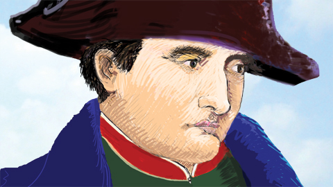
Portrait of Napoleon, detail © 2011 Kevin McCloskey

Got a Bamboo Fun Tablet by Wacom ($199) and have been experimenting with drawing and painting in Photoshop CS5. For this portrait of Napoleon, I began with a single reference image, an old print I bought in England over twenty years ago.

I was in a used bookshop in Greenwich and found it in a box of loose prints and asked how much.  The bookseller glanced over his bifocals and said, “10 pence.” I would have paid twice that. It’s a lovely little example of a printing process called chromolithography. Apparently, it is an illustration separated from an old book, circa 1900.
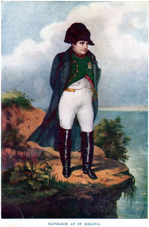
The original print depicts Napoleon in exile at St. Helena. In a rather surreal pose the general stands alone, his face in the wind, dangerously close to the cliff’s edge. One detail that strikes me as most peculiar is that Napoleon is carrying a sword. I don’t know much about how he was treated during his forced exile on St. Helena, but that detail seems unlikely. The uncredited illustrator has successfully captured the psychology of the forcibly retired Emperor, lost in thought.  He has a pensive, ‘It is what it is’ look that I hoped to capture.

A Xerox Machine Made of Meat?

Today, many illustrators would use the scanned print as their base layer of their Photoshop rendering. There is nothing legally wrong with that. The print’s copyright has surely expired. Still, I am old-school, and chose to draw it by hand and eye to make the image mine. I recall Art Speigelman’s injunction against tracing to a class full of aspiring cartoonists, “Draw! You are more than a Xerox machine made of meat!”
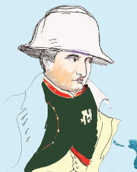
I inked directly over my quick pencil sketch. Without even erasing the pencil, I scanned my crude image and made it the base layer in Photoshop. I poured in a blue background. This gave me an idea of the sky’s tone, but more importantly the light blue is far easier on my eyes than a bright white screen. I started sketching in the skin tones with a Photoshop brush and within an hour my ink sketch was totally covered.

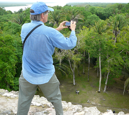
Now, I know Photoshop has a feature for rendering clouds, Filter -> Render -> Clouds. I found a nifty photoshop cloud tutorial here thanks to Michael Skora. I tried the exercise a few times, but found my Photoshop clouds didn’t have the ephemeral beauty of real clouds. Rather than swipe someone else’s super cloud photo via Google image search, I looked through my Iphoto files of my recent trip to the Yucatan. I was on top of  Maya pyramids with unobstructed sky views, but most of my pictures were snapshots of friends. I found one with lovely clouds against a pale blue and cropped out the people.

Notice part of a friend's hand shows in lower left of my cloud shot.

I placed the cropped cloud photo on a layer below Napoleon. I applied Photoshop’s Brush Stroke (Angled Strokes) so the sky appears less like a photo and more like my digitally painted Napoleon portrait. This might sound like I’ve gone over to the dark side to become a Xerox machine made of meat. However, I used my own photo-reference, and in my mind, the portrait is the essence of this picture.
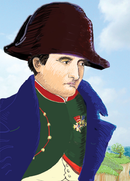
Napoleon, The Emperor Reflects, Photoshop © 2011 Kevin McCloskey

Notes: Since I posted this I find myself looking at the sky more. With Hurricane Irene we had some quite dramatic clouds here in Kutztown. Kutztown Cemetery is one of the few places in town without utility poles blocking the sky. I spent some time on the hill in the graveyard capturing clouds with my digital camera. I may update this image with more spectacular clouds.

Xerox is a registered trademark of the XEROX CORPORATION.
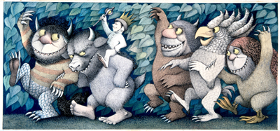
KUTZTOWN, Where the Wild Things Are!

Where the Wild Things Are, © 1963 by Maurice Sendak, all rights reserved.

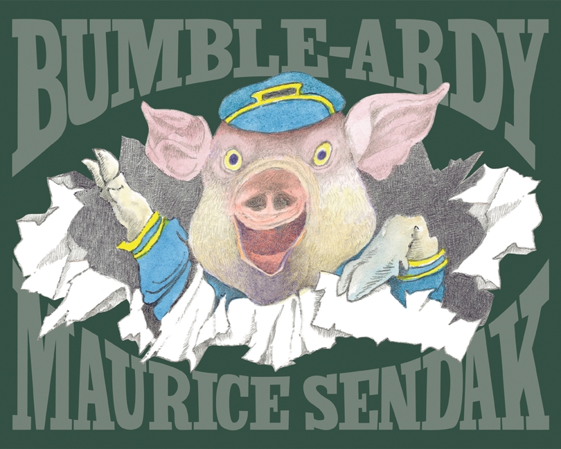
Rohrbach Library is having a Maurice Sendak exhibition,”In a Nutshell.” Best known for his 1963 book Where the Wild Things Are, Sendak created over 90 remarkable illustrated books. He is still working and has a new book, Bumble-Ardy, coming out this fall. There are a number of local events associated with the Sendak show. Here is a website with more info. I’ve highlighted some of the noteworthy FREE events below.

His newest book, Bumble-Ardy, © 2011, Maurice Sendak

Sept 1: 7:00 pm. Opening Reception. Rohrbach Library. Illustrated talk by Patrick Rodgers, Sendak scholar and Curator at Philadelphia’s Rosenbach Museum. Rodgers has interviewed Maurice Sendak and has many stories to tell about the great man.

Still from Spike Jonzes' film, Where the Wild Thing Are (2009, Warner Bros.)

Sept 9: 6:30 pm. Free movie, a feature film based on one of Sendak’s most-beloved books at the Louisa Gonser Library. Note: this local public library is in Kutztown, but not on campus. It’s near Young Ones. Enjoy the 2009 Spike Jonze film and a chance win a copy of Sendak’s new picture book, Bumble-Ardy. Kids of all ages welcome.

Sept 24: 10:00 Am-Noon. Rohrbach Library. Rumpuspalooza for Kids! Games, crafts, treats, KU Performing Arts Series tix, the Scholastic Book Fair, and a big Wild Thing—all part of KU’s Family Day.

Author 'Lewis B. Montgomery' is a pseudonym for Kutztown's Mara Rockliff (right)

Oct 5: 7:00 pm. Rohrbach Library. Children’s Publishing 101: Meet Kutztown resident and author Mara Rockliff along with illustrator and KU BFA Grad, Amy Wummer. Editor Juliana Hanford will also be there. This is the creative team behind the popular Milo & Jazz Mysteries. They will offer an inside look at how kids’ books are made. Bring your questions about illustrating and writing for the children’s publishing industry.

In a Nutshell runs from Sept 1 to Oct 14. KU Librarian Bruce Jensen has created a special web library guide about Sendak and the exhibition. It has extensive links to interviews and essays about Sendak.

John Esh wins Fantasy Art Award

Sleeping Beauty, oil, © 2011 John Esh

John Esh is an award-winning 2002 BFA grad. Twice he has won top honors at Gen Con. He recalls that it was in Joe Lacey’s Illustration class that he first learned of the Gen Con art show. Gen Con bills itself as,”the original, longest running, best attended, gaming convention in the world.  The Gen Con Art Show is the premiere showcase for fantasy, sci-fi, horror, and gaming art. ” The attendance for the event in Indianapolis topped 36,000 in 2011. John Esh’s artwork, pictured above, was singled out for a blue ribbon and one of the highest awards at the recent convention.

John Esh at his booth at Gen Con 2011

His oil painting, Sleeping Beauty, was awarded the Juror’s Choice Blue Ribbon by Jeff Miracola, Artist Guest of Honor. Miracola is a well-respected illustrator whose clients include Wizards of the Coast, Hasbro, and  Advanced Photoshop Magazine. Sleeping Beauty was produced by painting thin oil paint glazes on illustration board, a technique John learned from the fantasy artist Donato Giancola when he visited Kutztown’s illustration classes.

detail from 'Beowulf and the Grendel's Mother', watercolor © John Esh

John also attended Gen Con in 2005 and won that year’s Juror’s Choice Prize for a watercolor based on the Beowulf saga from guest juror, Jeremy Canford. Canford was art director for Wizards of the Coast, responsible for Magic the Gathering and the Dungeon’s & Dragons gaming franchises. John recalls that the Beowulf painting was originally produced for Prof. Martin Lemelman’s senior illustration class at Kutztown. By the way, Martin Lemelman has his own illustrated blog at http://www.twocentcomics.com.

John Esh thinks of himself as himself a “fantasy fine artist,” since he doesn’t work in the gaming industry as an illustrator. He enjoys the freedom to choose his subject matter and sell high-quality prints based on his original artwork. Anyone interested in his artwork is welcome to contact John Esh via email: artmanesh@gmail.com. Congrats to John on his well-deserved success. Hopefully, he will keep us posted about future exhibitions and awards.

Note: The Illustration Concentration Blog has had over 30,000 hits in the past year. Thanks for reading. If you are an illustrator, especially one with a Kutztown connection, please don’t be shy. Keep us informed about your success!

Ashley, How did you get that great job?

Tranformation, portfolio piece ©2011 Ashley McDevitt

I asked Ashley McDevitt, a 2011 grad, how she got her dream job so fast in today’s tough market?

OK, so it all started when I went to the Portfolio Review. I heard from Prof. Bosler and Prof. Cunfer about a few of the people coming that I should pay attention to, one of them being Kathy Davis. Kathy Davis, Paper Magic, and Hallmark where the three people on my list. So that evening I met three of Kathy Davis’s senior designers, one of whom was a fellow KU alumni. I immediately wrote down their names, collected business cards, and within two days had handmade thank you notes in the mail.

Fast forward: two weeks later and I got my first call from Kathy Davis. My first interview was over the phone with the head of licencing, HR and creative director, the second was at the studio to show my portfolio and then finally I met Kathy Davis. I didn’t know until when I came in for paperwork that Vallerie Berstecher and Laura Mounts had also been hired on as well. My first day was July 5th and I’ve been here ever since.

Project detail from KU Package Design Class © 2011 Ashley McDevitt

Which KU classes were most helpful to you, as far as getting a job?

I’d probably have to say Professor Bosler’s Self Promo class was the most helpful, with Portfolio a close second. But then again, all my classes were useful because they got me a job I like, in the field I was trained for, just 3.5 weeks out of school. But I’d say Self Promo gave me probably the biggest confidence boost to go out into the working world guns blazing. Prof. Bosler spelled everything out, –both pros and cons. I was still scared out of my mind, but at least I knew what to do.

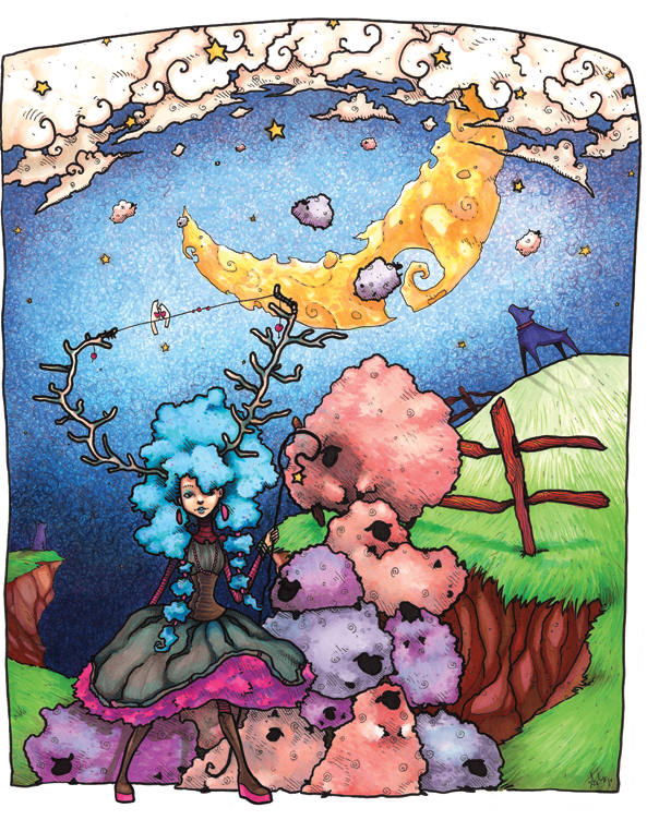
Little Bo Peep ©2011 Ashley McDevitt.

What can you tell us about out your new job? What sort of materials do you use, for example?

Software wise, we use CS4.  We don’t simply use the computer, but we still utilize watercolor, hand-drawn type and calligraphy that are staples of Kathy Davis’s art. This is also one of the things that I really enjoy about the company, too; there’s still this appreciation for these media. Kathy works with American Greetings and we use their resources to print/distribute our cards. We have a small staff of about 20, but everyone is easy to ask questions of, and we work as a cohesive team. I think that one of the best things about working here is that people will be able to buy cards I worked on at places like Target and Walmart!

artwork © 2011 Ashley McDevitt

Also we have a small gallery in the studio that every month each designer takes turns showcasing their work. We also have creative meetings to show inspirations we have come across both past and present.  We have an inspiration wall, as well, that a designer gets to put together themselves each month. 

Christmas at the Haggards card line and character © 2011 Ashley McDevitt

Editor’s note: Ashley McDevitt won the 2011 Kutztown C.D. Senior Illustration Award. She can’t share any of the Kathy Davis projects she has worked on, but the artwork on this page is from the portfolio that helped her land her dream job. More of Ashley’s illustration work can be seen here on her web site.  My question about how she got the job was not meant to express surprise at her well-deserved success, but to advise other illustration students. Ashley’s responses were edited for length.

Mark Van Stone, Epigrapher

In 2011, I traveled by bus through the Yucatan and Belize with a number of American scholars. One of them understood the language of the Maya.  Mark Van Stone is an author, calligrapher, designer and illustrator. He is also a world-class Maya epigrapher, meaning he can read and write Maya glyphs.

Mark Van Stone astride the great Pyramid at Lamanai, Belize.

He came to calligraphy late in life after finding his computer engineering degree led to rather boring jobs. He studied the Book of Kells at Trinity College in Ireland. He mastered medieval European letterforms and Egyptian hieroglyphics. He also studied Arabic and Japanese calligraphy, but his favorite writing system is that of the ancient Maya. He studied with the legendary Linda Schele at University of Texas. He currently teaches art history at Southwestern College in California.

Dr. Van Stone was one of my favorite colleagues and traveling companions on my Maya world tour. He explained to me that many Maya glyphs are ideograms, compact illustrations, like the apple on my computer, but others are phonetic devices representing sounds or syllables. It is only in the last thirty years that experts, like his late mentor Linda Schele, figured out the sounds and meanings for most of the glyphs.

Dr. Van Stone humored me and wrote Kutztown in Maya glyphs. As we know, there is more than one way to pronounce ‘Kootztown’, so he came up with two variants.

Using a flash light to increase readability of glyphs at Lamanai.

Mark Van Stone has an amazing amount of energy, both intellectual and physical. At more than one of the archaeological sites we visited, we were told we wouldn’t have time to see all the glyphs. He didn’t accept that. He would race up and down pyramids and jungle trails to document every known glyph at the site. I’ve read his two books pictured above. Reading Maya Glyphs, which he co-authored with Michael Coe is the best introduction to the subject. His latest book,(which he was good enough to send me in electronic form) is a lively collection of illustrated essays about the so-called Maya prophecies about 2012.

In the PBS NOVA documentary, Cracking the Maya Code, it is Mark Van Stone’s hand that draws the glyphs that appear on-screen. One of his most amazing calligraphy jobs was drawing the scribbled pages for the giant pirate’s book in Disney’s Pirates of the Caribbean. You never know where calligraphy might lead you!

Things I Carried: Ipad & Sketchbook

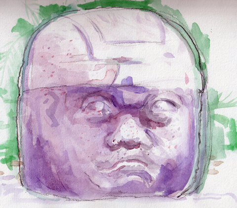
Olmec head, Parque La Venta, Villahermosa.

Back in sleepy Kutztown after 6 weeks of traveling through the Yucatan and Belize. I carried a sketchbook and an Ipad. My most recent on-the-road blog entries were done on the Ipad. WordPress for IOS worked pretty well. It doesn’t have the full toolset or versatility of the computer version of WordPress. I couldn’t manage to add links, for example. I know it is feasible, but it was beyond me working with ‘jungle-lodge’ wifi. At this point in time, a netbook or MacBook Air might be a better choice for remote blogging.

My sketchbook was a softcover Moleskine. It, too, was not the perfect choice. It wilted in the Mexican humidity, the perforated pages near the back came undone and ink from the cover bled into the edges of the interior pages. (See sketch below.) I know, it is the poor carpenter who blames his tools, and Moleskine has a devoted following. A more expensive hardcover Moleskine would have been a better choice. In the past I’ve used Cachet, Canson, and Holbein sketchbooks, all good products. Selecting a sketchbook is a very personal matter. Consider the media you use, and be realistic about the size and weight of the book you are prepared to carry.

 Hand-cranked ferry in Belize, ink and watercolor in Moleskine.Watercolors on the Go…
Back in my youth I would carry high-end watercolors on my journeys,–Schmincke watercolors. Schmincke colors are certainly extraordinary. The colors are lush, bright, and much more colorfast than Prang. But since I am an illustrator, not a “fine art” watercolorist, the Prang colors serve me well. If I get an image I like I can scan it before the colors fade. And though a watercolor purist would gag at the thought, I can also tweek the colors in Photoshop. Bottom line: The Prang set costs $1.99, a small Schmincke set can be found on sale for about $100.

I also carried a Niji waterbrush. It looks gimmicky, but I like it. It has a reservoir that holds enough water in the handle to complete a fair-sized sketch. Sakura also makes an even smaller waterbrush called the Koi. These can be found for under $8, and while they don’t compare to high-end kolinski sable brushes, they are wonderful for use in the field.

Note: Blog title today pays homage to Tim O’Brien’s Vietnam short story collection, The Things They Carried. I went on a sketch tour of Vietnam near the end of the war, in 1971.  If I find some of my old Saigon sketches I will post them in the future.

America’s Funniest Archaeologist

20110629-102558.jpg

Dr. Bill Saturno is in the news again for unearthing an ancient art studio in Guatemala. The post below is from July 2011, when I met him in Belize:

Dr. Bill Saturno has got to be America’s funniest archaeologist. His discoveries of Maya murals made page one of the New York Times. That’s him pictured above at an ancient Maya ballcourt in Caracol, Belize. He is built like John Belushi or Lou Costello, and like those great comics, he talks with more than his mouth. His eyes roll, his hands flutter, and he seems a surprised as anyone else to hear what he is saying.

I am on the road with a group of NEH fellows, most know much more about Maya art than I do. We heard Dr. Saturno tell his hair-raising story in a makeshift conference room in a funky Belizean hotel. We were supposed to meet Dr. Saturmo in the Peten, Guatemala, but a US State Dept. warning prompted by a recent massacre there led to a change of venue.

Currently at Boston University, Saturmo was an adjunct professor at University of New Hampshire in 2001. His life changed that March when he flew to Guatemala to do a brief project over Spring Break. He went into the Peten, the dense jungle territory near the borders of Mexico and Belize. His original Spring Break plan, Plan A, didn’t pan out, nor did Plan B.

A Guatemalan guide named Bernie Middlestadt suggested a Plan C. He told Saturno he might find upright monuments, Maya stela, at a looted site north of the famed ‘lost city’ of Tikal. Bernie was no ordinary guide. A steely-eyed Guatemalan of German descent, he was recommended by Saturno’s mentor, the British explorer Ian Graham. Graham’s autobiography is aptly titled, The Road to Ruins. According to Saturno, it is a ripping yarn, as the Brits say. Graham played parlor games at Rudyard Kipling’s house, served tea to the Grand Pasha at age 11, and cavorted with Picasso in Paris. All this, before dedicating himself to Maya studies.

Bernie led young Dr. Saturno and a crew of four on jungle journey that was supposed to be the proverbial ‘three hour tour.” The last road sign Saturno saw was an unhinged arrow pointing straight to hell. Felled trees forced the six to abandon their two vehicles. Saturno began to have doubts when Bernie’s men needed machetes to clear the path. He had a GPS, so he was never really lost. But it occured to him that knowing where you are is far less important than knowing where the hell you are going. They drank the last of their water. Bernie assured Saturno the Peten was full of shower vines. Cut the right way shower vines provide plenty of drinkable water, or so said Bernie.

Perhaps Saturno asked Bernie too many questions as they hacked their way forward. Bernie told a little jungle parable. Once upon a time, he was guiding a gringo, and the man stepped on a plant. Bernie informed his client that this plant was a very rare orchid. The man stepped on another orchid, and Bernie warned him politely not to do it again. When the gringo stepped on a third orchid, Bernie took out his pistol and shot him in the face. End of story. So, Saturno followed Bernie in silence and stepped exactly where Bernie stepped.

Zig-zagging north they encountered no shower vines, but Bernie promised  to break out the emergency rations when they reached the site. The jungle is quick to cover ancient pyramids, so a Maya temple covered with trees and moss looks much like a hill. They found the site eventually, an overgrown hill with a looters’ tunnel. Saturno looked around. If there were stelea here, they were long gone.

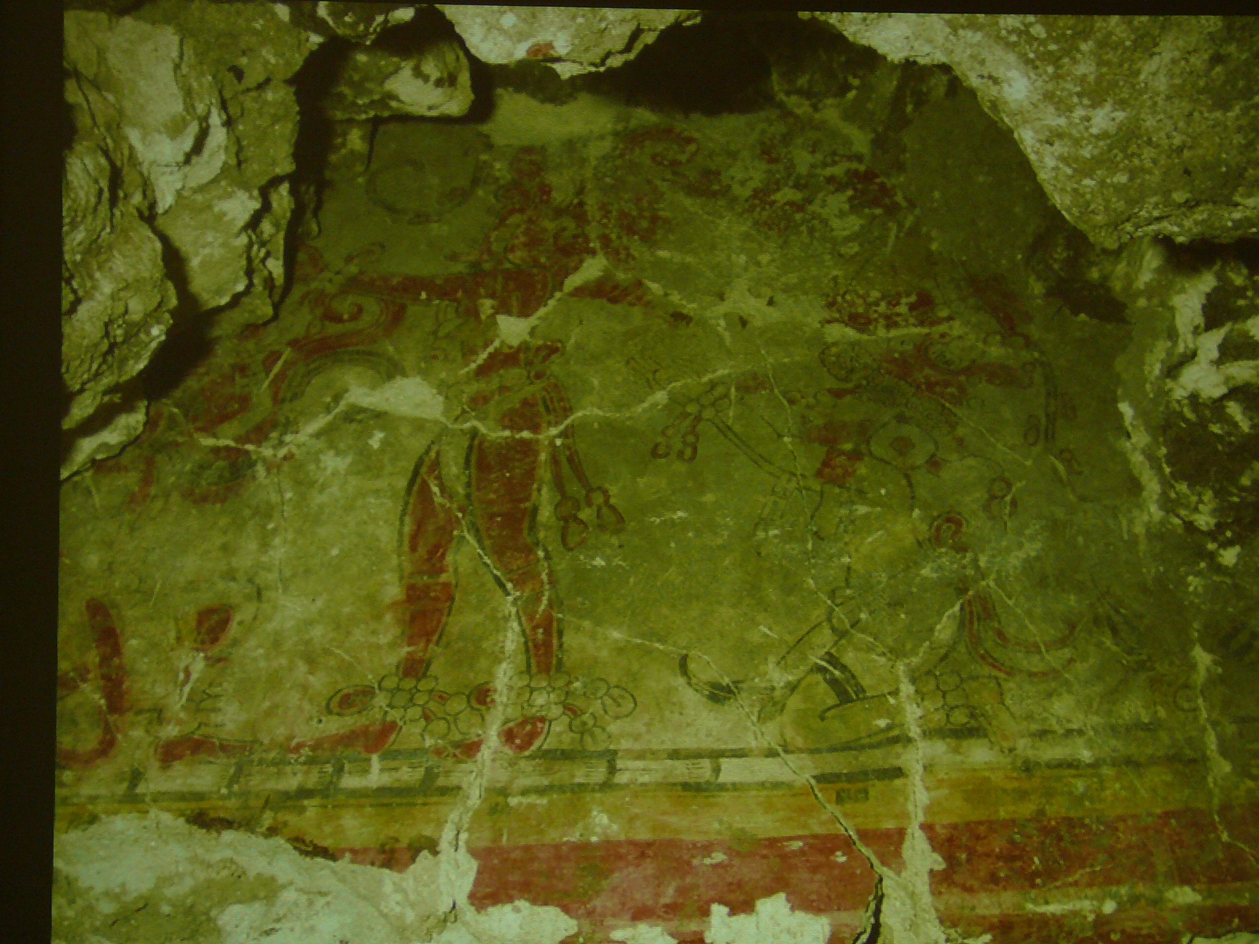
Bernie and his men went looking for water vines. Saturno took refuge from the heat in the looters’ tunnel. It smelled of bat droppings. He pointed his flashlight up and found the first Maya murals in over half a century. He took a photo. He said he was so tired and dehydrated that he felt no elation. Just thirst. When Bernie and crew returned Saturno said nothing about the murals. It had occurred to him that perhaps Bernie was a looter. 20110704-062339.jpg

Above is a painting by artist Heather Hurst, done over images scanned directly from the wall at San Bartolo.

20110708-021803.jpg

Bernie broke out the emergency rations, a single serving of crab flavored Cup o’ Noodles for six men. They found a few ounces of muddy water. Bernie told Saturno they needed his shirt to strain the goopey liquid. Saturno thought, why my shirt? But then looking a the dirty, raggedy shirts of the others’ backs, he saw the wisdom in Bernie’s decision. 

Retracing their steps through the jungle two of the men collapsed unconscious on the ground. Saturno said to himself – I don’t want to die on the jungle floor, so he strung his hammock between two trees and passed out. Sometime later Antonio, the eldest guide, returned with foraged bitter roots, and got Saturno and crew back to the vehicles. He made it home, and the rest is history.

Micheal Coe in his classic book The Maya, put it this way, “One of the great archaeological finds of all time took place in 2001, when Dr. William Saturno stumbled across San Bartolo…taking refuge from the intense sun in the shade of a looter’s tunnel.” Coe and I can’t tell it like Saturno. If you are at Boston University, sign up for his course.

Learn more, in Spanish or English at the San Bartolo project web site.

Note: Originally posted from my Ipad in Merida, Yucatan.  Updated links a bit since.

Jean Charlot, an illustrator worth knowing.

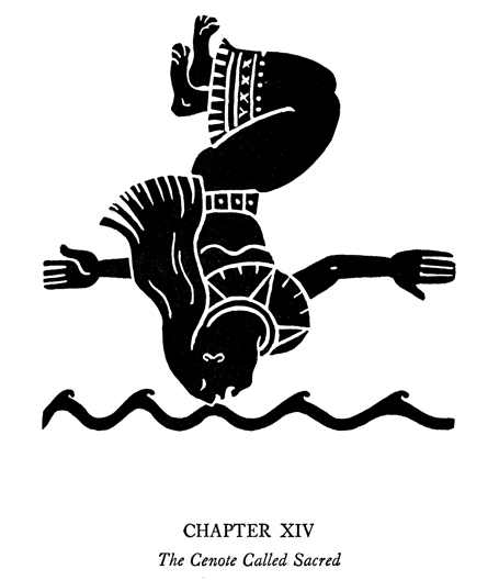
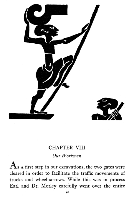
Illustration from Digging the Yucatan


Jean Charlot was born in Paris in 1898. His name is pronounced in the French manner, something like “Jahn Sharlow.” Oddly enough, Charlot was a great Mexican illustrator. His mother was from Mexico and after World War I, she returned to Mexico with her son, Jean. By that point he was a young man, having served in the French Army during the war and studied art in Paris. In Mexico City he began teaching printmaking and writing about Mexican art history. He sought out the great muralists and befriended artists who sometimes didn’t get along with each other, Siqueiros and Rivera, for example. He worked with Diego Rivera on several monumental mural projects. He spoke and wrote in fluent French, Spanish, English. He also spoke Nahuatl, one of Mexico’s many indigenous languages.

Illustration from Digging the Yucatan

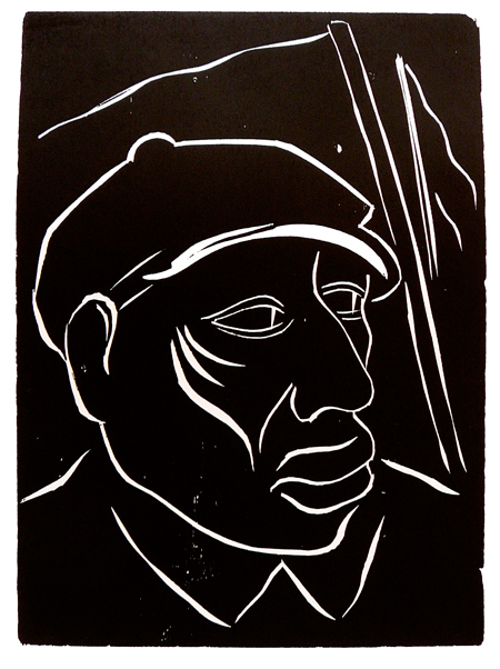
Charlot was an influential member of the Taller Grafica Popular. The TGP, or Taller de Grafica Popular (Workshop of the Peoples’ Graphics) printmaking collective was founded in Mexico City in 1937. The TGP still exists today and is well worth a visit. I wrote about my 2009 pilgrimage to the TGP here in the webzine, Commonsense2.com. There I held original prints by Charlot in my hands, including the one below. Like most TGP prints it is unsigned, but I have little doubt this is his work.

Worker: unsigned woodblock print attributed to Charlot photo: K.McCloskey, 2009

20th Century Mexican artists, Charlot included, did not look down on illustration, the way most North American painters did. Until Andy Warhol, many U.S. fine artists denied ever doing illustration, even when they had done it well. Edward Hopper, for example, was a notorious denier.

In 1926, Charlot was one of the official artists hired by the Carnegie Institute’s Maya Expedition to document the excavations at Chichen Itza. He later illustrated Ann Axtell Morris’s bestselling book for young adults about that expedition, Digging the Yucatan. The bold silhouette-style illustrations reproduced here are examples of his extraordinary genius. Clearly, the two years he spent in the Yucatan drawing copies of Maya murals and relief sculptures made him the ideal candidate for this assignment. These images are remarkable for their unusual use of white space. I’ve reproduced a few with the text included to give a sense of the book’s dramatic page design.

Illustration from Digging the Yucatan

Charlot’s life was so eventful I can’t even scratch the surface of his accomplishments in this note. I hope to write more about him soon. Interested readers should visit the web site of the Jean Charlot Collection at the University of Hawaii.

Credits: Art from Digging in Yucatan came the Jean Charlot Collection web site. Copyright statement from that site: This material is copyrighted 2001 by John Charlot, the Dorothy Z. Charlot Trust, and the Jean Charlot Estate. The text of these web pages may be reproduced in whole or in part provided that proper credit is given and reproduction is not for commercial purposes.

20110714-092656.jpg
Above: Watercolor of Jean Charlot’s quarters at Hacienda Chichen Itza by Kevin McCloskey, July 14, 2011.

Catherwood, illustrator in the Yucatan

20110707-112926.jpg
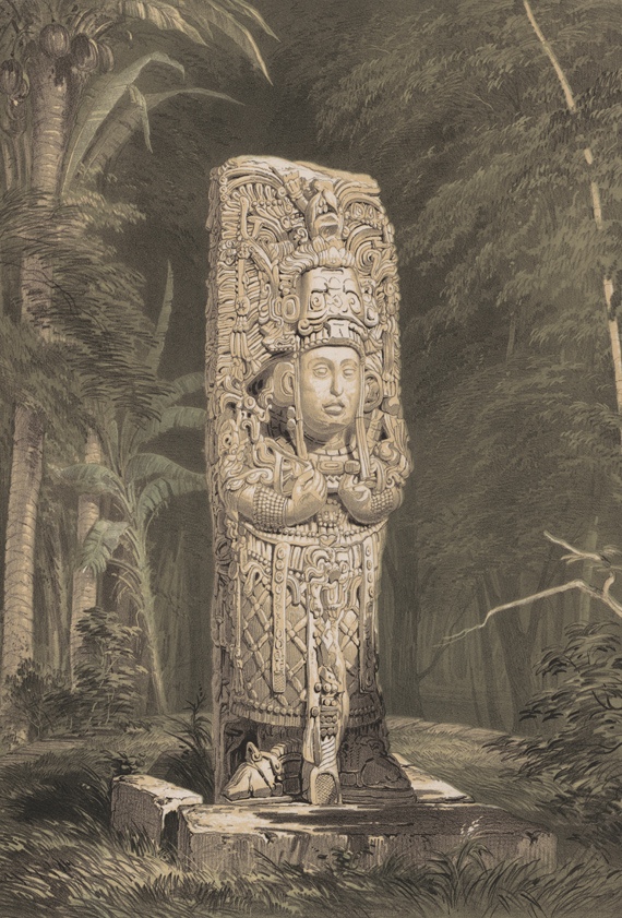
Above: Maya stela at Copan by Frederick Catherwood.
Blogging on an Ipad on a bus racing through the Yucatan can be difficult. For one thing, I can’t insert links. Also, I haven’t been in WiFi range for a day. Last night I slept at the Hacienda Uxmal, the same hacienda where the great English illustrator Frederick Catherwood stayed when he drew the Uxmal ruins in 1839. There is a bilingual plaque on the hacienda’s wall saying Catherwood ‘died at the height of his career in a sink on the steamship Artic’ traveling from Liverpool to New York. Imagine that! Reading the Spanish version I understood the entire ‘barca de vapor’ or steamship did sink, so his death was slightly less proposterous than I originally thought.

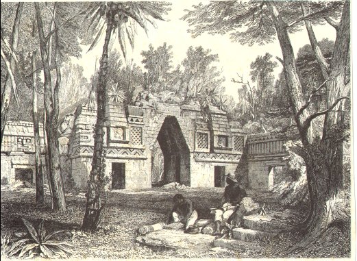
Catherwood braved disease, insects, snakes, and insurrections to complete his illustrations for John Stephen’s “Incidents of Travels in Central America, Chiapas, and the Yucatan.” With the help of native guides Catherwood would hack away foliage to cast light on ruins. Catherwood rigged a field camera lucida, a tracing machine with a prism, that works something like a pinhole camera. This device made for precise copies, but meant the artist had to work in a dark tent during the hottest, sunniest hours of the day. ‘Incidents of Travels’ was published with 77 stunning illustrations in New York in 1841. An instant bestseller, Edgar Allan Poe called it, “perhaps the most interesting book of travel ever published.”

Arch at Labna, by Frederick Catherwood.

Update: Back on campus, I’ve added links to Smith College’s splendid online gallery of his artwork. Here is more from  Casa Catherwood, in Merida. The stela at the top of the page is a chromolithograph. His black and white work is also worth checking out. Much of the Maya art and architecture Catherwood drew in 1839 has since been looted, vandalized, or otherwise destroyed. Fortunately, his drawings are so precise that epigraphers, folks who read Maya glyphs, can decipher much of what he documented. With today’s upswing in interest in all things Maya, Catherwood’s work is collectable again.

First editions of the 2-volume ‘Incidents’ originally sold for $5. Today an early edition in fair condition might be had for under $300. Print dealers buy the volumes then rip out the prints and sell them for $30 apiece. 77 prints X 30 = $2421, so by destroying these rare books these dealers can gain over $2000. I admit I have purchased the occassional page of incunabula, early printing, to share with students in Historical Survey of Graphic Design. I have a single page from Owen Jones’ ” Language of Ornament,” published around Catherwood’s time which I purchased online for $20. The Ebay dealers I buy from assure me they only remove pages for sale from ” unrepairable books.”

20110709-093947.jpg
Above: my sketchbook page showing the church at Mani and its bookstore.

Speaking of Books and the Yucatan….

Yesterday we were at the 16th century Franciscan Church at Mani. It is a massive structure with a fresh coat of burnt orange paint on its simple face. I knelt in church and said a quick prayer, asking for the impossible. Then I went into the little bookstore attached to the church. They had framed Virgens de Guadalupe printed on silver foil. Hecho en China, made in China, they cost 30 pesos, under 3 dollars. Somewhere between the Ipad factory and the bobble-head ballplayer plant, there must be a blessed printing press reproducing Mexico’s protectress. There was a colonial-era portrait mural of a Franciscan friar on the wall above the rosaries. Below the rosaries rested a horizontal fridge full of ice cold Coca-Cola.

There was a large selection of little books. Even though Maya language radio could be heard in the village, all the books were in Spanish. These seemed to be printed in Mexico. Some of the titles were fascinating, like The Seven Fortresses of Sobriety, and Que Falte Nadie en Cielo, roughly translated, In Heaven, You’ll Miss Nothing! I resisted the temptation to buy any book in this particular bookshop. This is where Friar Diego de Landa burned every Maya book he could find in 1562. Nobody knows how much science, history, and art de Landa’s bonfire destroyed. Amara Solari, Penn State art historian, estimates the friar burned between one and two hundred books at Mani. She says the book burning didn’t end there. It continued into the 17th century. De Landa reported Maya elders appeared ‘distraught’ to see their sacred books go up in flames.

Only 4 Maya books survived, some because they had been shipped to Europe prior to this book burning of 1562. The Maya codices were not like our books, exactly. They were hand-painted manuscripts, one-of-a-kind objects. While the Maya may have reproduced images on fabric and pottery with simple printing devices like rubber stamps, they never made the leap to printing on paper. On the other hand, Catherwood’s books on the Maya were printed in runs of 10,000 at a time. His illustrations appeared in the bestselling travel book of his day. Still, it seems to me, collecting individual leaves resulting from the destruction of a rare book, is a terrible thing. Dear God, thank you for the fact I have no WiFi, at this moment, when I am tempted to buy a print by Frederick Catherwood.

Something Craig Frazier taught me.

Craig Frazier has a great illustration studio website.

art © C. Frazier from 36pages.com

Beyond that, he also has a wonderful blog about children’s picture books called 36 pages. I heard him speak at an illustration conference in Philadelphia, PA, around 2003. He is an interesting artist. The art shown at right, lifted from his blog, demonstrates that he is at the designerly end of the illustration spectrum. You probably have used one of the postage stamps he’s illustrated. I do admire how Frazier manages to convey complex concepts with deceptively simple figures and sparse landscapes.

I often use one of the exercises he shared in Philadelphia in my Visual Thinking class. He is the guy who came up with the idea of taking four inches of black drafting tape and cutting it up and placing it down on a white rectangle to make graphic representations. The paper should be roughly twice the size of the tape’s total area. Use all the tape!

I find 3 X 5″ index cards work well for a surface. This is a nifty exercise in composition and balancing black and white.

I’ve done three examples below. Actually, I did six this morning; these are the best of the lot. Craig Frazier gives much better examples in his book, The Illustrated Voice. It is worth looking for.

Black Tape Exercise #1, K. McCloskey 2011
Black Tape Exercise #2, K. McCloskey 2011
Black Tape Exercise #3, K. McCloskey, 2011

Thanks to Craig Frazier for letting me share this exercise!