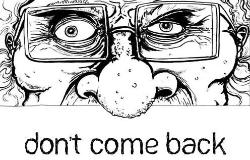
Pittsburgh cartoonist Nate McDonough’s graphic novel Don’t Come Back is quite interesting. It is nightmarish and convoluted in a good way. There are falling angels, dogs peeing in a cemetery, and one screaming chicken demon in the pizza box. There is death and resurrection. Don’t worry about me spoiling the ending. I’m not sure I figured it out. Another fascinating thing about Don’t Come Back – All 160 pages are available online Free! Here, the entire book, Nate’s gift.
Nate raised over $700 on Kickstarter to get this project in print. In 2011 Publisher’s Weekly reported that Kickstarter.com was the third largest source of indy graphic novels in the U.S. Today it looms even larger. Yet Kickstarter is not a publisher, but a funding site that savvy entrepreneurs and artists use to essentially pre-sell creative projects of all kinds. I’ve contributed modest sums to 7 Kickstarter ventures.
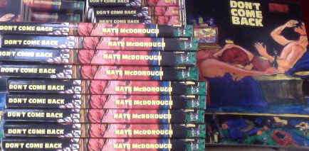
Fresh from the printer, first editions of Don’t Come Back.
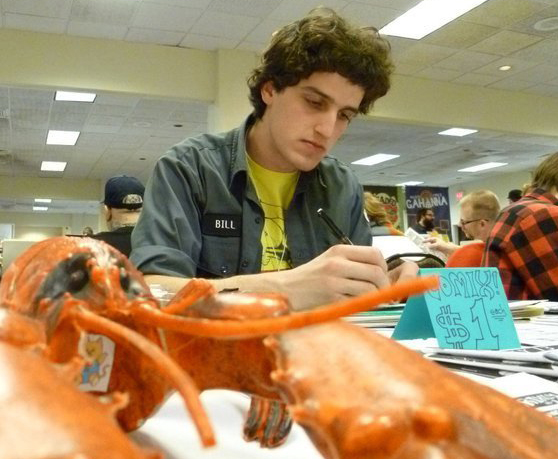
Full disclosure: Nate is a close friend of my son Daniel. Incredibly, I first met Nate, by chance, as he and I were gassing up at a Sheetz in Wheeling, West Virginia. Nate popped the trunk of his red 2005 Chevy cobalt and gave me a pile of his monthly zine, Grixly.
Have Coffee with Nate: Yinz near Pittsburgh? Don’t miss the Release Party for DON’T COME BACK. Weds, May 30, 7:00pm at Copacetic Comics and Lili Coffee Shop in Polish Hill. Here is your personal YouTube invitation. Even if you can’t make it, next time you are in Pittsburgh visit this great indy comic shop and great indy coffee shop.
Q & A with Nate McDonough.
Nate talks about his art education, Pittsburgh, his zine, and how Kickstarter worked for him. He talks frankly about the dollars and cents of the project and offers advice for aspiring comics artists. Interested in doing your own project?
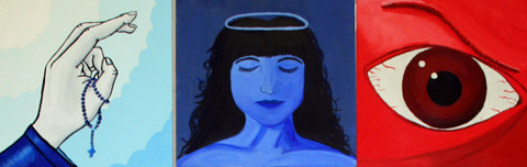
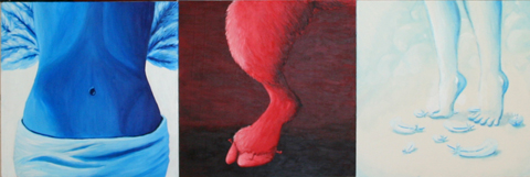
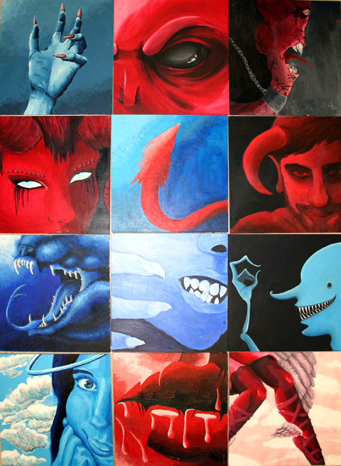
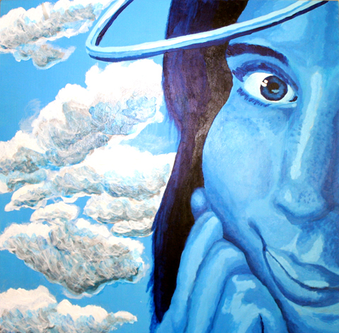
Angels & Demons is a book and a movie, sequel to the DaVinci Code. The title was inspiration for our final project in Illustration Techniques class. Most of these students are sophomore C.D. majors, not necessarily Illustration majors. This course involves mastering traditional media: pen and ink; scratchboard; watercolor; and for this final project, acrylic paint. Of course, the class asked to see past students’ work. Well, I mix it up to keep it interesting. Last year was “Rare Birds” so I had no “Angel and Demons” to show.
At the end of the semester students are running short on cash, so I treated them to the masonite and gesso. They had to provide the paint. Limiting the palette saved some money. I got two 4ft by 8ft sheets of masonite (about $11 each) from Lowe’s, cut into 12 inch squares.
Project instructions:Your Angel or Demon should be largely monochromatic, with red or blue the dominant color. Close up, a telling detail, not full figure. Imagine the light is coming from the upper left. Angels or Demons can be either blue or red. No color code, but largely one or the other. Grading criteria: Originality, sense of mass, and consistency of light source. No points for originality if you lift a cherub from Rafael or devil from Bosch. Better to find a baby picture or photo of a wicked-looking person for reference. Even better –take your own reference photo of yourself or a friend.
This was a two-week project and the results were fascinating when grouped side by side. We will do Angels & Demons again next year. If you teach illustration, feel free to use this. Let me know how it works!
Mr. Fish recently came to the Kutztown University’s Rohrbach Library. He also visited my illustration class. Students are lucky to have visiting artists like Mr. Fish in the classroom. His topical artwork savages our social system. Biting social satire is not the sort of thing a tenured professor (like myself) is likely to get away with. It is safe to say Mr. Fish will not get tenure. An Ivy League college dropout, he could not even get hired to teach at a state university.
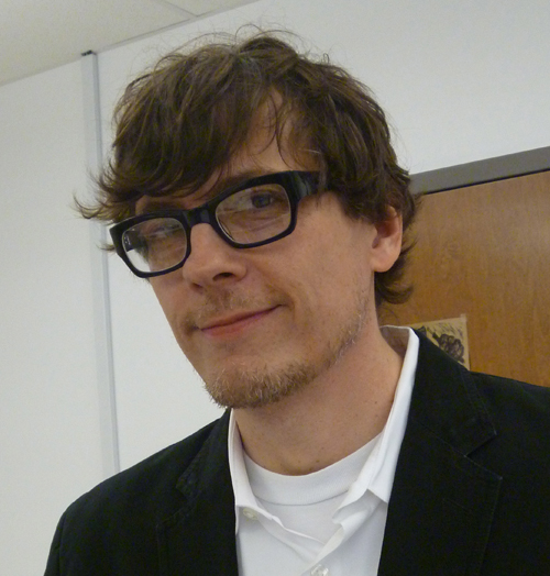
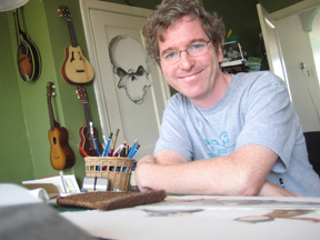
Mr Fish, photo by Kevin McCloskey
Even though this blog is unofficial, Mr. Fish’s work is so radioactive, I don’t think I should publish much of it here. It is a shame, as he gave me permission to use as many images as I like. Fortunately, my friends at Commonsense2.com, the progressive web magazine offered an outlet to share more of his work. If you are ready for a direct hit, visit Mr Fish’s own website, www.clowncrack.com.
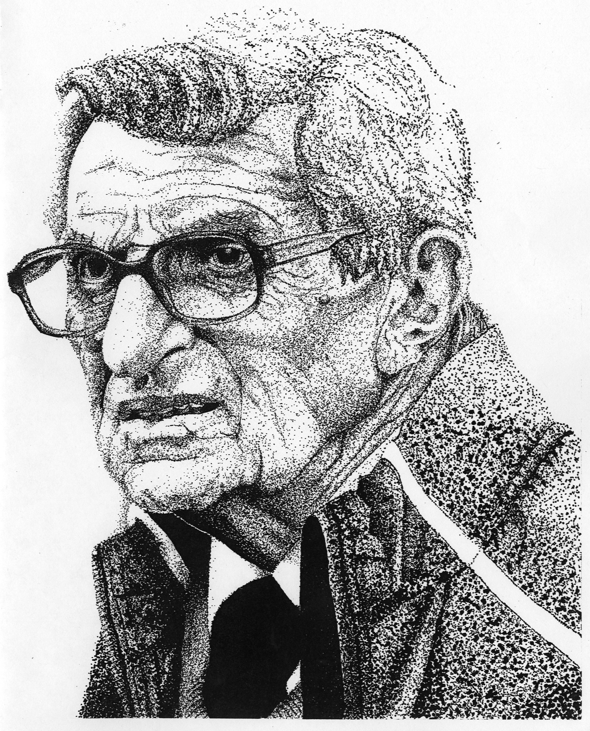
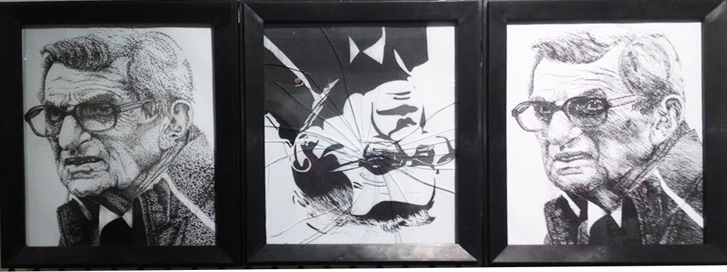
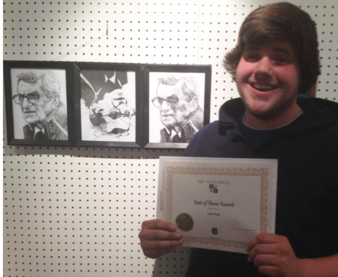
Dylan Rush, 19, a Communication Design sophomore at Kutztown University won Best in Show Award at the 2012 Hazelton Art League Open Exhibition. He drew a series of line art portraits of Joe Paterno in January for his first assignment in Kevin McCloskey’s Illustration Techniques class. Dylan calls the work “Joe Pa.” You will notice the central portrait is upside down and the glass is broken. Dylan explained that in his hurry to frame the artwork, he accidentally broke one of the frames. Dylan decided to hang it broken to conceptually reflect the shattering turmoil at the end of Jo Pa’s life. Note that in the final image Joe Pa has regained his upright direction.
The 2012 Best in Show award included a $300 cash prize. Dylan also sold the triptych for a nominal sum to a Penn State fan and it now hangs on the wall of a building on the campus of Penn State in Hazelton, PA.
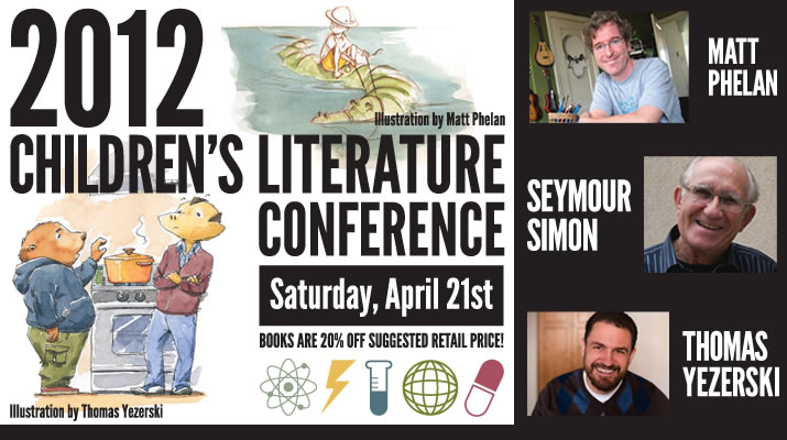
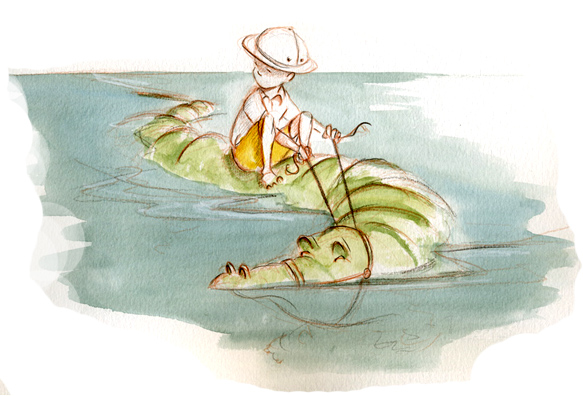
Matt Phelan is coming to Kutztown this weekend for the 2012 Children’s Literature Conference. Even if you can’t make the conference you might go to the KU bookstore to pick up his books at a discount. He is a prolific and popular illustrator. He writes as well. A piece of Matt’s original artwork from his award-winning graphic novel, A Storm in the Barn, was in the Dornish collection show last year at KU’s Miller Gallery. I emailed him five questions and here are his replies.
1. Do you recall an author or illustrator visit your elementary school when you were a kid?
Matt Phelan: I don’t recall anything that remotely cool happening at school. I don’t think author visits were a thing back then. It’s a shame because Lloyd Alexander (author of the Chronicles of Prydain and many other books I loved) lived in my town and might have been open to a school visit. Many years later, I ran events at a Borders store and I would invite illustrators in for signings mostly so I could ask them questions.
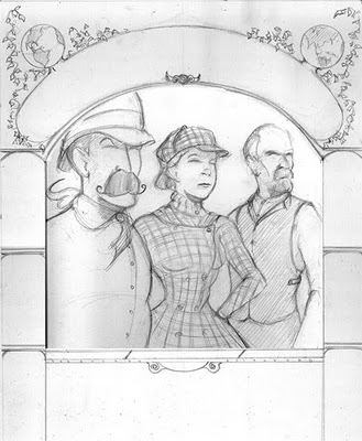
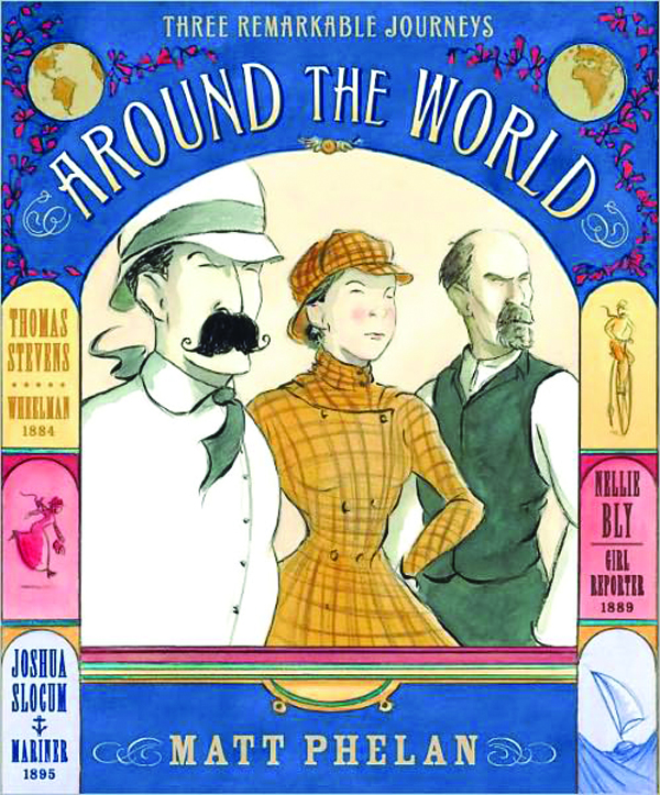
2. Are more children’s books headed in the graphic novel direction, like your recent Around the World?
Matt Phelan: The children’s publishing industry is definitely interested in putting out more graphic novels for kids. The great thing is, like all of children’s publishing, they are open to many different kinds of graphic novels. So there’s room for superheroes, talking mice, and creepy historical fiction set in the Dust Bowl. I believe there will be more picture book illustrators like me trying graphic novels in the near future. It’s already happening with people like Dan Santat (“Sidekicks”), Jarrett Krosoczka (“Lunch Lady”), and multiple Newbery Honor-winning author Jennifer Holm (“Babymouse”) putting out fantastic graphic novels for kids. Eric Wight came from comics and animation and is now creating a hybrid of prose and comics for his Frankie Pickle young reader series. Innovations like that and the variety of stories makes me think that children’s publishing is the most exciting place for comics today.
3. Any advice for aspiring illustrators?
Matt Phelan: The only thing you have compete control over at the beginning is your portfolio. And that’s really the one thing that will get you work. Before you worry about mailings, contacts, or any of that marketing stuff, concentrate on making the strongest portfolio you can. Other than that, I recommend that illustrators take an acting class or two or at least read some books on acting. I studied acting in college and it has proven to be the most useful training I’ve had for my work.
4. Often students say they met/know someone who has written a kid’s book and wants illustration. I give them the standard warning that publishers prefer “unencumbered projects.” What do you think, are they better off coming up with their own original story?
Matt Phelan: Publishers do not want to see illustrations in manuscript submissions unless the author and illustrator are the same person. If you want to write, then submit a sketch dummy of a book you have also written. If you want to illustrate other people’s books, then all you need is a strong portfolio. I’d say that illustrating someone’s unsold manuscript (even if they offer to pay you) is time that could be better spent elsewhere.
5. Have you been to Ireland? or taken a trip abroad that’s influenced your art?
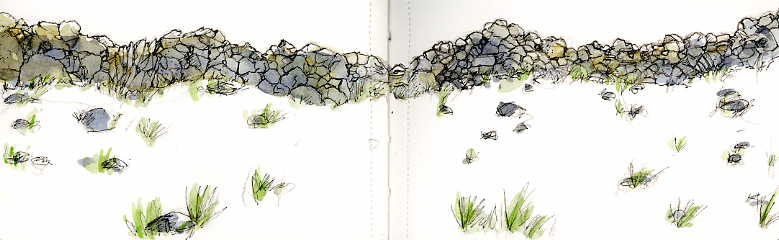
Matt Phelan: I actually went to Ireland on my honeymoon, Why do you ask? Does my work seem Irish? At any rate, I always bring plenty of sketchbooks on vacation. I think everything has potential to influence your work at some point. The important thing is to be open and observe as much as you can. Sketching forces you to slow down and notice. (I’ve included some Ireland sketches of one of the many walls of the Aran Islands and some sheep in County Galway.) I have taken some research trips for my work. I spent a week in Muskegon, Michigan which is the setting for my next graphic novel. Sadly, I didn’t have the time to circle the globe for Around the World. A missed opportunity there, I think.
Notes: I asked about Ireland out of curiosity after finding a web page where Matt explains the pronunciation of his Irish surname. If you haven’t read any of Matt’s work, I especially recommend Around the World. It graphically recounts three true stories of round-the-world voyages, by the reporter Nellie Bly, sailor Joshua Slocum, and bicyclist Thomas Stevens. It is like getting three good books for the price of one!
Mother and child, terra-cotta, approx. 14 inch tall. Elizabeth Catlett
Elizabeth Catlett died last week. She was an African-American artist and member of the Taller Grafica Popular, the famed Mexico City printmaking collective. Her Mexico City friends included Frida Kahlo and Diego Rivera. The U.S. obituaries generally referred to Ms. Catlett as a sculptor. In fact, the NY Times headline is Elizabeth Catlett, Sculptor With Eye on Social Issues, Is Dead at 96.
I was familiar with Catlett’s graphic work, but I’d never seen her sculpture. Oddly enough, I came across this one, above, when I went to MOMA to see the Diego Rivera show. The terra-cotta Mother and Child is small but has a monumental feel.
MOMA museum label for the print below.
I’ve written about my 2009 pilgrimage to the Taller Grafica Popular. I was struck then by how many international artists had produced work there, Elizabeth Catlett included. Art Historian Melanie Herzog wrote the book about Catlett, and a fine essay by Herzog on Catlett’s TGP work that can be found here. This is a brief excerpt in which Catlett talks about her TGP experience:
“The criticism in the Taller was always positive, like somebody would say, “I think that you have a very good design, and it’s very clear, but why did you hide the hands?” And so they would say, “I can’t draw hands.” “Well, I’ll help you, or I’ll draw the hands.” Or they would say, “This symbolism has been used over and over, it’s time we had something new,” and so then they would have a general discussion of what you could use. . . . And it didn’t matter how many people worked on something, as long as it came out the best we could make it.”
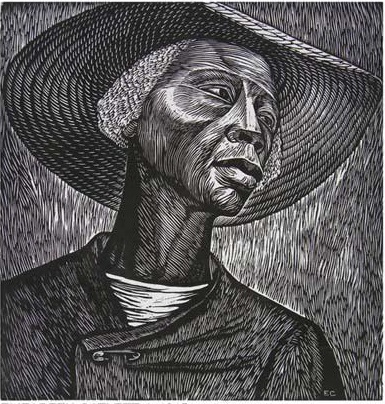
Sharecropper, Elizabeth Catlett, printed with Jose Sanchez, TGP, Mexico City.
Sharecropper is one of Catlett’s master works. The safety-pin holding the coat together is a nice detail; I only noticed it now. Every deliberate mark Catlett made on this print adds up to a portrait of dignity.
Update: View a larger sampling of Catlett’s artistic output in all its diversity at Ourstorian.
The two Elizabeth Catlett works on view at the MOMA.
Today at an otherwise ho-hum University Senate meeting we learned Eric D. Scheaffer, a BFA grad from Kutztown’s famed Communication Design program will receive an honorary doctorate from his alma mater on May 12 at commencement. The Fleetwood native has had extraordinary success in live theatre in the Washington D.C. area and beyond. He has been profiled several times on the PBS Newshour. The musical genius Stephen Sondheim declared Scheaffer’s interpretations of his musicals are his personal favorites.
Scheaffer’s many awards include six Helen Hayes Awards for Outstanding Direction, six Helen Hayes Awards for Outstanding Musical, and the Washingtonian of the Year Award. His Signature Theatre earned the 2009 Tony Award for the Outstanding Regional Theatre.
“Since cofounding Arlington’s Signature Theatre company in 1990, he has reveled in repeated waves of positive buzz that echoed in New York, Los Angeles, and London. One critic wrote that Schaeffer “seems to pull a bigger rabbit out of his hat every year.” –Washingtonian Magazine.
Scheaffer has also had four successful productions on Broadway, most recently Million Dollar Quartet. This show recreates the legendary rock and roll night when Johnny Cash, Jerry Lee Lewis, Carl Perkins and Elvis Presley jammed together at Sun Records in Memphis, Tennessee. Million Dollar Quartet can still be seen in New York on Broadway and in other major cities. And if you are heading toward D.C., the Signature Theatre’s spring line-up can be found here.
“Majoring in Art at the state university appealed to me because I have always hated Art, and I had a hunch if any school would treat the subject with the proper disdain it would be one run by the government. Of course I was right.”
– Chip Kidd, The Cheese Monkeys: A Novel in Two Semesters.
Detail from poster by Madison O' Neil, Kutztown student.
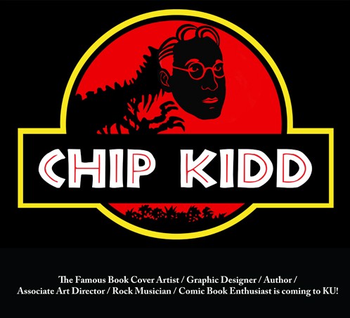
Chip Kidd is coming to Kutztown University. America’s best known book cover designer, he was even an answer (in the form of a question) on Jeopardy! His visit is brought to us by the hardworking students of Kutztown’s AIGA chapter. The event is FREE. Weds. March 28. Time: 7pm. Room 200 at Academic Forum. A sample of Chip Kidd’s greatest hits can be seen here at Time. By the way, the university referred to above is not Kutztown University. It is fictional and located in someplace like Happy Valley.
One of Chip Kidd's award-winning cover designs.
Chip Kidd is the author of the eagerly awaited new hardcover Batman graphic novel, Death by Design, with art by Dave Taylor, due out this June. Below is a sneak preview of the cover.
The ELVIS Tortilla is a fake, a hoax! I made it to publicize the lecture, Rockin’ Las Americas. I apologize if anyone takes offense. I am a big fan of Elvis and of Mexico. The Elvis Tortilla wasn’t easy. Jesus and Hello Kitty are easy; they make toasters especially for their fans. Elvis takes real effort. (See Below.)
Refried Elvis: The Rise of the Mexican Counterculture is a fascinating book about Elvis’s influence on Mexico’s Rock scene. It’s published in Mexico with a less catchy title: Rebeldes con causa: La contracultural mexicana y la crisis del estado patriarcal, (Rebels with a cause: The Mexican counterculture and the crisis of the patriarchal state.)
Refried Elvis, published by University of California Press.
Author Eric Zolov is coming to Kutztown to give the 2012 Esther Willits Lecture on April 3. Dr. Zolov is a Professor of Latin American History at SUNY, Stony Brook. He may be the foremost academic expert on what Mexicans call “La Onda” (The Wave) the music-driven counterculture that swept through Mexico and Latin America beginning with Elvis. That’s why I went to the trouble of creating the Elvis Tortilla.
My first try involved sketching Elvis at 8 inch tortilla scale. I placed a profile cut from one tortilla on a second and tossed them in the pan. I went with wheat tortillas, corn might have worked better. When I tried to remove the profile, the base tortilla came apart. That’s when I resorted to Photoshop. I burned a tortilla until it was as black as Elvis’s hair. I put that on the scanner along with a lighter tortilla. Then I fashioned a mask based on my original sketch. I had trouble masking, but I sat in the student lab alongside Photoshop pros, Jerry Cavill and Mike Mangigian, who helped me out.
Below is the final poster with the Photoshopped tortilla. Dr. Zolov’s lecture should be fascinating; I hope he brings some records. Tuesday, April 3, 261 Beohm, 7pm. Kutztown University. Hasta Pronto!
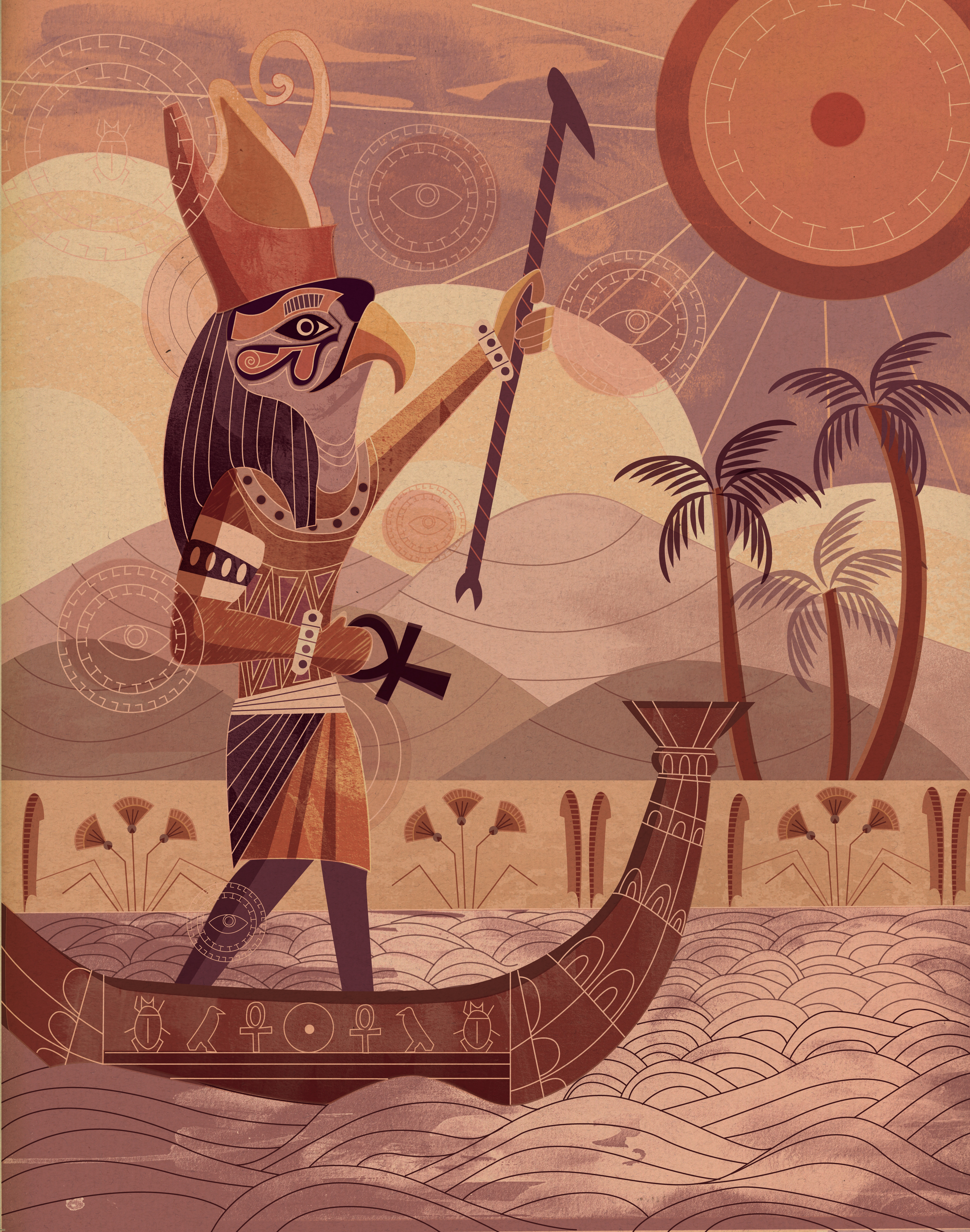
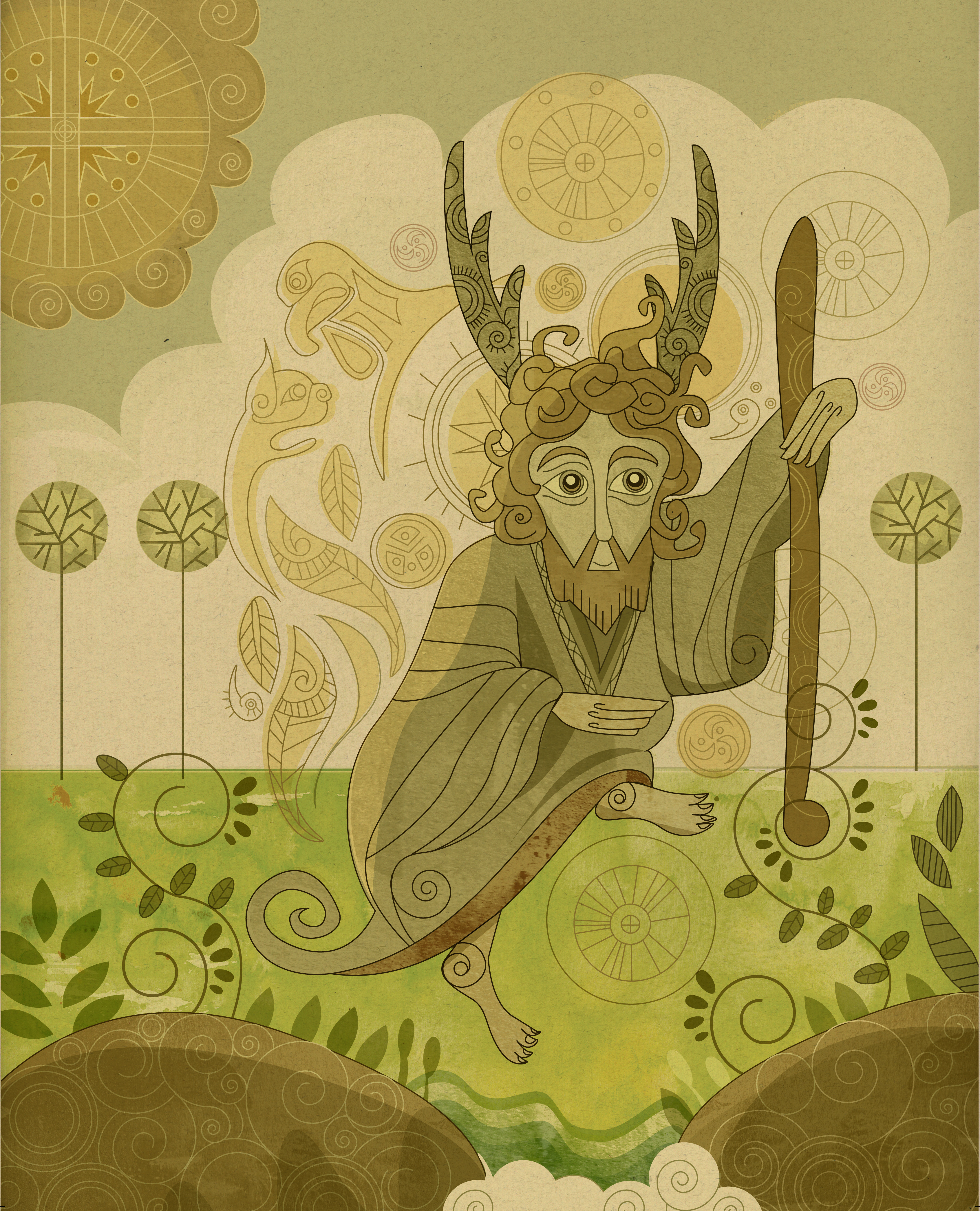
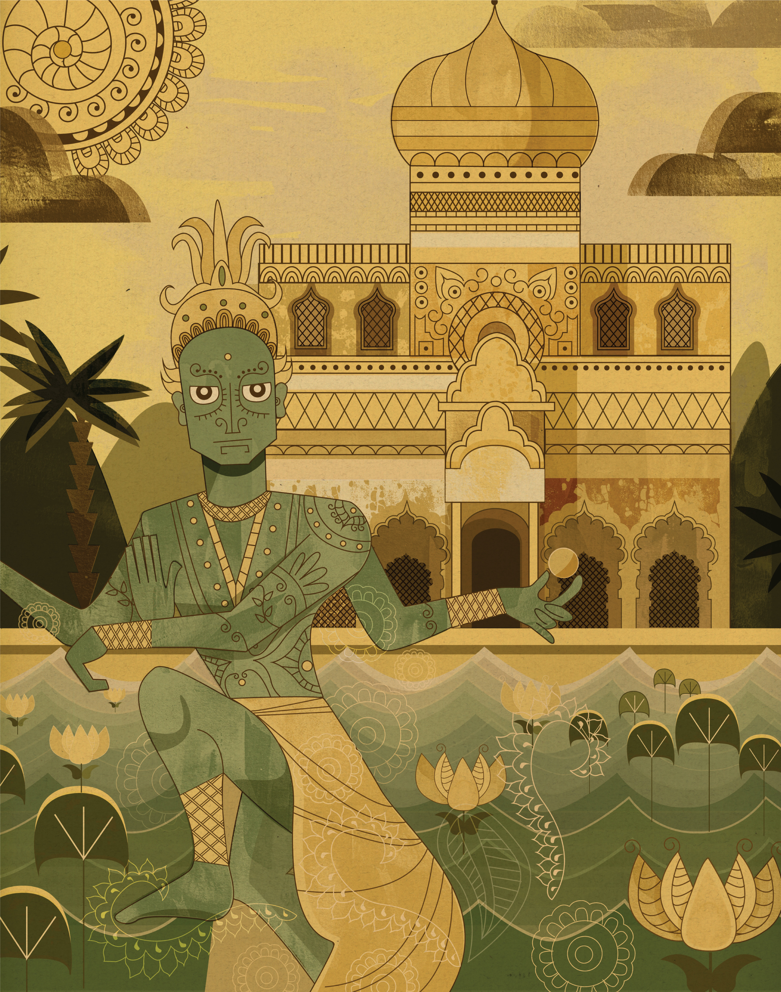
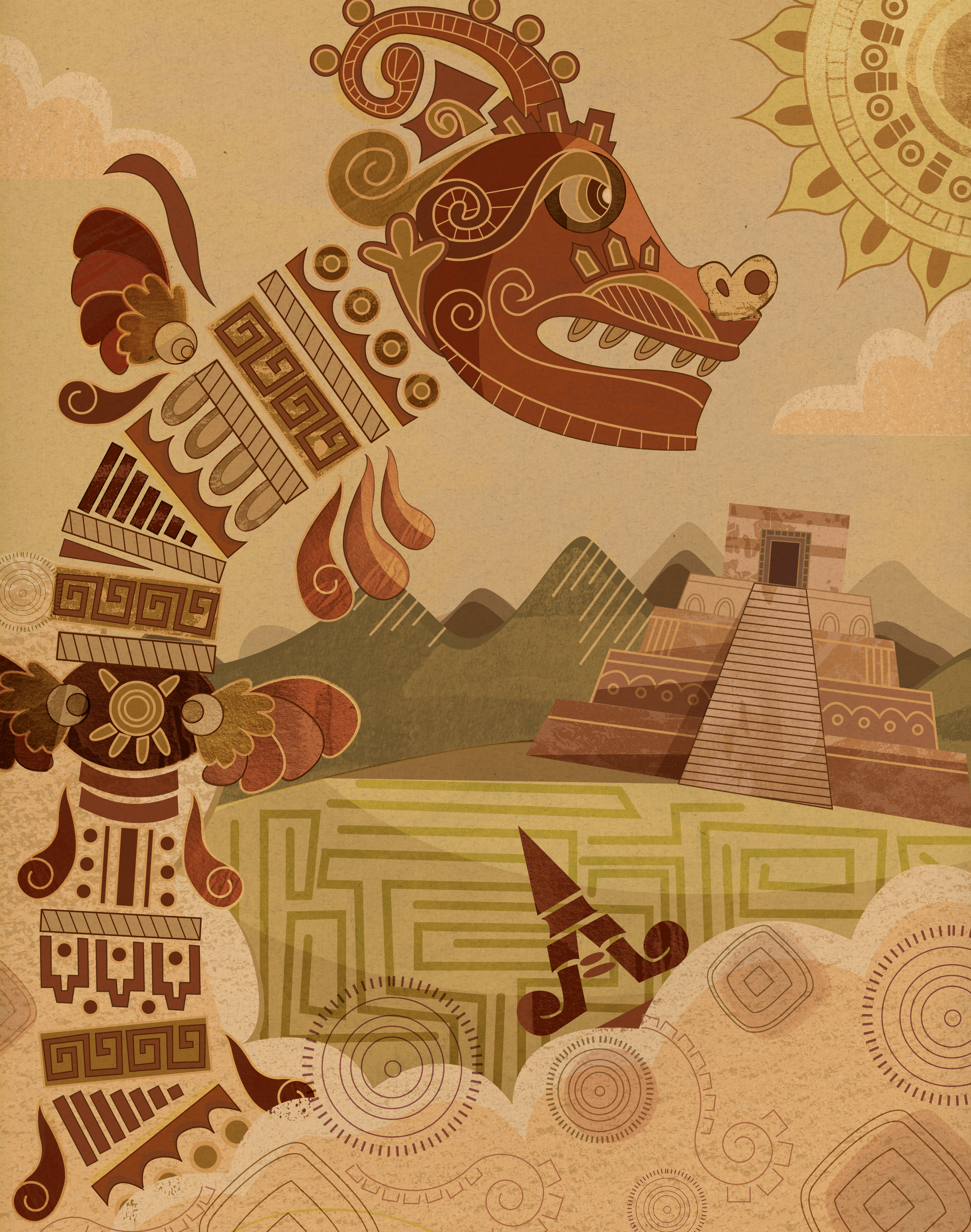
Wyatt Glennon’s illustration Egypt will hang on the walls of the Museum of American Illustration in NYC from May 9-June 2. This project was created in Prof. Denise Bosler’s Illustration I class. There will be a reception and awards presentation at the Society of Illustrators on May 18, free and open to the public, details here. The great illustrator C.F. Paine is scheduled to get the Society’s Distinguished Educator Award that night. Perhaps Wyatt will also get a student award; we will let you know.
Wyatt has had a good school year. He was also a finalist for the World’s AIDS Day Poster Competition in Skopje Macedonia. I asked Wyatt to tell us something about his style. His response is below.
“The inspiration for this series of illustrations, as well as much of my other work, comes from cultural patterns and design. Celtic knot-work, henna tattoos and hieroglyphics all influenced me as I worked on these pieces. I also get inspiration from classic cartoons and new animated features such as The Secret of Kells.Similar to The Secret of Kells, I find that giving my work a historical and cultural background aids in creating a cohesive finished piece. While this series was done mainly on the computer, I tried to instill a hand-done feel to it as I do most of my design and illustration work. By adding scanned in watercolor and paper textures I tried to add a vitality to these pieces that would have remained flat and cold vector shapes.
Congrats to Wyatt on his success! If you are in Kutztown let him know what you think of his work. Wyatt has a work study job at the Miller Gallery. He is often at the reception desk there; do drop in and congratulate him in person.
 Have Coffee with Nate: Yinz near Pittsburgh? Don’t miss the Release Party for DON’T COME BACK. Weds, May 30, 7:00pm at Copacetic Comics and Lili Coffee Shop in Polish Hill. Here is your personal YouTube invitation. Even if you can’t make it, next time you are in Pittsburgh visit this great indy comic shop and great indy coffee shop.