Quilts Honor WW II Women.

WW II apron image from the series ©2012 Camille Eaton RomigDuring World War II, many U.S. women changed out of their gingham kitchen aprons and donned heavy protective factory aprons to support the war effort. This took place all across the country. In the 1940’s Penn State’s Allentown Extension campus offered courses in drafting, chemistry, management, and civil defense. Women enrolled in extension courses and became gainfully employed by local industry. To celebrate this part of its 100-year history Penn State Lehigh Valley is mounting a commemorative exhibition. Ten woman artists honor the “Homefront Heroes: Women of WW II,” from Feb. 27-April 28, 2012, at the Gallery of Penn State Lehigh Valley Campus.

Camille Eaton Romig and her quilted art, For the Duration

Camille Eaton Romig contributed nine quilted rectangles illustrating this metaphor of changing aprons. She calls the series For the Duration. The panel below includes the 1941 headline: “WAR! Oahu bombed by Japanese Planes.” Camille’s father was stationed at Hickam Field, Pearl Harbor’s ground zero, on that date that will live in infamy. I asked Camille about how she created this project and about her parents.

“My dad was 19 and in the Army Air Forces, 72nd Bombardment Squadron, at Hickam. He was a buck sergeant. Later, he met my mother in Kansas in 1944. She was a WAC. I included the front page with the Pearl Harbor attack headline to honor him as well as to define the beginning of the duration.”

Panel with Pearl Harbor Headline © 2012 Camille Romig
Panel with Pearl Harbor Headline © 2012 Camille Eaton Romig

“I bought fabric prepared for ink jet printers–silk, cotton and organza. I found images on the internet (open source) and I manipulated them in a limited way with software that I had available–some day I’ll get PhotoShop.”

“Some of the images I incorporated include ration cards, a draftsman’s drawing of a U.S. Army airplane, letters, slide rules, compasses and the central lathe operator.”

Original War Office photo from the collection of Library of Congress.

Camille shared this background info about one historic photo she used: “The photograph of a metal lathe operator radiates strength, energy and beauty and presented an acceptable new image of women. Credited to Howard R. Hollem of the Office of War Information, it was probably used to motivate women to serve in the huge war machine that was required to win. Their humble services in industry, agriculture, education, volunteer organizations and the military were in addition to the many domestic challenges of the era. They did all jobs, whether traditionally understood to be masculine or feminine. They wore all the aprons.”
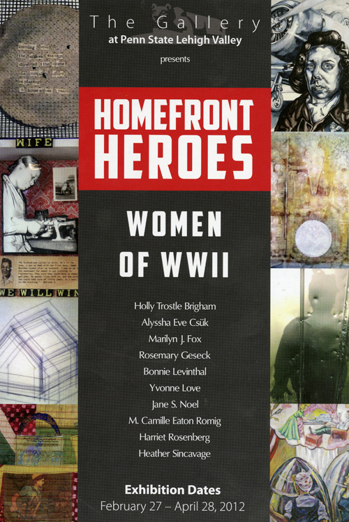
The postcard above lists the other artist participants. More info on the PSLV Gallery, including location and hours, can be found here.
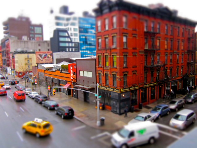
High on the High Line

Lower Manhattan from the High Line © 2012 Rona Dacoscos Macias

The Trailing Edge of Digital Photography. This February, Rona Macias spent a week in NYC and shot pictures from the High Line. The High Line, if you are not familiar with it, is a long and narrow public park built on the site of the historic elevated freight train line. It runs North/South two stories above the streets of Manhattan’s West Side.

High Line, Winter 2012 © Rona D. Macias

I asked her what’s so special about this place?  “From the High Line you can see HOBOKEN! ” writes Rona. “The Statue of Liberty! You are high enough to see architecture from a different level without being inside.”

Hoboken from the High Line (detail) © 2012 Rona Macias

She continues, “Anytime of the day is good, but I was surprised how beautiful the light was in the morning with the mists over the river almost covering up the Lackawanna train station. And, the best part is it’s near Chelsea Market where you can pick up something to eat along the way.”

Grand Central Station © 2012 Rona Macias

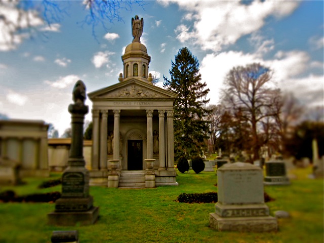
Naturally, Rona took shots of the Empire State Building and Grand Central Station. She also visited some lesser known sites, like Green-Wood Cemetery in Brooklyn. According to Rona the temple below is the final resting place of German immigrant Charles Feltman. In 1870 Feltman put a sausage in a horizontal roll and invented the Coney Island hot dog. The rest is history.

Tomb of the Inventor of the Hot Dog. ©2012 Rona Macias

Rona recommends searching the web for the latest in tilt-shift photography. Here is one site with over 80 examples and links to tutorials. And amazingly, Rona doesn’t use a pricey camera. Her Canon A1200 HD can be found on Amazon or Best Buy for as little as $80.

Hate Trolls, Love ELPHS

Strrets of Moyogolpa, Nicaragua, ©2011 Shelley Seale

My next camera will be a Canon ELPH. The wonderful photo above is by Austin-based travel writer Shelley Seale. She captured the colorful street in a small town on Ometepe, a volcanic island in the middle of Lake Nicaragua. Oddly enough, Shelley doesn’t think of herself as a gifted photographer. Do check out her ‘Trading Places Global’ travel blog to follow her adventures and see more of her work. Josh Berman, co-author the The Moon Handbook: Nicaragua shared Shelley’s picture (above) on Facebook. I wrote to her to ask about this eye-popping image, and if she had any photography advice to share.

Volcano, Ometepe, Nicaragua photo © 2011 Shelley Seale

“I assure you that was all the work of my fun, fantastic ‘miniature’ setting on my little Canon ELPH 500 camera. I don’t know if I would have any real tips for newbies; I can only say what I do, which is have my camera ready at almost any given time to snap that quick street shot or something happening in the moment. This is why I like having such a small camera.  – I even shot photos and video from the back of a motorcycle with it! I let the camera do the work and experiment with the fun settings and unusual angles or eye levels.”

Street scene, Luang Prabang, Laos, © 2012 Shelley Seale

Looking at Shelley’s Trading Places Global blog, I noticed she takes advantage of the magic of early morning light for her most dramatic shots, as in the Laotian street above. Canon’s ELPH 500, the model Shelly uses, can now be found online for about $220. Canon’s ELPH 300 is a slightly cheaper alternative: refurbished units go for under $150.

On a tighter budget? Rona Dacoscos, a San Francisco friend, uses the Canon’s A1200 HD. It has the same miniature setting. Canon’s A1200 can be found on Amazon or Best Buy for as little as $80. However, Rona recommends finding time to test every possible effect as soon as you unpack your camera. She sent back 2 lemons before she got one that was fully functional. Next post I’ll share some of Rona’s images.

Speaking of Scenic Nicaragua: My brother lives there part of each year and I’ve visited twice. Nicaragua is a colorful place to sketch, paint, or photograph. My friend Gerald Pavon is a great guide, and fluent in English, German, and Spanish. His Eco-Camp Expeditions, based in Leon, leads treks to Nicaragua’s highland coffee country, Ometepe, and other parts of Central America. Info: www.ecocampexpeditions.com

Best Camera for Illustrators?

Q. What is the best camera for an illustrator?

A. The one you will carry with you at all times.

Pumpkin head and iPhone photo by John Fronza © 2011

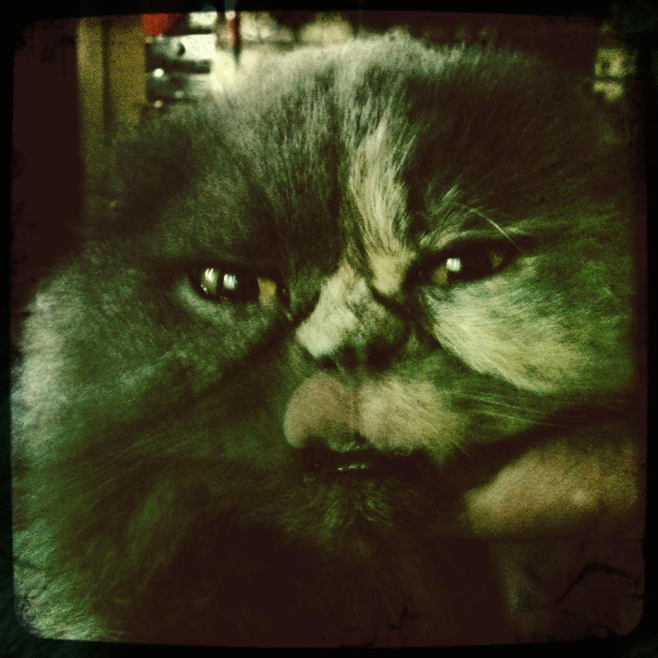
If that has to be your phone, fine, get good at taking pictures with your phone. Here are some amazing shots taken on the iPhone by John Fronza, an artist and the bass player in the Voyage of Slaves. (Click the band’s name only if you like death metal and you are not in the library!) He always has phone handy, so he has this camera with him.

Cat © 2011 John Fronza

Fronza uses his iPhone’s $1.99 hipstamatic app for memorable images like these. He makes it look easy. Love the retro feel, it is as if they were taken by a Kodak Brownie, or a Holga, that old Eastern European plastic camera. Nice format, too. Like the song says: It’s hip to be square.

Bananas © 2011 John Fronza

Some say the iPhone will be the death of the digital camera. Maybe, but meanwhile the picture-taking ability of the iPhone is driving the point and shoot camera makers to add features and innovate. They are adding better image stabilization, Hi-def video, and some wild special effects, including miniature and toy camera modes. Next post we will take a look at the spectacular effects you can get with the Canon Elph.

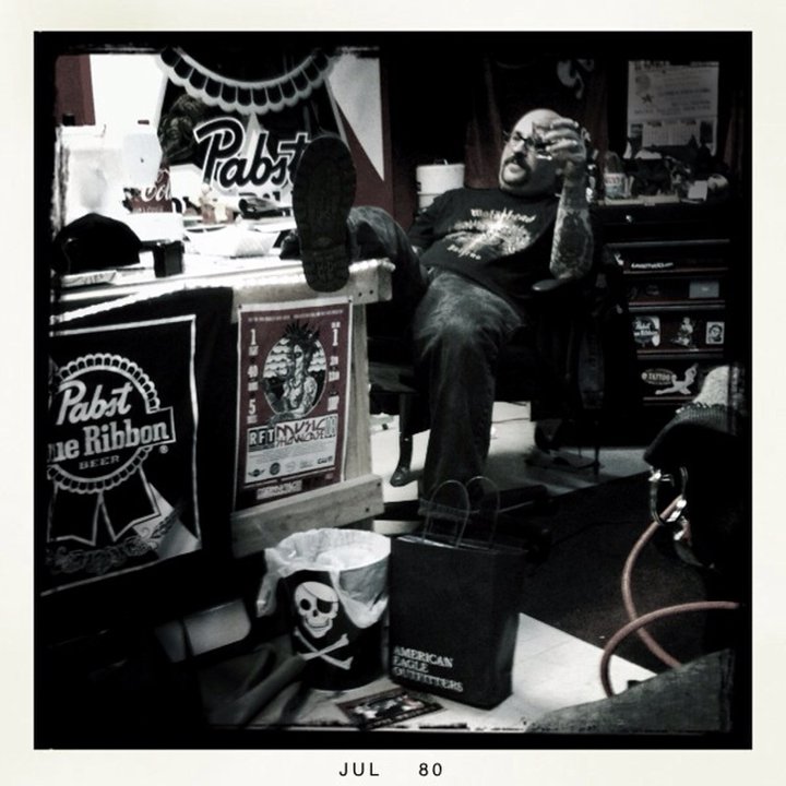
Tom Huck in his office at Evil Prints @2010 John Fronza

Generally, I use the term illustration for non-photographic artwork used in the service of a story or concept.  In my work, I only use photos for reference. The fact is, creative photographers capture images that if paired with the right text make for splendid conceptual illustrations. Fronza’s work could illustrate some weird and spooky stories.

That last image reminds me: Evil Prints Woodcut Boot Camp 2012 is open for registration. Want learn how to make woodcuts? This is the place to go. It’s where I met Fronza. Talk about weird stories!

An Illustrator’s Mind Explored

Loni Sue Johnson is an an illustrator who has had enormous success. Her whimsical watercolor illustrations graced the pages of the NY Times and six memorable New Yorker covers. Then one day in 2007 she fell ill with viral encephalitis, a rare condition, sometimes carried by mosquitos and ticks. She survived the virus, but large portions of both sides of her brain suffered devastating neurological damage.

Drawing from the Right and Left Side of the Brain:

Her mother, Margaret, invented drawing games to rehabilitate Loni Sue. She would draw a partial drawing then ask Loni Sue to complete it. Very gradually Loni Sue began to draw again. Shown artwork by famous artists she had studied in school, like Vincent Van Gogh, Loni Sue failed to identify the artist. But shown her own artwork, pre- or post illness, she recognized it immediately as her own creation. This suggests how very deeply one’s drawing style becomes ingrained in one’s self-identity.

Watercolor childrens' book illustrations © Loni Sue Johnson
Watercolor children's book illustrations © Loni Sue Johnson

An exhibition originally organized by Baltimore’s Walters Art Museum can be seen at Morven Museum and Gardens, Pricenton, NJ, through June 3, 2012. It is a wonderful show. Two Johns Hopkins University scientists, Dr. Barbara Landau, an old friend of Loni Sue, and Dr. Micheal McCloskey have been studying her art.

Loni Sue Johnson drawing, from the the Johns Hopkins video, link below.

Most illustrators are familiar with Betty Edward’s Drawing on the Right Side of the Brain.  Dr. McCloskey describes Loni Sue’s recovery portfolio as a sort of scientific detective story. The left brain/right brain divide may be more porous than we thought. There is a remarkable short video at the exhibition, in which Dr. McCloskey states, “I think if we were to make a map of the brain which showed which parts of the brain were important for art it would be pretty much the whole brain.”

Loni Sue on NPR: Radio seems a nutty way to consider illustration, but Guy Raz’s poignant interview with Loni Sue and her sister Aline is well worth a listen.

detail from Morven Museum announcement. Art above © Loni Sue Johnson 2011

See more of Loni Sue Johnson’s art via the links on her blog.

ASARO’s Revolutionary Art @ Princeton

ASARO Prints in the Street, Oaxaca ©2007 KMcCloskey

ASARO: “The Assembly of Revolutionary Artists of Oaxaca”

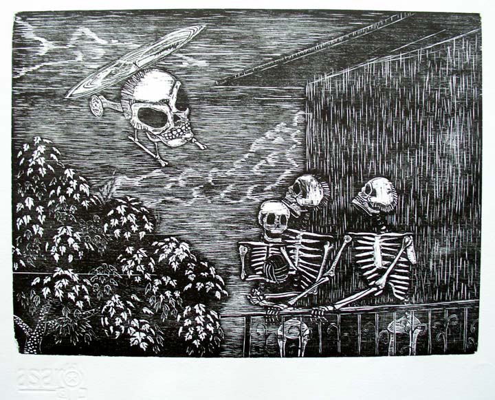
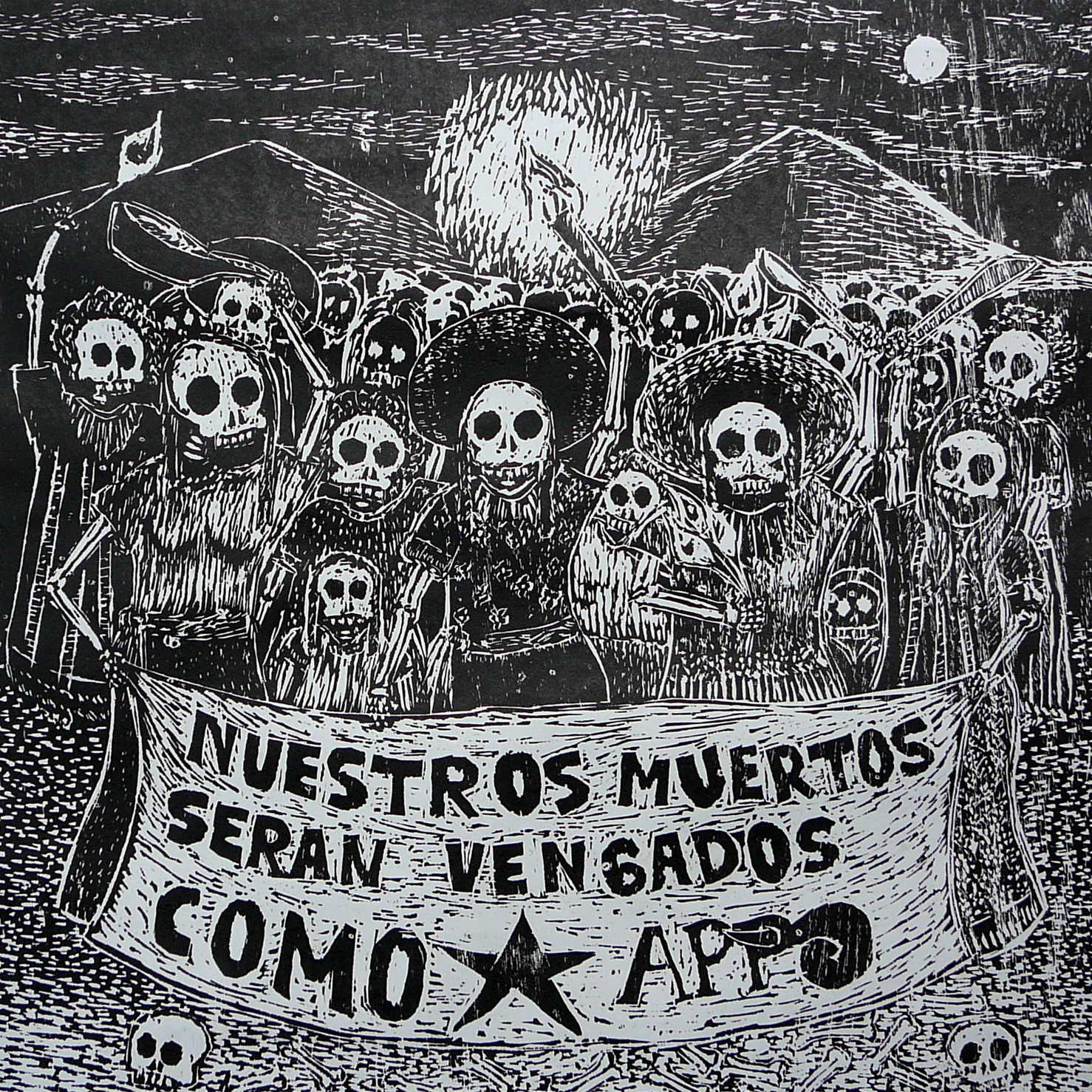
ASARO is a collective of radical young Mexican artists. I met them in 2007.  ASARO’s woodblock prints were laying in the street near Oaxaca’s cathedral. The artists were sitting on the curb. Some looked to be fifteen years old. Broom handles and chunks of stone kept the artwork from blowing away. Kneeling to look closer, I was stunned by the raw power of the images: revolutionary heroes, marching skeletons, striking farm-workers, open coffins, screaming widows. Black ink on ragged gray paper. It was as if the ink was shouting. I was mesmerized.

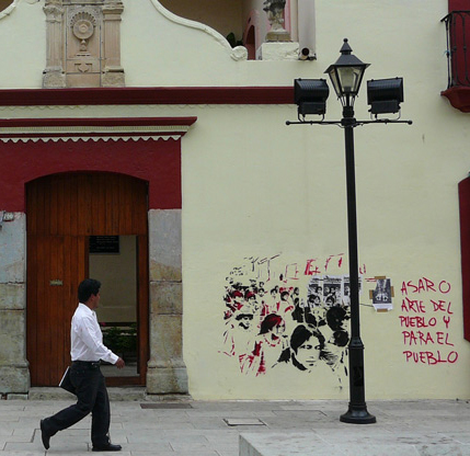
I found ASARO’s prints astonishing, not only for their political content, but also for their artistic excellence. It was exhilarating to see a centuries-old medium, woodblock printing, applied to the revolutionary issues of the 21st century. For one hundred pesos (roughly 10 U.S. dollars) ASARO sold prints by day. At night they poured their energy into street art, or interventions, as they call them. If a fellow activist was arrested or “disappeared” ASARO commemorated the event immediately with prints and stencils. They pasted tissue paper prints on the city’s ancient walls, or used pre-cut stencils to create complex murals in a matter of minutes.

Oaxaca’s most dramatic times occurred in 2006 after the annual teachers’ strike spun out of control. Teachers and their supporters protested to oust Governor Ulises Ruiz. APPO, the self-described “people’s assembly” occupied the city  for  months until Mexican Federal Police brutally removed them. Amnesty International documented the killings of at least 18 demonstrators; the full report is available as a pdf. Into 2007 there were still sporadic demonstrations, arrests, and disappearances.

Stencil mural by ASARO photo ©2007 K.McCloskey

There were other talented art collectives in Oaxaca, (notably Arte Jaguar) but ASARO’s daily gallery in the street made them the most accessible. I learned that some of the crew had studied art at the university with the Japanese-born printmaker, Maestro Takeda. The trained artists taught printmaking to anyone who wanted to join. Many had led hard lives. One ASARO artist told me he was abducted by thugs and questioned for 72 hours. I believe him. In 2007, their studio’s location was secret. The police would beat graffiti artists on sight. I remember being very nervous the rainy night I carried a portfolio of 20 political prints from that studio.

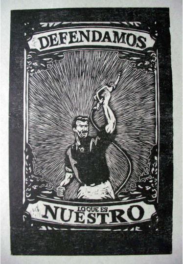
'We Defend What is Ours' from ASARO's petroleum portfolio.

Since ASARO formed in 2006, they have produced close to 200 different prints. They have also done canvas paintings, murals, folk art, and performances. Yet I remain enthralled by their woodblocks. They have created print portfolios focusing on issues that transcend their original concerns including: The Murdered Women of Juarez; The Future of Mexican Agriculture; Migration; and Petroleum. They have come up from the underground in the years since printmaker Lester Dore showed their work in Madison. Kutztown Univertity’s ASARO print collection  has toured the country.  Chicago Art Magazine’s Robin Dluzen noted,It is as if the ASARO has now occupied the art world.” 

 THAT WAS THEN. THIS IS NOW.

Last month the NY Times rediscovered Oaxaca. “With the city’s street art scene, a mescal-fueled night life and one of Mexico’s most exciting regional cuisines, Oaxaca is as cosmopolitan as it is architecturally stunning.” The article points out Espacio Zapata, ASARO’s workshop at Porfirio Diaz #509. This new location is in the historic district. ASARO has also been featured in the official Oaxaca State Tourist Office’s guide to the city. Now ASARO has a blog. Recently ASARO offered a free course in printmaking at  Espacio Zapata. One of the course’s sponsors is Conaculta, Mexico’s National Council for Art and Culture.

Espacio Zapata poster for free course in woodblock printing, 2011.

There is another change. A new governor, Governor Gabino Cue, replaced the polarizing figure of Ulises Ruiz. The New York Times is right; this is a good time to visit Oaxaca.

ASARO in Princeton, New Jersey

Princeton University is exhibiting a portion of their splendid ASARO print collection. Alas, none of the artists will be able to attend the Feb. 9 reception, but I will be there. The public is invited. I am honored that Princeton asked me to write about ASARO for the gallery walls. I’m taking part in a panel discussion “Born in the Zocalo: Art and Protest in Oaxaca, Mexico” at 4:30 on 2/9/2012. Reception to follow.

ASARO: Art and Activism in Oaxaca, Mexico
Protest prints from a collective of Mexican artists
Jan 16 to March 8: Bernstein Gallery, Princeton University

Sponsored by Woodrow Wilson School of Public and International Affairs, exhibition designed by Kate Somers. With special thanks to Karin Trainer and Princeton U. Library for the loan of artwork. For directions & gallery hours, ph. 609-497-2441. http://wws.princeton.edu/bernstein/

-Kevin McCloskey


He’s Got a Million of them –7 Great Designs by Greg Christman

Greg Christman is one of the most prolific illustrator/designers to come out of Kutztown’s C.D. Dept. His work is frequently seen on the hippest design blogs. He was recently featured in a spread in a new French design publication called the Book of Creation. I asked Greg to explain a few of his inventive images the French liked so much.

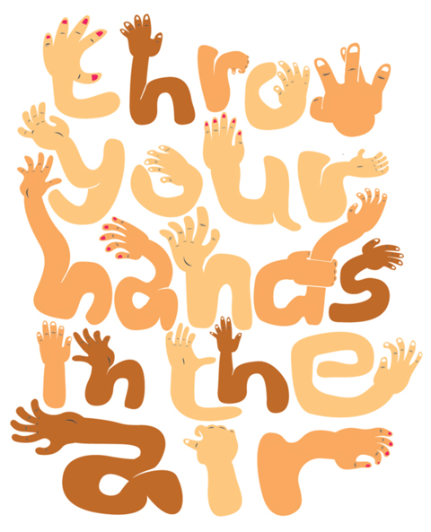
Greg: Did this when I was working at Gyro. Art in the Age of Mechanical Reproduction was looking for some artist shirts. I made this. It’s just a fun type experiment.

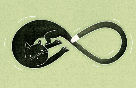
I love cats.  Andy O’ Dore (also a KU CD grad) and I created/run a cat website (which has really blown up this year )… so you know I’m always making dumb cat things. This is exactly that… a dumb cat thing.

Love Harry Potter. No other explanation for this. This got reblogged thousands of times which was really, really amazing for me.

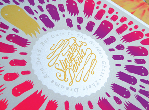
4-color screenprint for Slingshot Dakotas vinyl release of their record. Tom from Bird Apartment Printing screened this. He is also in the band. He is a talented screenprinter. I do a lot of work for him and his band. Excited that I’m doing their up and coming record on their new label.

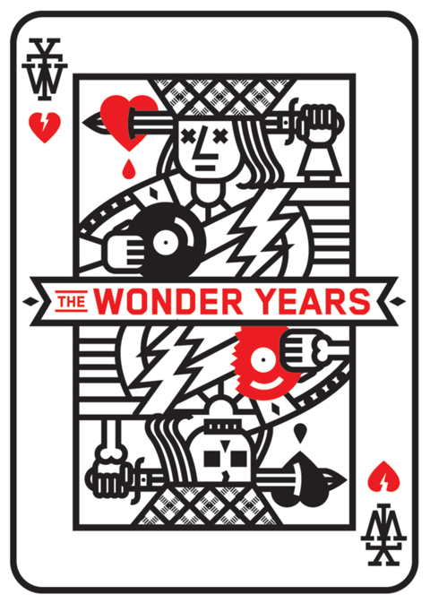
Wonder Years? Band contacted me to do a t-shirt. Went through a few rounds and this one got made. Really happy with it.

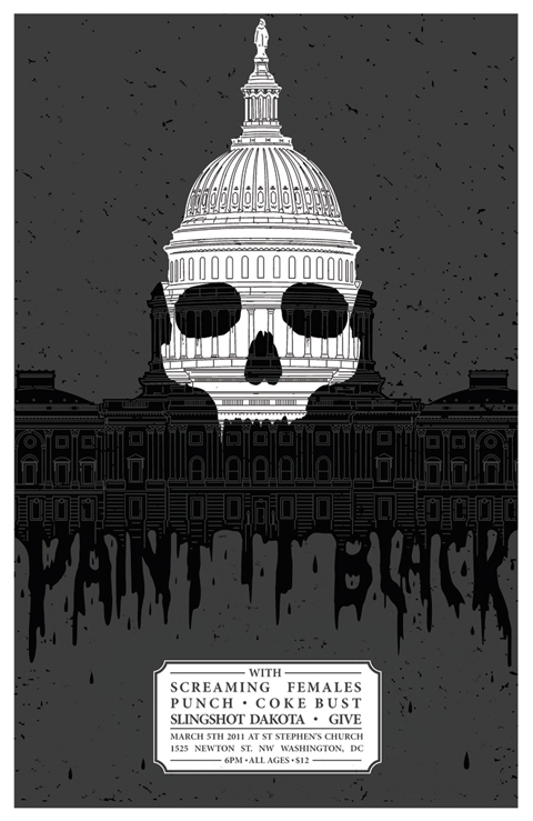
Paint it Black poster: 2 -color screen printed poster for a show in DC.  Contacted by the band to do it. Got a great response and sold a ton.

Asked about his career path, Greg responds: “Oh ___! Day job. I worked a crazy ad job for a few years. You know… 8am – 8pm, while still having work to do at home. It wore me out… so I quit. It was great for experience and I highly recommend anyone getting out of school to do the same… but MOVE ON. It’s what I did. I took a job that was far less stressful. It is fulfilling, allows me to do my own work, as well as spend time with my kid and wife. You have to have that balance. Design and illustration is fun and all, but life is way better and that ultimately makes you a better designer.”

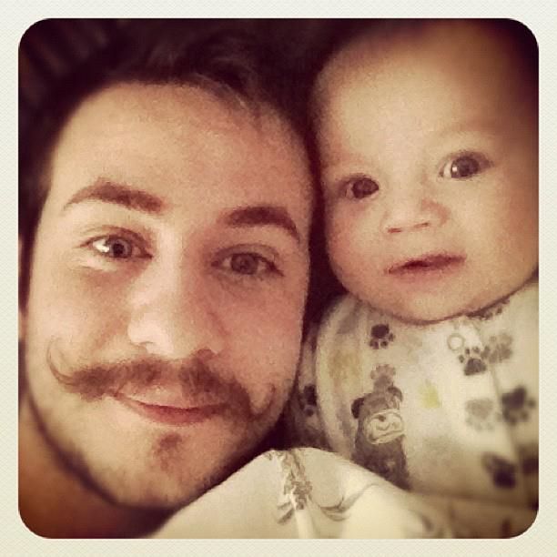
All images © Greg Christman. We leave you with a photo of Greg and his son, Oliver. Greg is the mature one on the left. 

Hot Type at Lead Graffiti

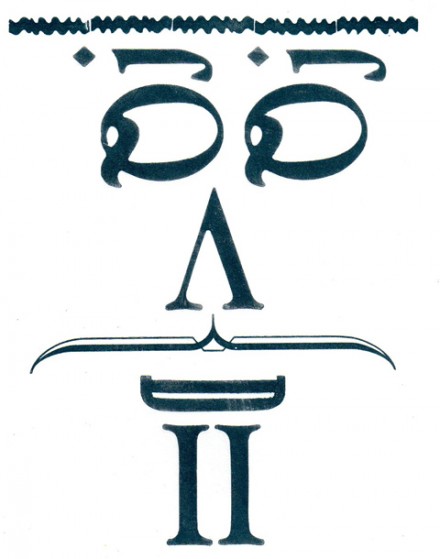
'TYPEFACE' by Miles DeCoster & Kevin McCloskey, 2012

Most of the Communication Design faculty traveled to Lead Grafitti in Newark, Delaware for a one-day letterpress workshop during winter break. We were joined by printmaker Evan Summer of the Fine Arts Dept. Lead Grafitti is a family-run studio that does fine printing (wedding invitations, for example), but also offers hands-on workshops. Our workshop involved creating a bound hardcover book in a single day and printing it on their antique presses.

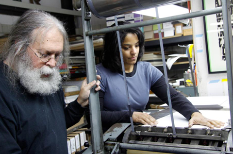
Ray Nichols & Vicki Meloney on press, photo © 2012 Miles Decoster

Ray Nichols is a former University of Delaware professor, reincarnated as a letterpress guru. Ray taught visual communications for years before he led a UD summer course to England. A chance visit to Alan Kitching at the Royal College of Art’s letterpress studio changed Ray’s life and he decided to build Lead Grafitti. Ray and his wife Jill shared a number of fascinating projects including their Kickstarter funded series based on the Tour de France.

Inked bike chain becomes map of France, from Tour de Lead Graffiti.

They also showed us a beautiful limited edition book of Bruce Hornsby’s essay on Bruce Sprinsteen’s Thunder Road illustrated by Jill.

Lead borders at Lead Graffiti, photo © Evan Summer

In the history of graphic design we talk about Ottmar Mergenthaler’s earthshaking 1884 invention, the linotype machine. From Gutenberg’s time until the linotype, printers needed thousands of individual pieces of moveable type to print a page. The linotype allowed an operator to type a line, then hot molten lead flowed into a brass matrix to create an entire “line o’ type.” We all got to work on an Intertype linecaster for a few minutes, which is essentially the same as Mergenthaler’s machine.

Tray Nichols explains linotype operation to Kevin McCloskey. photo: Evan Summer

Those of you who studied typography or graphic design will recall a colophon is, “the statement at the end of a book giving details about its authorship and printing.” The colophon below was cast from hot lead and lists participants and instructors at the Lead Grafitti workshop.

Colophon, the printing credits, at the end of our book.

Thanks to Profs. Ann Lemon and Vicki Meloney for arranging this worthwhile experience. I found it more fun than Disney World, and the lines were shorter. Lead Grafitti offers workshops year round and will customize an event based on your group’s experience level and particular interests. Info at: leadgrafitti.com

Ann Lemon and Miles DeCoster checking their type. Photo by Evan Summer

Lolli’s Logo: Kutztown Bicentennial

Laura Richardson is a Communication Design student at Kutztown U of PA. Her friends call her Lolli. A senior who just completed an internship at Crayola, she won the competition for the borough of Kutztown’s bicentennial logo. Besides the $200 prize, she will have the honor of seeing her logo all over town.  Other finalists included one of her Kutztown professors and Dr. Alan Robertson, an artistically inclined Kutztown dentist. More about the logo can be found in the Reading Eagle story by Ron Devlin.

Grant Snider, Remarkable Cartoonist, and Future Orthodontist

Grant Snider is a talented young cartoonist. I think his work is brilliant, but you be the judge. He generously gave permission to share a selection of comics. I selected strips that should interest illustrators. More of his art can be seen at Incidental Comics. Grant is studying orthodontics. I find that mind-boggling. We did an email interview.

KMc: I am impressed you are going to dental school, like the poet William Carlos Williams keeping his day job as a pediatrician.

Grant: Thought about your William Carlos Williams comparison before, but I think dentist/cartoonist sounds less noble than physician/poet. Also, Osamu Tezuka went to medical school while simultaneously becoming the god of manga, though he never practiced medicine.

Your work reminds me of one old, and one new artist, Otto Soglow and Kevin Huizenga? Are you familiar with them?

Grant: Definitely. I’ve read Otto Soglow’s cartoons in some old New Yorker cartoon collections, and I’ve read a couple of Kevin Huizenga’s books and followed his work closely in comics annuals. That’s a flattering comparison – Soglow’s cartoons have some of the most beautifully efficient line work ever drawn. And I can identify very closely with Huizenga’s “Glenn Ganges” stories – especially the middle-class suburban-Midwest adult-male protagonist. They’re everyday life drawn with incredible attention to detail, and he experiments with comic format and convention in a way that adds great depth to the story.

Who are your influences?

Roz Chast, Matt Groening’s “Life in Hell,” and Tom Gauld have probably influenced my comics the most. Edward Gorey, Bill Watterson, Chris Ware, and B. Kliban are four cartoonists I greatly admire, but they would be very difficult to emulate. Designer and illustrator Christoph Niemann has genius graphic ideas and is a huge inspiration, though I doubt he considers himself a cartoonist. This American Life keeps my brain occupied in the long hours spent drawing and probably subconsciously influences my comics. I also frequently look to children’s books and music for ideas.

Does your online poster shop pay enough to cover your time at the drawing board or is Incidental Comics a labor of love?

Labor of love! It’s very nice when people like a comic enough to put it up on their wall, but if I tried to break down the hourly wage of time spent at the drawing board I would quickly become depressed. My comics appear weekly in the newspaper in Kansas City (where I went to dental school) and biweekly on GoComics.com (also based in Kansas City) so I get some compensation that way as well. It’s never been my intention to make it a full-time job, though I plan on pursuing my dual careers (cartooning and orthodontics) as far as they will take me.


Could you share some sketches?

I included some pages from my sketchbook that eventually became full-fledged comics (“Jazz,” and “The Diabolical Botanical Garden”). I use my sketchbook mostly for working out ideas and rough sketches, though there’s an occasional bit of life drawing or journaling. It’s full of false starts, but I sometimes come back to a long-unused idea and manage to spin it into a new comic.

Can you give any advice for aspiring web or print cartoonists?

Focus on writing and ideas! If you are excited about an idea, you will find a way to make the drawing and layout work. Nothing is going to look how you want it to when you first start, but if you make new comics consistently your drawing style will develop and improve. Some of the best cartoonists have idiosyncratic (or even “bad”) drawing ability, but their drawings look amazing when coupled with great ideas. Share your work early and often – try to get into your school newspaper, start a webcomic, print out mini-comics and give them away, don’t keep it hidden in a sketchbook until you’ve achieved some imagined level of perfection.

Thanks, Grant for thoughtful answers and great advice. Wonderful to see the sketches, showing that even great ideas need to be refined. The sketch below became “The Diabolical Botanical Garden.” Most of Grant Snider’s cartoons are available as $15 prints from his Poster Shop.


Sketchbook pages & all art reproduced above ©2011 Grant Snider