Moku Hanga, Not a Coffee: Lessons in Japanese printmaking

april
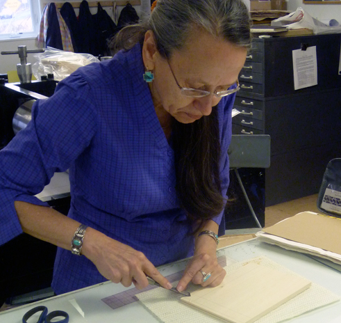
April Vollmer demonstrates how to carve registration notches on woodblock.

April Vollmer recently taught a two-day Moku Hanga workshop at the Printmaking Center of New Jersey.  KU Prof Elaine Cunfer and I took the class along with five other students. I know a bit about Japanese prints, but had never tried my hand at the traditional Moku Hanga woodblock printing technique. April, a great teacher and printmaker, has travelled to Japan to perfect her skills. She has an extensive gallery of her prints online at aprilvollmer.com.
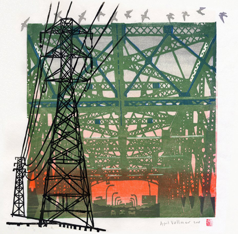
Moku Hanga print "Migration" ©2008 April Vollmer, from www.aprilvollmer.com
“Migration”  Moku Hanga print © 2008 April Vollmer

Moku Hanga is nothing like my prior printmaking experience. I am used to the down and dirty printing of Oaxaca or Tom Huck’s Evil Prints. Moku Hanga is far more refined. I came to class dressed in my ink-stained black shirt and raggedy painting jeans. I learned there is no need to dress like a hobo to print Moku Hanga.  The pigments are water-based and do not stain clothes like oil-based relief printing inks.
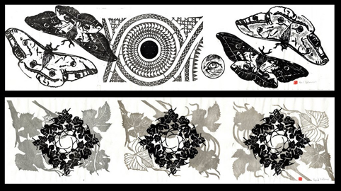
2 horizontal pattern prints © 2011 April Vollmer
2 horizontal pattern prints based on nature © 2011 April Vollmer

April suggests beginners might start printing with tube watercolors, but a more economical color can be had by mixing pigments. She uses the pigments from Art Guerra. For wood and carving tools she recommends McClain’s Printmaking Supplies. The wood we used was shina plywood, imported from Japan. The shina and carving tools are rather expensive. A small, 8 by 10 inch, piece of shina ply costs $6.35. April says the expense is due to the currency imbalance between the Japanese yen and the U.S. dollar. If you have never used real shina ply, it is a joy to carve. McClain’s will send you a free sample; find details here.
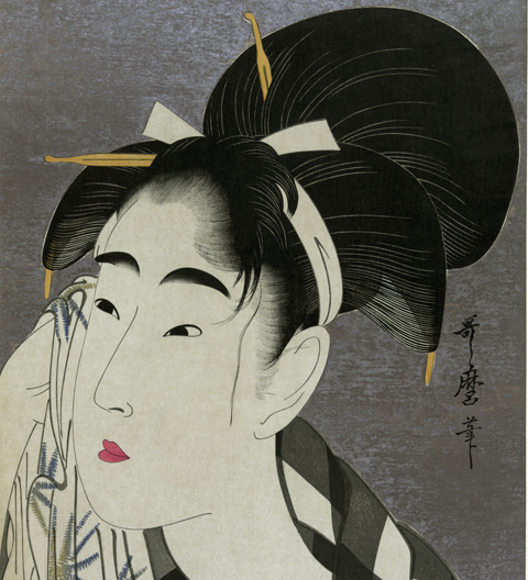
Ukiyo-e print by Utamaro, circa 1800, printed with mica  background. (Wikipedia)
Ukiyo-e print by Utamaro, circa 1800, printed with mica background. (Wikipedia)

April showed us master Ukiyo-e prints by the likes of Morunobu and Utamaro before demonstrating her technique. One of the secrets of the art is cutting a precise registration corner and landing pad for the printing paper. The best paper, naturally, comes from Japan.
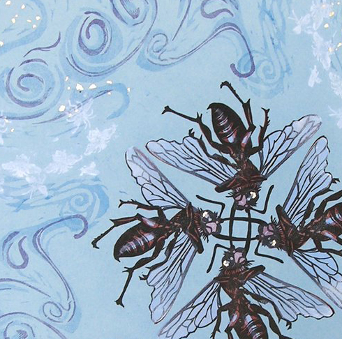
Blue Vortex, woodblock, (detail) © 2005 April Vollmer

More of April’s tips: Your work table should be about navel level. Printing is not done with a press, but by rubbing the baren, a light weight disk, on the back of the paper. Printing starts from a balanced standing position with a quick burst of energy using upper body strength. April says she can print faster with a baren than printmakers who use a press. She claims she can print an edition of 25 in one morning and I believe her.
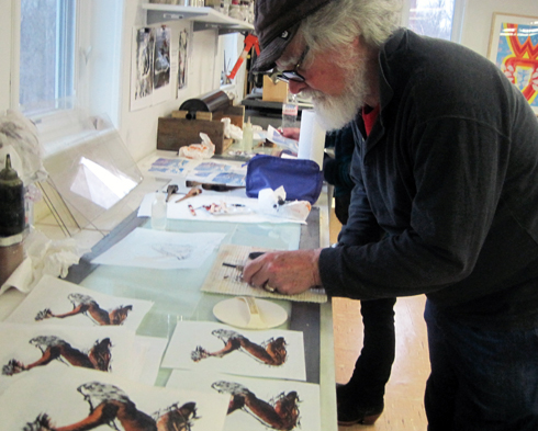
McCloskey making prints of St. Francis. photo: E. Cunfer
K. McCloskey making prints of St. Francis. photo: Elaine Cunfer

She also demonstrated the proper way to hold the paper, set up one’s workspace, and sharpen cutting tools. There was one student who had no prior printmaking experience; even he came away with successful prints. We managed to do an edition of two-color prints with a single block of shina by carving the second color on the reverse side. If you have the opportunity to study with April Vollmer, you can learn a great deal in a brief amount of time.
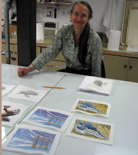
April Vollmer pleased with her student's prints at Printmaking Center of NJ
April Vollmer seems pleased with her students’ prints at Printmaking Center of NJ

For more insights into the history and current state of Moku Hanga (also spelled mokuhanga) check out April Vollmer’s comprehensive essay in Art in Print. There is also a brief (4-minute) documentary video filmed by Dempsey Rice of April Vollmer at work, here.

……………………………………………………

UPDATE: Dec.12, 2012: April Vollmer sent a note about the post above:  “I hardly recognize myself your review is so flattering, but it is great to have someone describe the class. I always have fun, and people learn a lot. I always talk about the history, and how the technique fits into Japanese culture. I do hesitate about the refinements, it can be overwhelming. But my printmaking career (if one can call it that!) has been about making mokuhanga accessible, less precious, but without throwing out the baby with the bathwater. Good tools and good paper are such a pleasure, and actually much more affordable than, say, coated digital paper, computer software, etc. I paid $120 for my large soainomi (fan-beveled chisel), but I have had it for 20 years already!

Printmaking in NY is very different from Mexico, and that is completely different from Japan…The shina (basswood) plywood from Japan is good not only because of its even grain, but because the glue between plys is very thin and waterproof. Printing wet makes more demands on the wood than oil base does. Shina is also very lightweight which I appreciate, having to carry it around all the time!”

She also noted that she has met the legendary Tom Huck and went bowling with him when they both taught at Frogman’s Print Workshop in South Dakota.

Ethan Ross On Broadway.

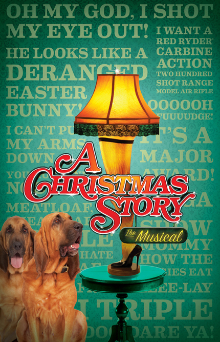
Signage for Christmas Story at Broadway’s Lunt-Fontanne Theatre, NYC

I know the purpose of higher education is not job-training. Still, I must admit there is nothing that warms this professor’s heart more than getting an email with the subject line:  Hey Prof, I GOT A JOB!

Ethan Ross, NY designer, KU CD grad, class of 2012.

Ethan Ross wrote to say, ” I have been working full-time as a Junior Designer at aka NYC. I interned here over the summer and they offered me the job. The company is located in the Theater District in Manhattan and exclusively does advertising for Broadway. Right now our biggest shows are: “Matilda the Musical” and “GlenGarry Glen Ross.

Ethan designed posters, signs, and banners for Christmas Story, the Musical. The image above is peppered with quotes from Jean Shepard’s beloved holiday tale, notably, “Oh My God, I shot my eye out!”

Ethan got to do edgier design work for the new rock musical, BARE.

Ethan Ross’s poster for BARE, an Off-Broadway musical

Ethan describes Bare as an “Off-Broadway musical about teenagers attending a Catholic boarding school and trying to find their own identities. I am the lead graphic designer on this show and have worked with a creative director from the beginning. In addition to the poster, I designed a direct-mail piece and a series of illustrations that are being used on the show’s social media outlets.”

He has also been doing a lot of art for Bare‘s Facebook page. Bare opens this week, Nov 19, at The New World Stage, 340 W 50th St.

I wrote to Ethan asking how he fared during Hurricane Sandy. He wrote back, “Sandy didn’t affect me much, thankfully. I live in Marble Hill in the Bronx which is pretty far north and on top of a cliff, so I didn’t have to worry about flooding or losing power. The only inconvenience  I experienced was when the subways shut down after the storm I was essentially trapped for a few days.” Clearly, Ethan has adjusted to life beyond Kutztown. We expect to see more great things from him.

funny things art spiegelman said about the funnies

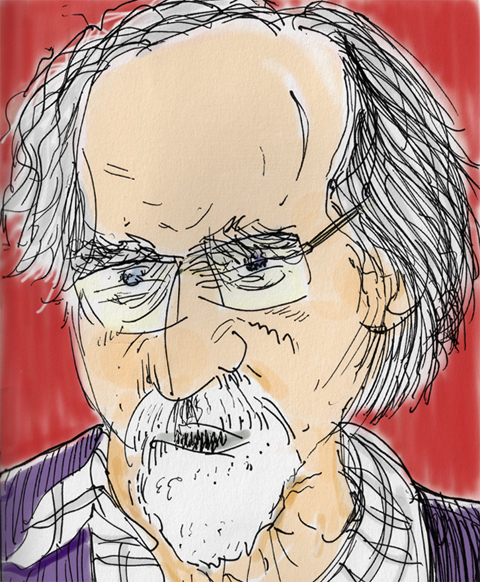
art spiegelman by Kevin McCloskey © 2012

“I’ve been called the father of the graphic novel, but I demand a paternity test!” -art spiegelman.

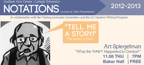
I caught art spiegelman’s “What the %@&*! Happened to Comics?” at Lehigh University. One of the most influential artists of our time, I knew him before he won the Pulitzer for his graphic novel, Maus. Even though we are nearly the same age, I was once his student.

In 1985, I took his comics course at the School of Visual Arts. It was the History of Comics, but included some drawing projects. I recall one interesting assignment. Each student in the class did a zine based on a different letter, picked from a hat. I got “S.” Then the 26 zines were wrapped together in a cover that evoked a Campbell’s soup can. He called it Alphabet Soup and he arranged for it to be sold at Manhattan’s Printed Matter.

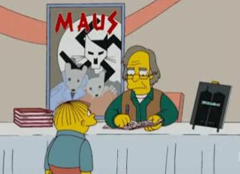
art spiegelman, guest star on the Simpsons

I’d heard many of his one-liners in class. Still, it was great to hear him again at Lehigh. I brought my camera, but just as they dimmed the lights there was a “No cameras, No recording devices!” announcement. Luckily, I had my Moleskine sketchbook, which is a permissible sort of recording device, I suppose. I took notes of his comments and did the quick sketch above. I added color in Photoshop at home.

“Definition of graphic novel: comic book that needs a bookmark. ” -art spiegelman.

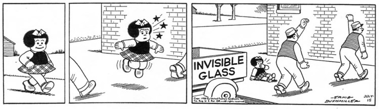
Nancy by Ernie Bushmiller

“In the period following world War II, Nancy was the most read comic, not because it was the best, but because it took more effort not to read it, than to read it.”

“My wife says I should take pride in my two great achievements, the first is Maus, second – Not permitting Maus to be made into a film.”

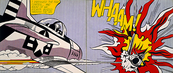
Roy Lichtenstein’s pop art painting Whaam, image from Wikipedia

“Lichtenstein did no more for comics than Warhol did for soup.”

Back in the day, I remember spiegelman always insisted his name be written in lowercase letters, like e.e. cummings. That’s why I am overriding spellcheck, for the sake of art, art spielgelman.

Art Drawn in Blood

Savage County, movie poster illustration © 2010 Vincent Castiglia

Saturday I took the early bus from Kutztown to New York City to deliver a print to a downtown gallery. I’ve shown my illustration work at the Society of Illustrators during their teacher shows, but this will be different. This is a juried “fine art” exhibition at Sacred Gallery, 420 Broadway. Emerging from the Canal St. subway station at noon I made my way east through the sidewalk bazaars of fake Fendi and Gucci. On Broadway I looked for a ‘Sacred’ sign. Looking up, through the railings of a fire escape, I found the words, “Sacred Tattoos.” Tattoos? A hoarse Chinese man stood by the doorway repeating, “Watches, Watches, Watches, Watches.”

I climbed the stairs past boldly lettered warnings. “Stairway Under Surveillance by Camera 24/7.”  Another sign said,  “Photography Strictly Forbidden.” I entered the tattoo parlor and a lean young lady glanced at me. She had short black hair and was dressed in black jeans and black t-shirt. Her only touches of color were the serpentine tattoos covering her forearms. She said, “You are here to deliver art?”  The big flat parcel in my hands gave me away.

Vincent Castiglia’s blood collection tools and brushes

She pointed me toward a large, well-lit, gallery. On the walls was a one-man show by NY artist Vincent Castiglia. Mostly figurative, expertly rendered, nicely framed, the work was strong. The media was shocking. Everything was painted in pale reddish brown washes -of blood. I looked around at all four walls, blood, blood, blood, and more blood!
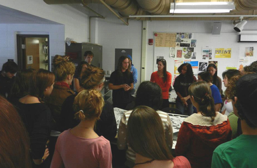

The artist uses his own blood. According to the gallery’s press release, “In the privacy of his studio, Vincent practices a kind of modern-day phlebotomy, siphoning the life force which contains his own psychic energy, while giving it an outlet and form. In doing so, he dissolves the barrier between artist and art in a most literal and immediate sense.”

Detail from a triptych of portraits in blood © Vincent Castiglia

Castiglia’s large blood paintings were priced in the thousands of dollars. On the other hand, he sells his hand-signed posters for the MTV horror film, Savage County, on his website for only $25. The poster is printed with archival Lucia inks. For $25, what do expect? Blood?

To see more of Castiglia’s art, head to his website. To learn more about Sacred Gallery, check here. The Art of Democracy print show opens at the Sacred Gallery, Sat. Nov 3. There is a reception 8-11pm. You are cordially invited. My print, below, will be there.

Woodblock print about California’s 3 Strikes Law © Kevin McCloskey

Will Ruocco & the Secrets of Gig Posters

There are illustrators and presses everywhere. I was in Worthington, Ohio, just north of Columbus, one recent weekend. There was a big street fair going on.  A sandwich board announced “Open House at Igloo Letterpress.” I have been to Worthington many times and never knew there was a press there.

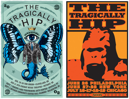
Tragically Hip posters © 2002 Will Ruocco

Will Ruocco was minding his booth in the courtyard of Igloo Letterpress. He does gig posters, among other things. My illustration students are always interested in this sort of work. I had a too brief conversation with Will, but grabbed his card and sent him some follow-up questions. Here are some of his thoughts, including advice for students.

Will Ruocco and his wares. Photo courtesy of Igloo Letterpress © 2012

Q: Where did you study?

Will Ruocco: I was an Art major at Fredonia State (N.Y.) with a concentration in graphic design. It was a four-year art program.

Whiskey Daredevils in Erie, PA © Will Ruocco

Q: How big was the program there?

The graphic design program wasn’t very big, but was one of the best in New York State. The design professor was tough. Many students were cut from the program after the first year. The professor really pushed us to create strong work and never get sloppy or lazy. I still apply many of his design standards in my work today.

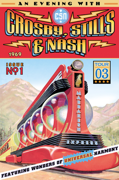
Crosby, Stills & Nash’s Marrakesh Express © Will Ruocco

Q: How did you get into gig posters?

I spent a lot of time in New York City as a teenager. The concert posters along the streets left a big impression on me. There seemed to be an ‘anything goes’ design approach that was really appealing. So in the back of my mind it was always something I wished I could do. Finally, one day at work, a friend asked me to create a poster for her band. It was so much more fun than anything I was doing at my day job that I wanted to do more. I quickly made up a series of mock posters for my favorite band, The Tragically Hip – just as a personal creative outlet. I was so happy with the results that I contacted the band directly and shared my designs, never really thinking they would ever hire me…to my surprise they loved the artwork and asked me to do six posters and a t-shirt for their world tour. After that I was hooked and it led to work with many other rock bands.

Concrete Blonde gig poster ©2004 Will Ruocco

Q: What advice can you give to students interested in pursuing this area?

Start by doing actual local events. They don’t have to be concert posters, but creating something for a real event is a good learning experience. If they really want to design for a particular band they need to have finished work that shows off their skills. You can’t just approach them because you like them. Show what you can bring to them if they hire you. It’s the same for any job really.

Silkscreened animal girl band posters © Will Ruocco

Q: You go to shows in Chicago and the West Coast. Did these trips pay off from the start?  How do you decide what shows to do?

There is a concert poster show called Flatstock (that has been going on for about a decade now) that has linked itself with a few major music festivals. There is sort of a built-in audience because concertgoers are gig poster artists’ biggest customers – so those shows are always good to participate in. Choosing other shows and whether they are successful or not is really just a matter of trial and error. You just have to keep your travel expenses low in order to make any of them worthwhile.

Th’ Legendary Shackshakers © 2007 Will Ruocco

Q: What ever happened to Th’ Legendary Shackshakers?

Th’ Legendary Shackshakers are still around. They’re an intense band that plays a lot of country and rockabilly with a punk rock edge. They don’t have a huge following but the fans are really loyal and the band always gains new fans wherever they play.

Q: What is your relationship with Igloo Letterpress?

Working with Allison Chapman and Igloo Letterpress has been great. I’ve always loved Hatch Show Prints‘ letterpress posters and when Igloo came to town to set up shop I immediately knew we had to work together. I took the initiative and approached them with a few projects that I thought we could collaborate on and Allison was really open to the idea. We’ve had nice success with the Farmer’s Market posters. It’s been a great experience.

Last Question: Any upcoming project that you want to share?

I’ve been creating fewer concert posters and focusing on my signature work. Working on my series of whale designs, as well as my series of prehistoric creatures. I’m continually releasing new graphic tees on Society6.com and Skreened.com. Soon I’ll start work on new project with Igloo Letterpress.

Igloo’s logo and press from iglooletterpress.com

Bottomline: I am glad I ran into Will Ruocco, a talented illustrator/ designer willing to share his secrets. Will maintains Etsy and Big Cartel virtual storefronts for those not lucky enough to run into him in person. The best place to keep up to date with all of his many projects is www.willruocco.com or: www.facebook.com/WillRuoccoArtDesign.


KUTZTOWN to LEGOLAND

Austin Carlson graduated from KU in May, 2012 with a BFA in Communication Design. He won the Don Breter Illustration Award. Lately he has been working at a supermarket near his home in Hanover, PA. That will all change in a few weeks when he flies to Denmark to start his new job as a designer for LEGO. I wrote to him to ask him to share some of the portfolio pieces that helped him land his dream job.

What is your new job title?

“I will be first working as a Junior Graphic Designer for LEGO and hopefully work up from there.”

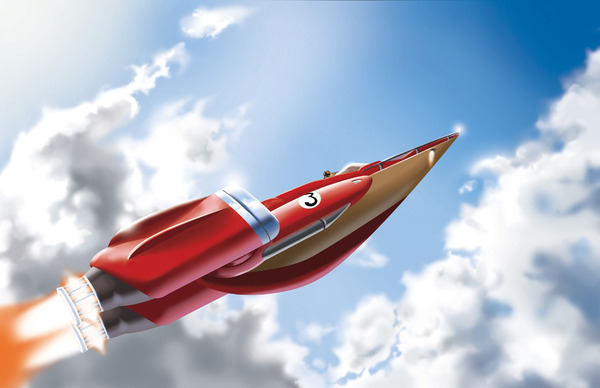
“Sky Ship” digital Illustration done at KU © 2012 Austin Carlson

What can you tell us about the interview?

“All I can say about the interview is that I doubt I will ever have a better job interview in my life! The LEGO Company paid for everything and I’m not overselling that statement.”

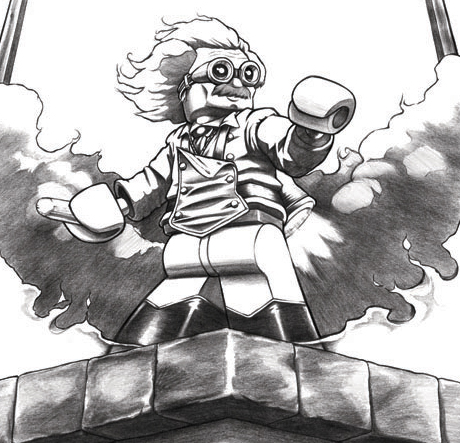
Einstein as Rocketeer, © 2012, Austin Carlson

“They paid for my plane tickets there and back, my taxi rides, all my meals, two tickets for LEGO Land, plus about 150 dollars worth of LEGO sets. Also all the nine candidates that came for the job interview became quick friends. I still keep in touch with them and I will see two of them again real soon since they were hired also.”

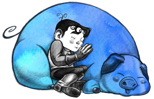
Children’s book concept illustration © Austin Carlson 2012.

How long have you wanted to work for LEGO?

I’ve always wanted to work for the LEGO Company!” says Austin. “This is really a dream come true for me! Since I started building when I was 4, I always wanted a position at LEGO. I just had no clue what Graphic Design was as a kid. I thought you had to be a starving artist if you wanted a career in art.”

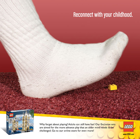
LEGO ad design by Austin Carlson, KU project, 2012

Austin shared a couple more curious images that look like two of his illustration classmates transformed into LEGO characters. He calls them Mini-Joe and Mini-Laura, see below. To view more of the artwork that impressed LEGO visit Austin Carlson’s portfolio site.

Mini-Joe and Mini-Laura by Austin Carlson, 2012.

When Museums Cohabitate.

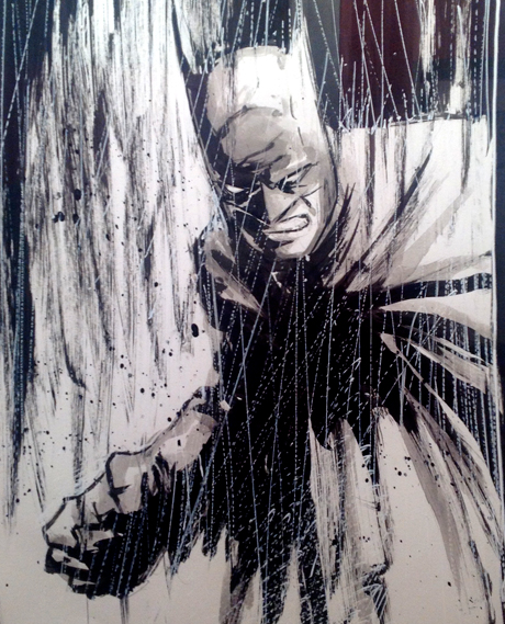
Batman, detail, original art by Tommy Castillo.

I was sorry to hear of MoCCA’s near-death experience. I’ve met some interesting people at the Museum of Comic & Cartoon Art in lower Manhattan. I ran into Prof. Bill Foster there, the expert on the portrayal of African-Americans in comics. He came to Kutztown to share his presentation, “Looking for a Face Like Mine.”

Underworld © KAZ (Kazimieras G. Prapuolenis)

Last summer MoCCA went broke and closed its doors overnight. MoCCA scrambled for a refuge to “transfer their assets”  and keep the name alive. The call was answered by the venerable Society of Illustrators. The MoCCA collection moved uptown to the townhouse walls at the Society of Illustrators, 128 E.63rd St.

Anelle Miller & Dennis Dittrich of the Society of Illustrators.

I was at the 2012 Educator’s Symposium at the Society and met Dennis Dittrich, President, and Anelle Miller, Executive Director, and asked about the MoCCA adoption process. Dennis, whose own humorous illustration style leans toward the cartoony, loves the new acquisitions. He told me the merger happened so fast, “it turned on a dime” and he felt like “a blacksmith on the freeway entrance.”

Homage to Norman Rockwell © R Sikoryak for the Comics Journal

Dennis and Anelle consulted attorneys to make sure MoCCA’s liabilities would not haunt their organization. The merger still needs final approval from the NY Board of Regents. I knew the NY State Board or Regents was responsible for universities, but Anelle explained the Regents’ mandate also includes museums and other non-profits.

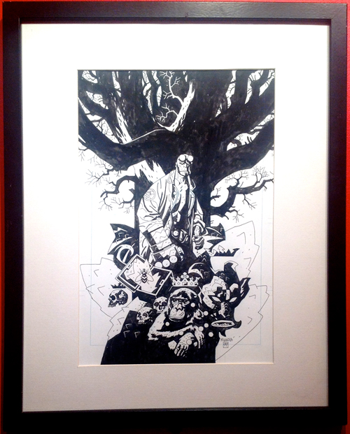
MoCCA Hellboy © Mike Mignola

What’s in it for the Society?  Wonderful original artwork from comic books, comics strips, and gag cartoons. Dennis says an unexpected benefit is the new blood of MoCCA’s passionate fan base. The Society is now hosting “Dare to Draw” and Super Hero Sketch classes. Pros are teaching Penciling and Anatomy for Cartoonists. Anelle confirmed that MoCCA fest, the hip NY indy comics con, will happen April 6 & 7, 2013 at the Fighting 69th’s Armory on Lexington Ave. Unlike ComicCon, which is slick and leans toward shameless film promotion, MoCCA fest is the real deal. At MoCCA fest you can still find diamonds in the rough, from Norse graphic novels and Pittsburgh zines to thesis projects from the Center for Cartoon Studies.

The MoCCA Gallery area at Society of Illustrators

The New York Times called the Society of Illustrators one of NY’s five hidden gems. Now they have Batman, Wolverine, and Hellboy originals on the wall. The Society’s Museum of American Illustration may be one of NY’s last free-admission museums. Hours and directions can be found here. I was delighted to see the crackpot strips of my old Hoboken neighbor, Kaz, on the wall. His artwork reminded me of the first time I saw original illustration with my own eyes at the Society of Illustrators. I was so relieved to see eraser marks and retouching with white paint that I was able to get back to the drawing board.

Photo courtesy Society of Illustrators.

Find more info on MoCCA and The Society of Illustrators here.

Russ Spitkovsky: The Pigeon Has Landed

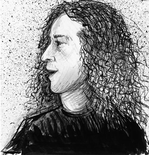
Rostislav “Russ” Spitkovsky by Kevin McCloskey 2012

Russ Spitkovsky makes things happen. He came to Kutztown as one of the 9 artists in the 2012 Print Invitational at the Miller Gallery.  The founder of the cutting edge art magazine Carrier Pigeon hung artwork from the latest issue at the Eckhaus Gallery on Main St. He circled back this week as a visiting artist to spend time with students.

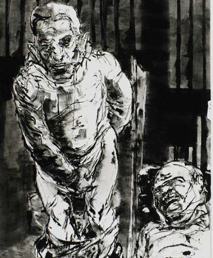
oil monotype illustration by Russ Spitkovsky for “Hall of Mirrors”

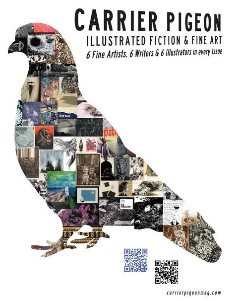
Carrier Pigeon is an artist-driven publication. Russ and friends began it after grad school at SVA’s Illustration as Visual Essay MFA Program. Each issue has works by six fine artists, plus six writers, and six illustrators.

Carrier Pigeon cover by Cannonball Press, Martin Mazorra & Mike Houston

The magazine has included original etchings and woodcuts by Russ and guest artists including Marshall Arisman, Bruce Waldman and Frances Jetter. KU Prof. Evan Summer has contributed to several issues.

Russ speaking to overflow crowd in KU Print studio. Photo by Evan Summer

Russ shared some mind-boggling stories. Like the one about a meth addict who tells his wife he’s spending their life savings importing alpacas, but the alpacas are being held up in customs. There are no alpacas; he’s building a giant meth factory. The factory bursts into flames and meth maker gets encased in glass and, well, I don’t want to ruin the ending. The full story by Ryan Scamehorn called “Hall of Mirrors” can be found in Carrier Pigeon #3. It is fiction; I hope.

Illustration by Marshall Arisman for “Good Dog” by Erin Browne, Carrier Pigeon #7

Digression: Many years ago I sent a book idea to Lawrence Ferlenghetti’s City Lights Press. A few weeks later I got the best rejection letter ever. It said, ‘Your project is so interesting, you should publish it yourself. We are swamped publishing our own friends. Start your own press. Here are some resources…‘  Russ Spitkovsky never got that memo from City Lights, but certainly he embodies the D.I.Y. publishing spirit.

Kevin McCloskey, Moe Tierney, Russ Spitkovsky. Photo by Evan Summer

Russ was born in the Ukraine. Why do so many amazing printmakers come from Eastern Europe?  KU’s Print Invitational includes Michael Goro from Russia, Ivanco Talevski from Macedonia, Endi Poskovic from Sarajevo, and Russ. It occurred to me perhaps these artists find core concepts difficult to express in English and are therefore driven to excel at graphic communication. Russ provided a better insight into why so many extraordinary artists come from places once under the Soviet sphere of influence. Growing up in the Ukraine he showed a precocious talent for art. He was plucked from preschool and put in an art academy. He was drawing the human figure from plaster casts at the age of four.

Illustration by Russ Spitkovsky from Central Booking, his self-published visual essay.

On the night of January 3, 2009, Russ was walking down a Brooklyn street. The police stopped and searched him and found he was carrying a knife. It was an ordinary knife purchased at Home Depot. The NYPD decided it was a lethal weapon, “a gravity knife,” and threw him in jail. He spent the next 32 hours in an overcrowded holding cell at Brooklyn’s Central Booking. Charges were dropped, but Russ made art from the experience. Upon his release, drawing from memory, he transformed that grotesque night into a visual essay in book form. He published “Central Booking” via the print-on-demand publisher Blurb. The book was not a financial success, but led him to explore other self-publishing options.

Russ loves working with the likes of Martin Mazorra and Mike Houston of Brooklyn’s Cannonball Press. Russ calls Cannonball Press the pioneers of the indy press and affordable art movements. Russ advises art and illustration students not to hole up in their studios after graduation. “Find a co-op print shop; work among other artists.” He said the community of Robert Blackburn’s  NYC printmaking studio saved his sanity. He was able to get instant feedback on his art and stay in a creative loop.

Today, Russ works not only with graphic artists, but an ever-expanding community of playwrights, jugglers, Coney Island sideshow performers and puppeteers. Strange doors keep opening for Russ. Recently someone gifted Carrier Pigeon with a building in Gutenberg, NJ. To keep up with Carrier Pigeon news and events visit their Facebook page.

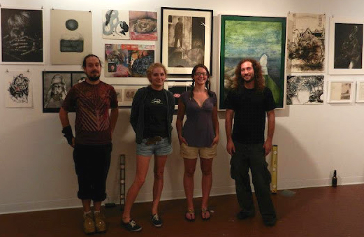
Justin Sanz, Eckhaus workers Nicole and Megan, Russ. Photo from http://www.eckhausgallery.org/

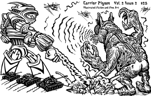
If you are fortunate enough to be in Kutztown, PA, get to Eckhaus to see the original art from Carrier Pigeon. There are copies of the latest issues for sale. Each issue costs $25. Twenty-five bucks is a lot of money for a magazine, but not a lot for a work of art.

Type faces

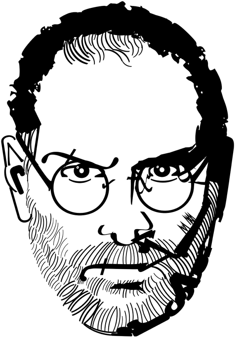
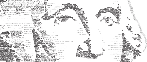
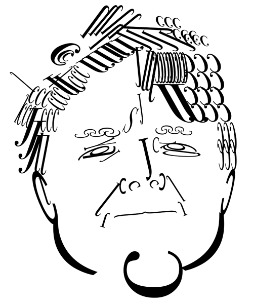
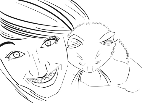
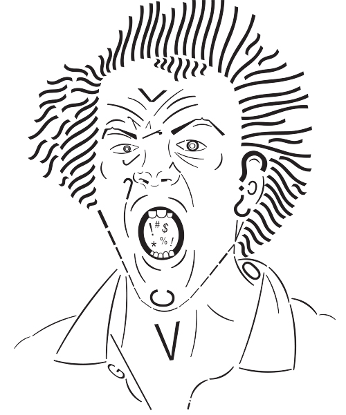
Prof. Josh Miller asked his students to create faces from type. Some of the results were quite fine. He’s hung a selection up outside the CD print lab. I asked him if I could share a few of the best here.


Steve Jobs by Caleb Oshefsky

The class is called Intro to Digital Design II. The exercise is meant to familiarize students with type-handling in Adobe Illustrator.

George Washington (detail) by Caleb Oshefsky

Here is the assignment brief: Create 3 portraits using the Illustrator’s type tools. The first portrait will emulate line. The line can be expressive, descriptive, implied, or directional. You can use contour or gesture. The second portrait represents Shape and Form. Try using negative and positive space in this portrait. The last portrait is Value. Use pattern, emphasis, and space to help create the tones.

Elizabeth Cane’s Portrait

These were the additional ground rules:
Students could the change text to outlines and manipulate the letterform, but it still had to resemble the original letter.  They could rotate, change the leading, kerning, tracking, or change the direction of the text.

Heather Johnson
Screamer by Nick Stover

Interestingly, this week Printeresting.org had a link in their notebook section to the work of Italian artist Frederico Pietella. He does something similar with rubber stamps, but he takes it to a level approaching obsession. See Pietella’s work at This is Colossal.

St. Patrick & His Miracles & Me

Patrick McCloskey was born in Killycolman, County Donegal, Ireland. He was my grandfather. He immigrated to the US around 1915. His family in Ireland called him “Paddy the Yank.” He celebrated his birthday on St. Patrick’s Day. My middle name is Patrick, after him. There are many Pat McCloskeys. I’ve got a wife named Patt, an Uncle Pat, and cousins Pat.

St Patrick Driving the Elephants from Ireland ©2010 Kevin McCloskey

My parents were born in the USA, but St. Patrick’s Day was a big deal growing up in our Irish-American household in Elizabeth, NJ. Each spring, the family would fast for the 40 days of Lent. We didn’t stop eating, but we ate less. One pious year, maybe 1961, I went to Lenten mass every morning, meaning nothing but water for breakfast. We’d have a very small lunch. I remember my Dad eating dry saltines. At dinner there was no meat, not even hot dogs, as the days stretched toward Easter. There was no dessert, either.

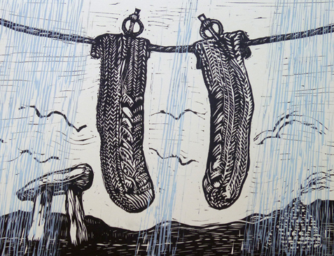
The Miracle of St. Patrick’s Socks. linoleum print ©2011 KMc

March 17th, St. Patrick’s Day, generally falls in the middle of Lent. In early March the parish priests at St. Gen’s would announce that Archbishop Boland was prepared to bless us with a dispensation from Lenten observances for St. Patrick’s Day. There was a catch. First, there would be an extra collection for a very worthy project, and if the collection was robust we got a one-day free pass. We always won the St. Patrick’s Day pass!

After three weeks of fasting, we had a smashing big dinner of beef brisket and boiled potatoes with baby pearl onions in the peas. There was butter on everything. We had Irish soda bread made from cousin Kitty Gallagher’s recipe. Dessert was Mom’s Dundee pound cake filled with walnuts and cherries. Dad would have a Scotch, Mom sipped a Rye and Ginger. The four kids got a dash of ginger ale to toast the glory of St. Patrick.

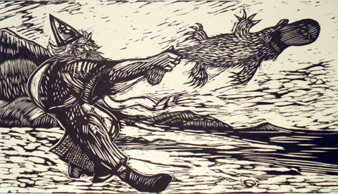
The Last Platypus in Ireland © Kevin McCloskey 2012

Years later, a priest told me my memory of this dispensation proclamation was “absolute rubbish.” Archbishop Boland wouldn’t do such a thing. Next, some theologians decreed that St. Patrick never existed, or, at best, he’s an amalgam of Gaelic-speaking missionaries. The heck with them. In my mind, St. Patrick will always be a beloved symbol of my heritage. I see him as a canny and powerful man who out-wizarded the druids at their own game.

My St. Patrick print series started in 2010 in St. Louis, Mo. I went to study woodblock printing with the great artist Tom Huck at Evil Prints. Huck has a diabolical persona. His printing press is named for the British Satanist Aleister Crowley. My fellow students were carving Huckish prints of devils and demons, fiends and phalluses. Being a contrarian by nature, I decided to make my print about my favorite saint, blessed St. Patrick.

“Sit, Stay!” © 2012 Kevin McCloskey

Now I have these six St. Patrick prints done. I’ve got ideas for many more. Folks seems to like them. These will be on exhibit at Firefly Books, 230 W. Main St, Kutztown, PA. Show runs Sept. 6 to Sept.30. The prices range from $50 to $150. I hope to make enough to cover my frames and paper. My definition of an artist is simple. An artist is anyone who can increase the value of art supplies. After the Firefly exhibition I will print proper editions of 30 or 40. I will put them up for sale on my Moonpenny Press website when they are ready.

St. Patrick Skipping Rope © Kevin McCloskey 2012