Pittsburgh has a lively comics scene. It is home to the Toonseum, one of only three museums in the US dedicated to the cartoon arts. The great comics store Copacetic Comics is still in Pittsburgh, now on Polish Hill. Visit Copacetic and you’ll find an outstanding collection of alternative comics. Bill Boichel, the owner, reminds me of the Music Genome project on Pandora Radio. I tell him the name of a few comics that I love and he tells what to pick up next.
Macedonia, cover by Ed Piskor
For example, if you liked Joe Sacco’s Palestine, you gotta read Macedonia. One of Pittsburgh’s best known comic illustrators is Ed Piskor, who illustrated the legendary Harvey Pekar’s Macedonia, as well as the Beats: A Graphic History. Besides these nonfiction graphic works, Piskor is the creator of the hacker/geek favorite, WIZZYWIG.
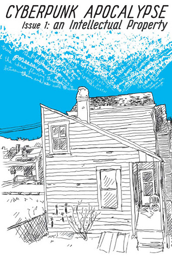
My son Daniel McCloskey is a part of the Pittsburgh comics scene. Daniel is the founder of the Cyberpunk Apocalypse writer’s co-op. Dan does zines and comics and is completing a graphic novel. His zines are available at Copacetic or through indie distributor, Microcosm Publishing. If you create you own zine and it leans toward anarchy, and you want national distribution, get in touch with Microcosm.
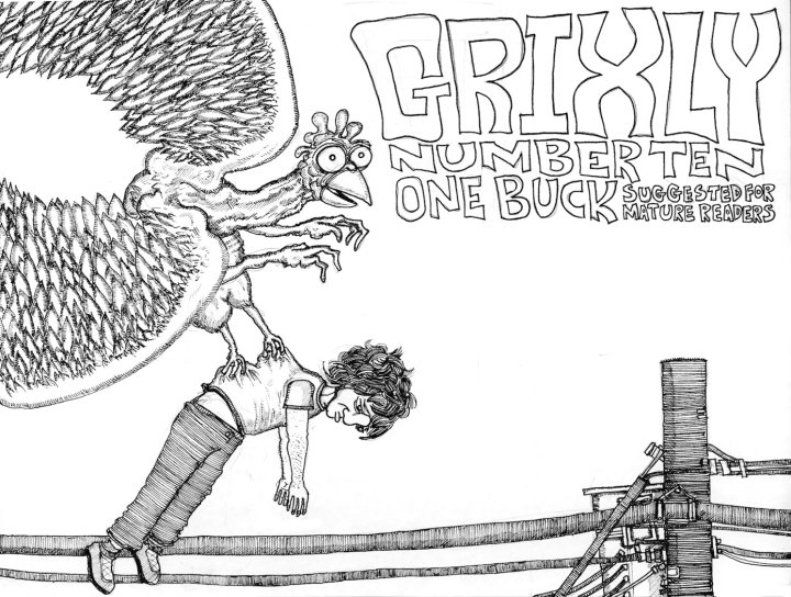
Comics creation can be a solitary project, but Dan draws weekly with his friends Andy Scott and Nate McDonough. Oddly enough, I met Nate in Wheeling, West Virginia at the biggest Sheetz I’ve ever seen. I was gassing up my van and heard someone at the next pump say, “Hey, that’s my dad.” I looked up and it was my son Daniel talking to his friend Nate McDonough. It was a coincidence of Dickensian proportions. Nate didn’t believe it, either. When Dan convinced Nate he wasn’t kidding and told him I was a reader of comics Nate popped his trunk and gave me a pile of his self-published Grixly comics.
Grixly is a “nearly monthly” comic zine featuring “A hodge-podge of short stories, vignettes, anecdotes, fantasias and straight-up auto-biography.” I admire Nate’s productivity. He is closing in on issue 18 already. The cover price varies, but is usually around $1. I enjoyed his comic stories about his day job delivering prescription meds to seniors. The old folks he visits apparently don’t get many visitors. They call him Nat, or Ned, or Norm and offer him candy in exchange for just a precious minute of conversation as he makes his appointed rounds.
Andromeda Call for Entries:
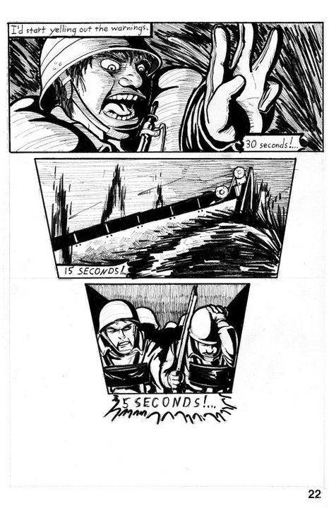
Finally, I want to point out another fascinating Pittsburgh comics zine, Andromeda, edited by Andy Scott at Little Tired Publications. While most of the artist contributors are Pittsburgh-based, Andy will accept art from further afield. Kutztown University student Joe Probition just had a six-page story published in Andromeda #10. The editors told Joe they usually prefer darker tales, quirkier humor, but were impressed with his World War II inspired story. Andromeda is open to comics submissions for future issues, next deadline is Feb 29. Andromeda is currently raising funds for this special full-color 1st Anniversary issue. To contribute or order Andromeda try Etsy, or contact Andy Scott directly via email: littletired (at) gmail.com
Below are 2 pages from Joe Probition’s beautifully drawn war story:
Dan sent me this comment which I’ll add here: “We also have Jim Rugg, Frank Santoro, and a bunch of other talented indi comic folks. And there is the “Out of the Gutter” comic discussion group on the third monday of every month at the Carnegie Library.”
3/11/11: Jim Rugg writes to add, “We also have Tom “Godland” Scioli, long-time Marvel great, Ron Frenz, the uber-talented Pat Lewis, Dandy Don Simpson…” Since some folks don’t click on the comments, I pasted it here, too, to add to the Pittsburgh Pantheon. Do check out Rugg’s awesome work and blog here.
SeeScotty.com is a site worth a visit, 2001 KU alum Scott Reifsnyder’s personal illustration and design web site. Still more mind-boggling is another site he worked at, Headcase Design. This was his day job, at Dr. Kepple’s laboratory, where Scotty assisted in the “treatment a broad range of design disorders.” Scotty is a good friend. After KU he got his MFA at Tyler. He has taught at Kutztown as an adjunct and along with Mike McAghon he designed the award-winning KU CD website featuring our beloved CD House.
Scotty wrote to us recently with great news, “I’ve been notified that my Heroes of Folk Letterpress Card Series has been selected by the 2011 Communication Arts jury to appear in its Illustration Annual 52!”
I took a tour of his website and emailed him some questions:
Scotty, How do you get to do a poster for a popular band like Wilco? (image above) “For the Wilco poster I had illustrated Paul Bunyan for my Heroes of Folk series and I approached Wilco’s management about using it for a show. They thought it would be ideal for their upcoming show in Duluth, Minnesota, so that is how that came about. ”
Note: Fans can order Scotty’s limited edition Wilco serigraph (silkscreen print) here at kungfunation for $25.
“One of the art directors from Wired over in England came across an illustration I did on the design blog http://designspiration.net/ which was very fortunate for me.
You went to school in the U.K. for a semester abroad, right?
“That’s right. I went to Colchester Institute in England for a semester while I studied at KU.”
Any advice for young illustrators?
“Always push yourself to work on your style and personal aesthetic. Even if it’s not for a paying client. Some of the best work I’ve done has been personal.”
Do you think of yourself an illustrator? ” Some designers and art directors feel the label “Illustrator” is a bit polarizing. I wouldn’t go around calling myself one until I can prove it. It wasn’t until I got my first commission I thought I deserved that label.”
At Scotty’s site, visitors can download free desktop wallpaper based on the Coen Brother’s film Raising Arizona, here, in a variety of resolutions. We leave you with one more current project by Scotty from Philadelphia Magazine. It is an editorial illustration for the controversial new book on child-rearing by Amy Chua, Battle Hymn of the Tiger Mother.
Speaking of Successful Alumni, if you are on campus this week: KU AIGA presents: TAKING THE PLUNGE, Thurs, Feb 17 at 7 p.m., Sharadin 120. KUCD grads from last year return to show and tell about their experiences in the real world. It is always a very informative and enjoyable evening. Here is the list of attendees so far: (Subject to change) Jon Shelton, Lacey Christman, Sam Carr, Geoff Reynolds, Ashley Kichline, Alyssa Dienno, Shane Walsh, Zac Martz, Ross Moody, Corey Reifinger, Bill Reidel, Lindsey Smuck, and Shani Tucker.
James McMullan said the search for an illustration style is a very personal thing, like deciding if you prefer to wear silk or cotton. Same goes for picking an art school; you need to know yourself. “Art School,” or “University” with a good art program? It is a very personal thing.
A big city art school might not have a grassy campus, a rec center with a climbing wall, or varsity sports, but the city has its own rewards. Ben Shahn said ‘the greatest art school is one you walk through a great museum to reach.’ Cities have the advantage of high concentrations of cultural institutions. Some U.S. cities, notably Boston and Pittsburgh, with many colleges clustered together, work at being student-friendly. A Pitt student I.D. gets free entry to the Andy Warhol Museum,Carnegie Museum of Art, and the Mattress Factory. If you crave a high culture fix, consider a big city art school.
Speaking as the father of two recent college grads (one creative writer, one fine artist): Do not go deeply into debt to get a degree in the arts. If you are getting a degree in a high demand design area, like web design, maybe, loans are reasonable up to a point. I once toured RISD, Rhode Island School of Design, the luxury liner of art schools. The cafeteria was like a restaurant with vegetarian and vegan options. The studios were amazing, including a fully-equipped glassblowing facility. Tuition is now $38,000; with dorm and meals the bill nears $50,000 a year. Of course, many students get financial aid. I know a very talented young artist who was offered a $3,500 merit scholarship. At a state school $3,500 would be quite a scholarship; at RISD it was more like a discount. If you can afford a luxury class school, like RISD, or Cranbrook, or Pasedena’s Art Center College of Design you will be in good company. Go for it, if you and your parents can afford it. I must admit I get sticker shock even thinking about this sort of expenditure.
I once met a young man who was spending $250,000 at a four-year college to become a potter. I suggested an alternative education. Hire a master potter from Mexico for $50,000 a year, bring the artist to the U.S. and open a collaborative studio gallery. Apprentice to the master potter for three years and sell the pottery as you go. I’d wager the ceramics of that young potter with the three-year apprenticeship would far outshine a college grad’s. Of course, this is a pipe dream. The student loan industry, academic accrediting agencies, immigration laws, the higher education system, and the U.S. tax code, all favor the ‘college experience’ over such a ‘work experience.’
Reality Check: If you have a place to live in the city, and you can get some financial aid, do consider the big city art school. If not, read on.
Consider a State College. Your best value may be a state college. I know many young people want to relocate, but look into your home state first. I teach at Kutztown University of PA. Tuition and fees are a reasonable $7,732 a year for PA residents. The cost more than doubles to $16,557 for out-of-state students. Montclair State, in neighboring N.J., is a tad cheaper, $7,324 a year in-state, $15,654 out-of state. (Montclair has a dorm named for Frank Sinatra. How hip is that?) Be aware that university tuition pages are designed like car dealers’ ads. The tuition appears quite low at first glance, but it is usually quoted in semesters, or even quarters, and doesn’t include mandatory fees. I’m including all fees in my yearly tuition numbers here.
Of course, not every state school has an art program. How does one find the schools with art programs? Ask your art teacher, if you are lucky enough to have one. Or, start with a web guide like Peterson’s Guide to Colleges. I just did an informal test and found Peterson’s was not very useful. Starting with Search by Major “ART” gets 11,700 schools, “GRAPHIC DESIGN” brings it down to 507. Advanced Search of “Visual and Performing Arts” for “ILLUSTRATION” and “Bachelor’s Degree” gets 63 schools. Screening for PA narrows it down to 4 schools, all privates. Kutztown University, where I teach illustration is not even listed! Technically, illustration is a concentration here, not a separate major. Using the term “GRAPHIC DESIGN” got me a longer list, but still did not include Kutztown. My point is, Peterson’s program is not perfect.
There is another more useful tool at NASAD, the National Association of Schools of Art and Design. This art college accreditation organization has a searchable list of their 312 members. (Update 2.12/2011: I went to the NASAD site from an off-campus computer and this list is very difficult to access. Sorry. One must become a “free subscriber” to reach the list. I don’t understand why NASAD makes this basic member information so difficult for prospective students to see.) A “Pennsylvania” search finds 24 schools (including KU), New York State – 25 , Ohio -17, North Carolina- 4. Now, there are certainly fine schools that are not accredited by NASAD. For many years Kutztown was not a part of NASAD and our program has not fundamentally changed since then, but NASAD might be a good place to start.
I would do a “web visit” to every NASAD school in my state and neighboring states. Search out the terms illustration, communication design, and graphic design. Get a sense of the number of faculty, and where they studied. If you can find individual faculty web pages, look for diversity of faculty backgrounds. If you can’t study at one of those luxury liner schools like RISD yourself, it might be nice to study with someone who did. Check out any school that has the word ‘state’ in it, like Kent State in OH, Montclair State in NJ, Buffalo State College in N Y . Why? State schools are subsidized by tax dollars. Even though this state subsidy shrinks every year, think of it as an invisible scholarship. Of course, sometimes a state school with a great art program, like Ohio University or Kutztown, doesn’t have the word state in it; maybe your guidance counselor can help weed down your list.
At Kutztown we have a good-sized program in Communication Design. “C.D.” is the most selective program here. We get 250 applicants for 60 freshman seats. We have 12 full-time faculty. The faculty to student ratio is low. Low is good. I teach a design history course of about 110 students, but my largest illustration studio classes has 23 students. For better or worse, Kutztown has the collegiate stuff you don’t find at ‘art schools,’ the rec center, climbing wall, clubs, frats and sororities. The other thing Kutztown has, not found in purest ‘art schools,’ is a general education requirement. Basically, you will need to take a little over a year’s worth of science and math and literature and things you might not have enjoyed in high school. I’m generalizing, but I’ve met many art students, and most find “gen ed” boring. Gen ed is part of the deal you are making with the taxpayers; you may not be working in the arts all your life. A well-rounded education is meant to prepare you for life in the broadest sense.
Last week the blog entry on picking an art college got nearly 500 visitors in three days. That’s not viral by dancing cat standards, but proves there is a lot of interest. I promised to reveal the name of the state college art program that I found most impressive. Kutztown University is wonderful and the CD program is the best thing here, but I must exclude my employer from this pool.
From Joe Fig's 'Inside the Painter's Studio,' now at MassArt.
The most impressive state college art program I’ve ever seen is Massachusetts College of Art and Design. I believe MassArt is the only state college devoted exclusively to the visual arts. Fittingly, this profound respect for the arts took hold in Massachusetts. In 1780, President John Adams, of Massachusetts, envisioned a time when the U.S. would reach such a level of freedom and prosperity that his descendants might study fine art and applied arts.*
I spent a portfolio day at MassArt with a prospective student. The upper level undergraduate students had their own small studio spaces, a rare and wonderful thing. The arts curriculum was diverse yet deep, offering everything from illustration to “Dynamic Media.” MassArt faculty are practicing artists and the student work I saw was first-rate. On an historical note, one of my favorite illustrators, N.C. Wyeth, began his training there. I’d say MassArt is a wonderful choice for Mass. residents. (In-state tuition & fees: $9,000 a year.) Interestingly, MassArt offers a discounted rate for neighboring New England States of about $15,500 a year. Applicants from all other states, alas, pay a hefty $25,500.
I would be very interested to hear your opinion on where best to study art. Please post a comment if you have thoughts on the matter. Next week we will share some great news about KU grad Scotty Reifsnyder.
* Here is how John Adams put it in a letter to his wife, Abigail, “I must study politics and war that my sons may have liberty to study mathematics and philosophy. My sons ought to study mathematics and philosophy, geography, natural history and naval architecture, navigation, commerce and agriculture, in order to give their children a right to study painting, poetry, music, architecture, statuary, tapestry, and porcelain.”
Some of this may relate to other art and design majors, but I’m focusing on illustration. I often talk with talented high school students considering studying art at college. My advice should be taken with a grain of salt. It took me 17 years to get my bachelor’s degree. During those wonder years I studied at all sorts of schools, metropolitan private art schools, rural state universities, and even an inner-city community college.
The first thing one has to learn is the difference between various sorts of art schools. There are state schools (Kutztown), state supported schools (Tyler), and private schools (University of the Arts, Phila.) and there are also many proprietary schools. A proprietary school is a for-profit college or university. Generally proprietary art schools that advertise on gaming sites, on FM radio, or those that offer a free laptop are to be avoided. The most dubious of these institutions are not accredited. Avoid any “college” or “institute” that has no accreditation. We’ve had students come to Kutztown after studying two years at a non-accredited art school who are near tears when they learn that zero credits transfer from their previous school. They might as well have not gone to college. In my opinion, a non-accredited school is the worst sort of place to study illustration. The U.S. Dept of Education has a web database where you can check to make sure a post-secondary school is accredited.
Nearly as bad as unaccredited proprietary schools are small private liberal arts colleges known for general education. No good art school has a duck pond. These small liberal arts colleges are likely to be accredited by a regional body. They might have one talented teacher who teaches every art course from ceramics to lithography to 3-D modeling. Let’s suppose this prof has those requisite Renaissance Man/Woman qualities, imagine having a personality conflict with the only prof who teaches every course you need to study. Don’t go there.
Proprietary schools are not necessarily scams. I got my graduate degree from SVA, The School of Visual Arts, in New York City. SVA was founded by Silas Rhodes and Burne Hogarth, who drew the comic Tarzan better than anyone. Originally SVA was founded as The Cartoonists and Illustrators School. Yowsa! I’m glad they changed that name; that wouldn’t look so good in Comic Sans on my diploma. In the beginning SVA catered to G.I. Bill veterans who wanted to live the artist’s life in Manhattan. Despite its, pardon the pun, sketchy origins, today SVA is fully accredited. It is also very pricey and a moneymaker for the Rhodes family. That said, if you can afford SVA, there are some advantages: Location, Location, Location, and the reputation of the faculty. Many of its teachers are giants in the field, Steven Heller, Marshall Arisman, Stefan Sagmeister, Jessica Abel, Paula Scher, Milton Glaser, to name a few past and present. I’m glad I went there.
Why Pay Retail?
Let’s say you can’t afford the roughly $150,000 for a four-year SVA degree, but you live within commuting distance of NYC. For about $400, consider one of SVA’s one semester continuing education courses. For example, illustrator John Ruggeri teaches “Drawing New York City on Location.” He takes students on nightly sketch excursions to Chinatown, South Street Seaport, Night Court, and Grand Central Terminal. I didn’t pick that course at random. John was one on my gifted classmates and has earned SVA’s distinguished teacher award. His visual essays have appeared in leading magazines including The New York Times, Seventeen, Mademoiselle, Print, and Rolling Stone.
It is possible to get a NYC art education for less than retail if one lives close enough. For example, a New Jersey resident might study full-time at Montclair State, a good art school in its own right, and take a continuing ed course in Manhattan each semester. Not just SVA, but Pratt, Parsons, and FIT all offer continuing ed bargains. Sometimes you end up in a class with regular undergrads. In some cases the course credits might transfer and count toward your degree; do your research. You might also be able to take a short workshop course at an artist’s studio. NYC’s Society of Illustrators occasionally has one night workshops with celebrated professionals. Greg Spalenka recently taught his intensive 3-day “Artist as Brand” seminar there for $295.
This continuing ed principle can be used in other metropolitan areas. SAIC, The School of the Art Institute of Chicago, is another prestigious art school that offers continuing ed courses. You get to add a line on your resume underneath ‘BFA Graduate of East Bypass University –Studied at SAIC.’ If the faculty member is a star in your chosen field, you might put their name there, too.
Next week I will post my thoughts about studying at state colleges and let you know the school in that category that impresses me most.
Just yesterday, CD Dept. chairperson Todd McFeely told me he sensed the job market for designers was turning the corner. He’s been hearing more and more good news from recent grads who have found work in the design field.
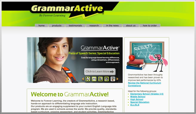
Even more encouraging is that grads are starting new businesses from scratch. Victor Beazzo wrote yesterday to announce the birth of Solid Design Group. That sounds stable. Solid’s website has launched at soliddesigngroup.net. Victor, since graduating from K.U.in 2008, gained experience working at two well-known Pennsylvania agencies and is now putting out his own digital shingle. He says he still has a lot of work to do. We wish him luck.
Example of web design by Solid Design Group, Whitehall, PA
Logo for holistic health clinic in Bethlehem, PA. Solid Design Group
Below is a quote from Solid’s inaugural blog entry, a bit of advice that illustrators might take to heart. Visit the site to read more.
“If you can’t find paying work, do pro bono stuff to learn. Your cousin’s wedding invitation, a local band’s album artwork, or a website for a local non-profit, are all great examples. Craigslist is a great place to start when searching for low pay or charity work for experience. You’re getting your name out there and building a reputation for yourself, but the most important thing is that you’re actually learning and improving! The more you do, the faster you’ll get better!”
Kelly Weihs' illustration for The Tower (Click image to enlarge)
Kelly Weihs just graduated May 2010, BFA, Communication Design. When I saw her illustration in the Tower, I wrote to ask her how it happened. She wrote back, “I was in professor Dr. Ed Simpson’s Dinosaur class at KU. I’d sent him dino artwork I had done in one of my illustration classes, and he liked it. I ended up doing an illustration at the end of the spring ’09 semester based on his scientific findings. He showed me a photograph of the dinosaur diggings he had found, and some skeleton photos and references of what this dinosaur may have looked like, so I recreated what I thought the scene would look like.”
Dr. Simpson’s research, as noted in the Tower, was reprinted in publications around the world. The British magazine the Economist, wrote about him here.
Kelly’s illustration media? Graphite pencil scanned into Photoshop and colored using a Wacom tablet.
KU design students tend to complain about being forced to take General Education courses, but here is one instance where a Gen Ed course paid off. Even though Dr. Simpson’s Dinosaurs is a large early morning lecture class, it is so popular that it fills quickly.
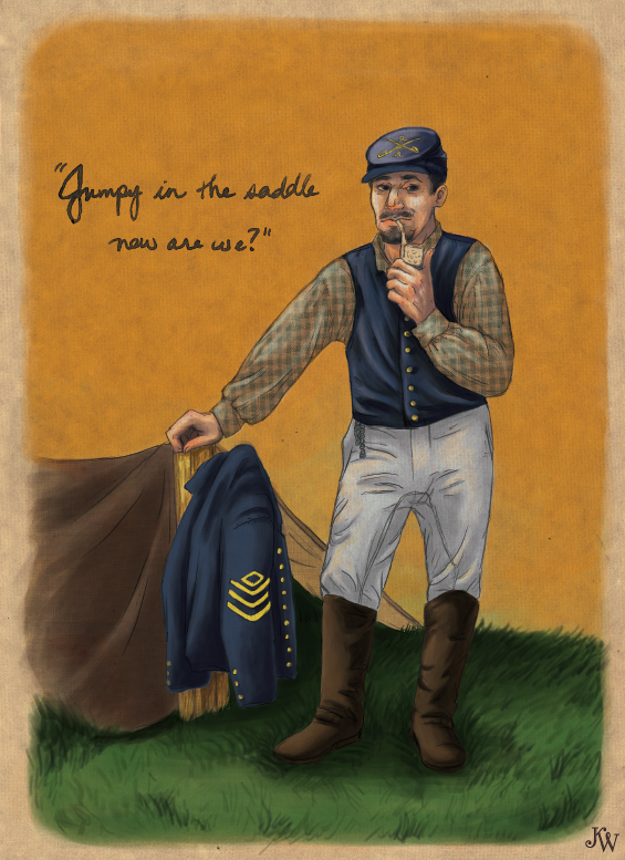
Kelly has a keen eye for historical details, above is a piece she did for a visual essay on Civil War Reenactor village near her Maryland home. Another research intensive project she completed during an Illustration Senior Seminar, below, is her “paper theater” or “toy theater” based on the life of Napoleon. Toy theaters were once sold a souvenirs at the concession stands of Victorian-era theaters and opera houses. If you’d like to learn more about the fascinating history of these theaters, you might start with the Wikipedia entry, here.
Kelly is currently planning to do a new toy theater based on colonial U.S history. This project seems like a perfect fit for Colonial Williamsburg or other historic sites in the Mid-Atlantic states. Kelly’s website is worth a visit, it has many more examples of her creative illustration and carefully researched graphic design projects.
The Kutztown University Bookstore now has copies of A Dog Named Pavlov/ Un Perro Llamado Pavlov for sale. They are stocked on the faculty author shelf. I wrote about the book here. Pick one up and I will be happy to sign it!
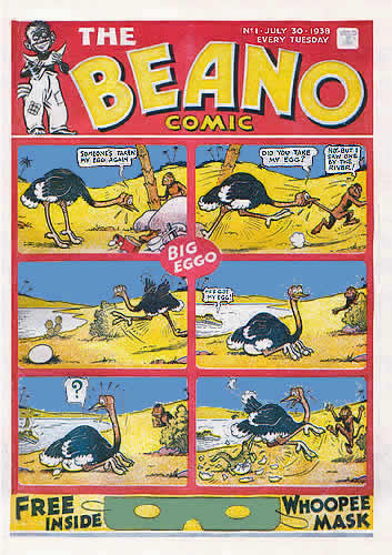
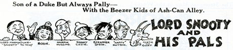
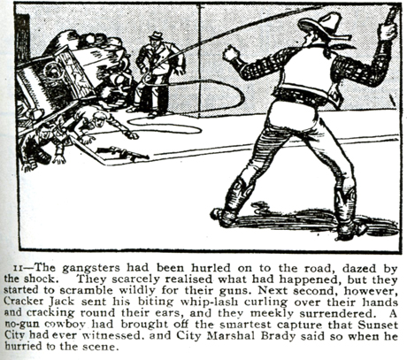
Someone slipped BEANO (not the anti-gas medicine!) the British comic book, under my door. This was just before break, during exam week. I was thrilled and amazed. I hadn’t seen a copy since I was in England in 1995 teaching British Humorous Illustration as part of the KU/UK program. This copy is dated July 30, 1938 with Big Eggo, the ostrich, on the cover. I thought it may have come my way because on my door hangs a woodblock print of an ostrich that I carved at Evil Prints. I took Beano home in my backpack and read most of it in bed. It is a strange mix of cartoon styles, some very juvenile gags, a few more sophisticated adventure strips, including one about a bullwhip expert, Cracker Jack. Some pages have more text than pictures. The drawing styles are varied, often charming, and with distinctively British characters.
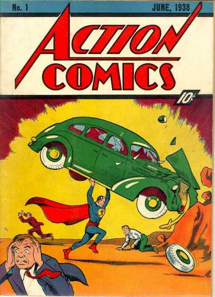
It occurred to me Beano is quite different from the famous U.S comic that also appeared in the summer of 1938, in which Superman made his debut. Everyone knows Superman’s Action Comic, Number 1, is worth a fortune. In 2010 a mint copy sold for 1.5 million dollars at auction. I wondered about the value of Beano, Number 1, and who had slipped it under my door.
Turns out it was Prof. Elaine Cunfer who sent it my way. She said, “I’ve had that for ages, never got around to reading it; glad you like it.”
I googled Beano #1 and found a blog about a recent EBAY sale. Better yet, there’s a video about Beano’s value on a UK version of Antique Roadshow. Beano # 1 is worth about 4,000 pounds, more if it still has the free Whoopee Mask (1 British pound = 1.54 US dollars, over $6,000.) I emailed these links to Elaine Cunfer telling her I couldn’t accept such a valuable gift, but asked if I might to scan a few of these amazing illustrations before returning it.
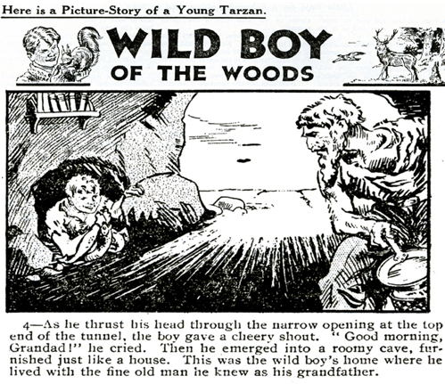
A panel from Wild Boy, Beano #1. More scans below.
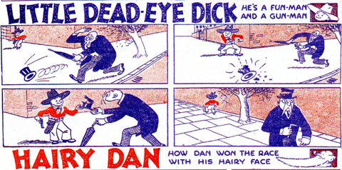
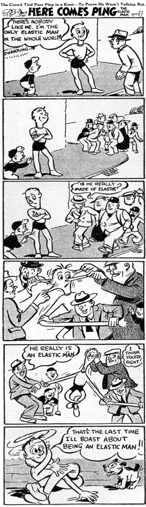
Elaine Cunfer wrote back to tell me this Beano was a reprint that came with the Sunday Funnies. She got it last time she was in England. She was touched that I wasn’t intending to rip her off. “My” Beano has 24 pages, a real 1938 Beano has 28 pages. Beano’s original 1938 masthead features a crude caricature of a grinning black boy eating watermelon, not the sort thing you would find in mainstream comics today. During the World War II years, Beano was filled with equally crude anti-Italian caricatures and slurs. These are not the things I like about Beano, but any popular magazine is a time capsule. And alas, unedited time capsules include some ugly curios among the gems. The U.S. is no different from England in this respect. I’m guessing the missing four pages might have featured a story about the boy with the watermelon. If anyone can shed light on the mysterious missing four pages, please do get in touch. Here, below, is one of the original Beano comics in its entirety, Ping! illustrated by Hugh McNeill.
This blog began in June as a sort of trial balloon with the intention of highlighting the many accomplishments of KU’s illustration concentration. There is a myth, repeat myth, that KU is shutting down illustration. The roots of this misconception may be due to the reduced footprint of illustration in the new Sharadin building. But we have had some significant accomplishments in the illustration area in the new Sharadin, including the Brad Holland Exhibition. This was the first one-person illustration exhibition in Sharadin in over 25 years! This year we also had The Dornish Collection Exhibition of children’s book illustration, which broke all records for gallery attendance. We also hosted three exceptional visiting artists illustrators in 2010, Bret Helquist, Peter Kuper, and Megan Halsey. We look forward to Caldecott winner Jerry Pinkney‘s visit in April.
The future looks bright. Enrollment in upper level illustration classes is up at Kutztown University. Applications for CD are higher than ever, and there is a lot of talent headed our way. Spread the word.
A special thank you to Prof. Denise Bolser. She wrote two blog posts this year, and one on advice for illustrators is among our most popular and practical, See link below.
The folks at WordPress sent me stats and a chart for the first year of Illustration Concentration Blog :
The Blog-Health-o-Meter™ reads Fresher than ever.
Crunchy numbers
A Boeing 747-400 passenger jet can hold 416 passengers. This blog was viewed about 5,800 times in 2010. That’s about 14 full 747s.
In 2010, there were 33 new posts, not bad for the first year! There were 111 pictures uploaded, taking up a total of 24mb. That’s about 2 pictures per week.
The busiest day of the year was December 4th with 152 views. The most popular post that day was What’s SpongeBob Really Like?.
Where did they come from?
The top referring sites in 2010 were facebook.com, kutztown.edu, faculty.kutztown.edu, mail.yahoo.com, and twitter.com.
Some visitors came searching, mostly for spongebob, spongebob pictures, sponge bob, renee french, and tom whalen.
Attractions in 2010
These are the posts and pages that got the most views in 2010.
Illustration Concentration signed up for the WordPress POSTAWEEK 2011 challenge. We will try to continue to post something worthwhile weekly. Kutztown alums with illustration news please keep us posted about your successes!
What’s SpongeBob Really Like? is the most visited page on this blog. KU grad Amanda Geisinger, web designer of Nick.com’s SpongeBob site, told us she can fiddle with SpongeBob art, but only a few select artists are actually permitted to draw SpongeBob. Of course, Stephen Hillenburg, the creator of all Bikini Bottom’s characters, is in that category. But who else?
An Amazon.com search reveals over 650 results for the term “SpongeBob” in books and at least a dozen illustrators. I was amazed to find these titles: SpongeBob RoundPants, SpongeBob SantaPants, SpongeBob SpookyPants, SpongeBob PartyPants and WhoBob WhatPants? Based on the cover art by Clint Bond, it seems our mellow yellow hero becomes a nudist in SpongeBob NaturePants!
Seems I’m always reading 3 books at once. I am working my way through Jonathan Franzen’s new novel, Freedom and two SpongeBob Books. (If read concurrently with SpongeBob books, anything else seems rather dry.)
I’m reading A Very Krusty Christmas by David Lewman and The Art Contest by Steven Banks. These choices are not random, but rather based on my background as a Santa turned illustration professor. Both books, it turns out are ably illustrated by NY-based illustrator Robert Dress. Dress’s blog is a lesson in illustration; the fluid line drawings that fill his many moleskine sketchbooks are a joy to behold. I wrote to him and he was good enough to answer a few questions.
From A Very Krusty Christmas, art by Robert Dress, Simon Spotlight/Nickelodeon
What is SpongeBob really like?
Robert Dress: “Um hmmm…I’ve never met Stephen Hillenburg.”
Has SpongeBob changed your life?
R.D. “Changed my life? Yes, he’s allowed me to work with some amazing illustrators and art directors at Nickelodeon.”
Identify SpongeBob's inspirations or go back to Art History class. (answers below ) art by Robert Dress from The Art Contest, 2009, Simon Spotlight/Nickelodeon books
What is the project you enjoyed working on with him the most?
“I love just sketching him and getting into how he’s feeling and reacting to a situation. He’s an emotional guy which makes him fun to draw. Because his eyes are so large he’s not too hard to get expressions out of. One of the hardest things to do when your drawing a character like SpongeBob is to pull out genuine feelings and the eyes are the most revealing features.”
Sincere thanks much to Robert Dress for his quick responses. As he points out, he is one of many artists privileged to work with SpongeBob. He also wrote that he wasn’t permitted to dicusss future projects, but we hope to see more of his work. By the way, Stephen Hillenburg, SpongeBob’s creator, doesn’t do many interviews, but made exceptions for his alma mater, Cal Arts, here, and the Washington Post.
(SpongeBob’s paintings inspirations: Grant Wood’s American Gothic, Edward Hopper’s Nighthawks, Edvard Munch’s Scream, Leonardo DaVinci’s Mona Lisa, and Jackson Pollock. The cover, above, channels Rene Magritte’s Son of Man.)