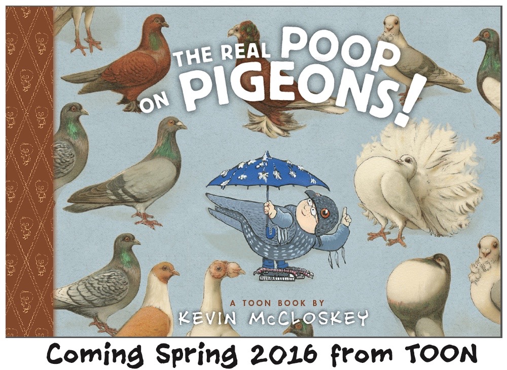
Time to reveal the subject of my next book, -PIGEONS!
“Robert McCloskey’s original idea for Make Way for Ducklings (1942) was to use pigeons …but he found pigeons too difficult to draw.” from Claudette Hegel’s Newbery and Caldecott Trivia. Hard to believe, but it makes me happy because my next book is The Real Poop on Pigeons!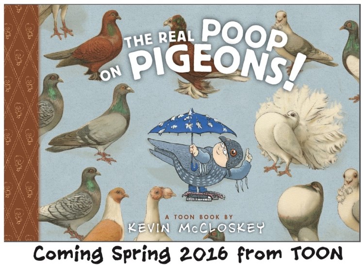
The great Robert McCloskey, no close relation, could draw anything. I sent him my 1992 kids’ book, Mrs. Fitz’s Flamingos. He sent me back an encouraging note. Now, oddly enough, I’m doing a book about pigeons. The Real Poop on Pigeons will be published by TOON BOOKS, April. 2016.

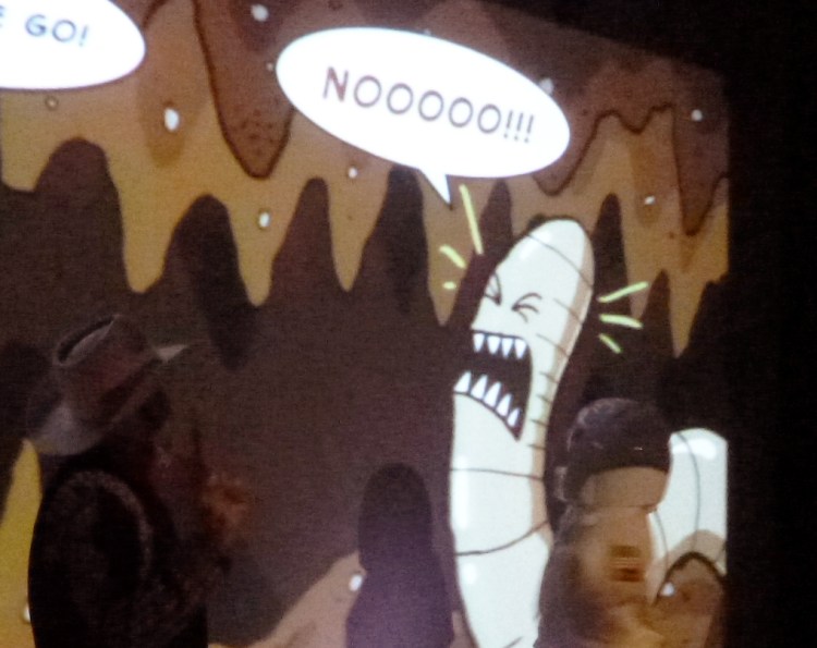
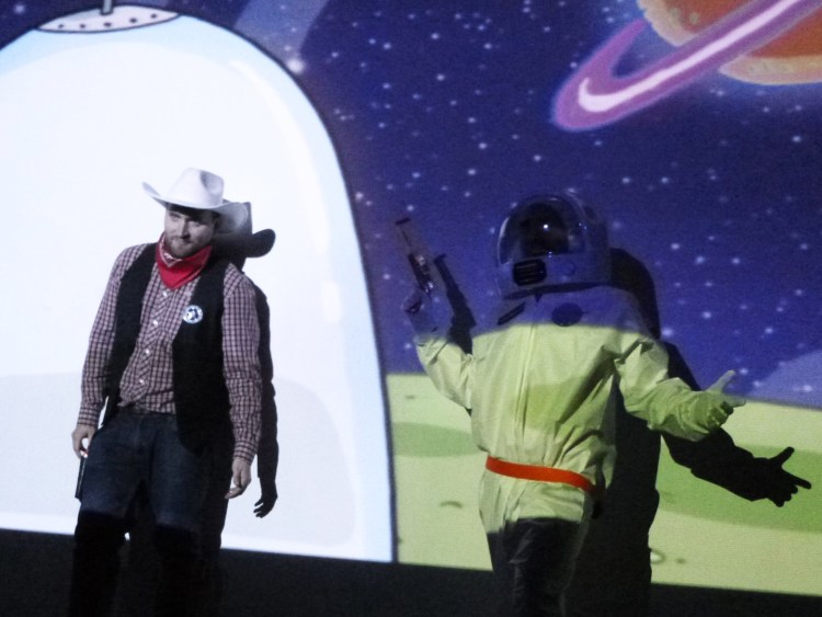
We Dig Worms! was such a hit it went into a second printing just 3 months after its April 2015 release. I got a call from Toon Books’ editor-in-chief Françoise Mouly this summer. I was out, but she left a message, “We need another book, We Dig Salamanders, We Dig Birds, We Dig Something!” Got to admit, I listened to that voice message more than once.

Why Pigeons? Like worms, most kids, no matter where they live, have seen pigeons. I learned about pigeons from an expert. Thanks to Holly Metz I met Vinnie Torre, one of the last of Hoboken’s great pigeon racers. Holly was editing a series of oral history chapbooks for the Hoboken Historical Museum.
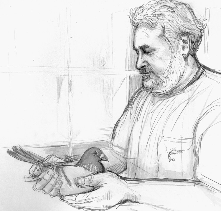
I visited Vinnie’s rooftop loft to research art for The Pigeon Guys. That book is available as a free ebook, here. Sometimes students ask if they should do ‘pro bono’ or free work. Well, I did the Pigeon Guys for free. I am a founding member of the Hoboken Historical Museum and think it is great place.

Plus what I learned on that project inspired my own pigeon book. The research was fun.
I read a number of way cool books on pigeons. I liked Andrew Blechman’s Pigeons: The Fascinating Saga of the World’s Most Revered and Reviled Bird. I loved Courtney Humbprey’s Superdove: How the Pigeon Took Manhattan … And the World. Wow, books about pigeons have long titles.

I visited the National Aviary in Pittsburgh to sketch their rare Victoria crowned pigeons. I learned Picasso painted lots of pigeons. He even named his daughter Paloma, Spanish for pigeon.

I bought inspiring antique pigeon prints from a Warsaw dealer via Ebay, they are chromolithographs. Some came from a lovely German book, Emil Schachtzabel’s 1906 Illustriertes Prachtwerk sämtlicher Taubenrassen. The entire book can be found on Wikimedia, here.
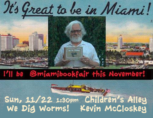
You can pre-order Real Poop on Pigeons at Amazon. It is on sale now, but they will not ship it until April. Of course, if you need a Christmas present, We Dig Worms! is available wherever books are sold. Thank you, worms, for all you have done for me this year!
Did I mention this? School Library Journal chose We Dig Worms! for their Top 10 Graphic Novels of 2015. To me this is as mind-boggling as the idea that Robert McCloskey couldn’t draw pigeons.