MACO,The Museo de Arte Contemporaneo de Oaxaca has an exhibition of street art on its walls. Does street art belong in a museum? Well, MACO’s Hecho en Oaxaca spills over into the streets. The artists came from all over the globe, Swoon, The Date Farmers, How and Nosm, MOMO, Retna, Saner, StenLex, and Vhils. Oaxacan artists Yescka, Dr. Lakra, and Lapiztola round out the show curated by Pedro Alonzo.
Lapiztola Collective’s birds seem escape onto the street.
I am fond of Lapiztola’s work. I’ve met them, in fact they once let me hitch a ride home with them from a birthday party in the hills. Their stencils are always crisp graphic statements, often they relate to musical themes. I was not familiar with L.A. artist Retna. Retna’s blue wall at MACO (below) titled “Somos los ninos de las manos manchadas” translates as “We are the children of stained hands.”
Art by Retna, 2013 Acrylic.
His work resembles Arabic calligraphy. I thought Retna also painted the front of ASARO’s studio, Espacio Zapata, home to a gallery and the cafe,”Atila Del Sur.” A reader informs me it is the work of Sanez.
Wall by Sanez, Espacio Zapata, Studio of ASARO, # 519 Porfirio Diaz. Van artist unknown.
Dr. Lakra has an untitled mural in the exhibition. It looks to be inspired by Hollywood, Bollywood and cheap whiskey. In Lakra’s case, I prefer his simpler ‘dragon woman’ mural on a wall near Espacio Zapata.
Dr. Lakra, untitled, acrylic and spray paint.Dr Lakra, Street mural, Porfirio Diaz, Oaxaca.
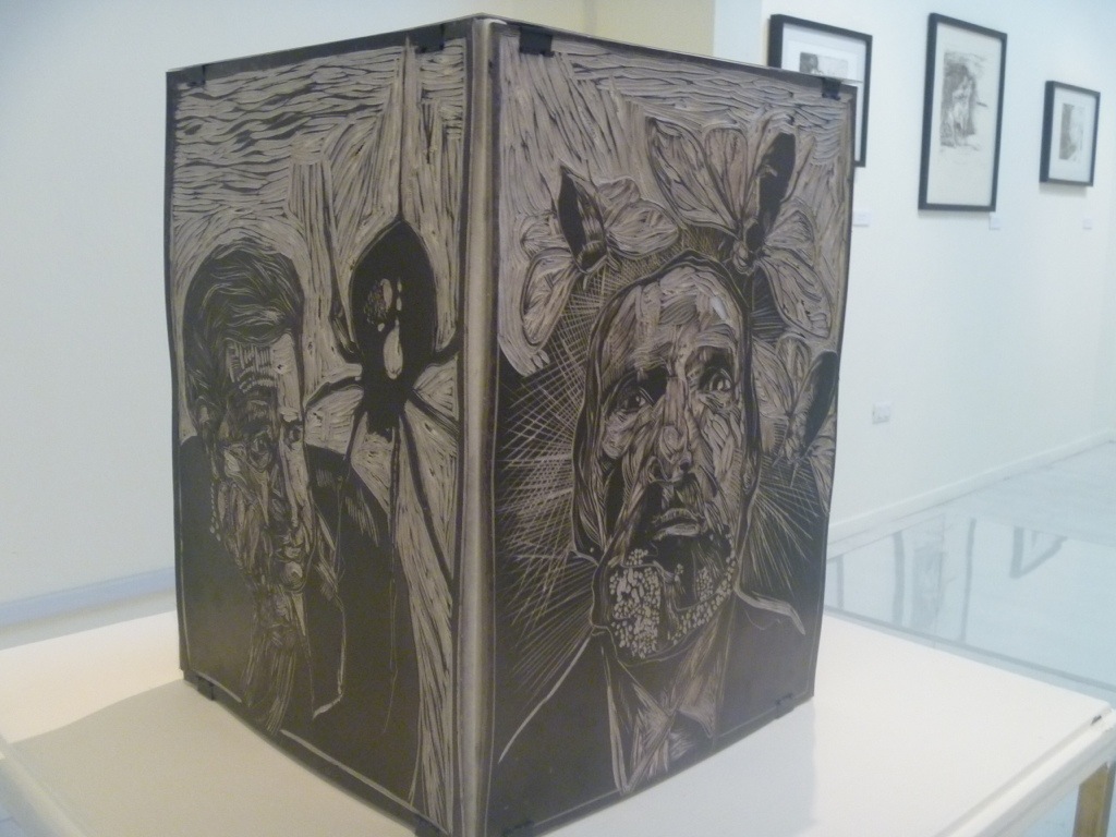
Swoon’s project is among the largest artworks in the museum. Like many old public buildings in Mexico the museum was once church property until it was seized by the government. Swoon worked around fragments of painted wall decoration which may date from the 17th century. She turned a high-ceilinged room into a temple of intense female figures. To borrow a phrase, the walls reflect both “agony and ecstasy.” Overall, her imagery evokes a suggestion of hope. I first saw Swoon’s work on a wall in Braddock, PA. She is an inspiring artist.
Swoon, detail, showing fragments of the colonial wall decoration.Wall by Swoon at MACO, Oaxaca.
Swoon’s outside murals were on prime real estate in the historic center of Oaxaca. I was told the building houses Dr. Lakra’s painting studio. Her works are woodblock prints on kraft paper which are pasted to the walls with wheatpaste. In some places they call these works “throw-ups.” The street artist can unroll the work and throw it up on a wall in a matter of minutes.
Oaxaca Street Art by Swoon, complete with a museum label on right edge.
I will leave you with an image that includes art by Swoon, but it looks to be a collaboration with Retna and perhaps the blue skull is by Dr.Lakra. Next post I will share work by my old friend Yescka.
Oaxaca Street art, Swoon, Retna, and maybe, Dr. Lakra.
In 2006, when all hell broke loose in Oaxaca, and the streets were filled with tear gas, Jesus ‘Chucho’ Martinez was a founding member of ASARO, a radical printmaking collective. Today he works 6 days a week in what may be the most beautiful location for an art workshop. CASA’s Taller de Fieltro, the felt studio, is located in the power room of an old textile mill near Oaxaca. One entire wall is open to the mountain view.
CASA or the Center for the Arts at San Augustin was founded in 2006 by Maestro Francisco Toledo to be Latin America’s first center for ecology in the arts. The 1883 factory was lovingly restored by architect Claudina Lopez Morales. It has galleries and classroom spaces surounded by reflecting pools and breathtaking views. Even if there is no exhibition it is worth the 20 minute taxi ride from downtown Oaxaca. For those who read Spanish, more info on CASA can be found here.
Below is a photo of Alejandra Salgado mixing pure white and blue wool for a felt painting. The taller is working with noted artists including Guillermo Olquin, Irma Palacios, Francisco and Miguel Castro Lenero, Paloma Torres and Jan Hendrix. Also participating is the always outlandish Dr. Lakra, who I wrote about once before. Hey, I just realized Dr. Lakra rhymes with Oaxaca.
Chucho told me they use the finest lamb’s wool including that from Merino sheep. In keeping with CASA’s code the dyes must be nontoxic. They keep a color chart of over ninety different hues that they mix like paint pigment to match the artist’s palette.
Below Chucho and a colleague work out the material list based on the color charts. Despite the lovely surroundings, clearly this must be a demanding job, working with such important artists.
Here is detail from Dr. Lakra’s project, a tattoed man. Then following is Lakra’s larger work. Following that is glimpse of Oaxaca artist Guillermo Olquin’s art. All copyright on the images belongs to the original artists. I close out this post with a sampling of the remarkable views surrounding the workshop.
I believe these remarkable felt artworks will be exhibited in Puebla, Mexico in the near future. When I learn the details of the exhibition, I will update this post.
NOTE: I am blogging from Mexico with my Ipad. It is wonderfully portable, but has its disadavantages. I have trouble adding the accent marks that should appear on some Spanish names. I also can’t caption the photos as easily as I might from a laptop. Sorry.
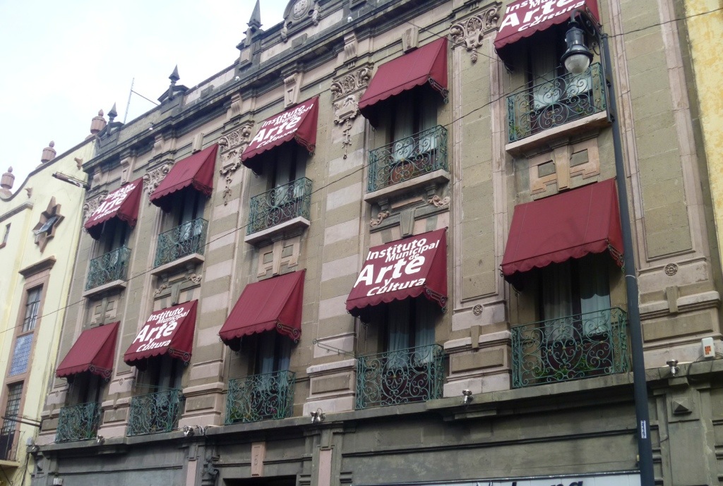
Passing through beautiful Puebla on my way to Xalapa, I stopped to see a one-man exhibition of prints. The artist who I knew as ‘Lukas’ invited me to view his Peregrinajes (Pilgrimages) at the Municipal Institute of Art and Culture. The gallery space does double duty as a classroom. When I entered, the floor was covered with student prints set out to dry. The Gallery Director, Domingo Castillo, apologized, but it is good to see so much artistic activity in the city-run institute.
LUKAS?
As it turns out, Lukas is his Facebook name, his real name is Victor Hugo Mereno Terrez. Considering the literary references in much of work, his birth name suits hims. There were over 20 works in the show, linocuts, wootcuts, etchings and lithos. He brought even more work to show me, sketches and works in progress carved in plywood and drawn on metal. He shared a process new (to me) Silocografia, a dry form of lithography done on metal. Below is a detail from one such print, La Derrota de Quiron.
He draws quickly with an ordinary ballpoint on sheet metal. I’ve used a litho pencil on a metal plate, but this ballpoint technique in Victor’s hands retains the remarkable vitality of his drawings. I asked him where he studied. He told he was an autodidact, meaning self-taught. He studied philosophy and letters at college. He has, however, since studied printmaking at tallers, teaching studios, across Mexico including with Maestro Bulmaro Escobar Ramirez and Maestro Per Anderson at La Cieba Grafica.
Detail above from a large print, Logos. Additional examples from the work of Victor Hugo Mereno Terrez appear below. Visitors to Puebla interested in prints should visit the Municipal Institute Gallery and also the famed Museo Erasto Cortes, devoted to the art of printmaking.
Lukas, I mean, Victor Hugo, is devoted to the printmaking media. He has an upcoming exhibition in the Ukraine and prints in groups shows throughout Mexico. His future as an artist looks bright. If you want to contact him here is his nom de plume, and Facebook name: http://www.facebook.com/lucas.volturno:
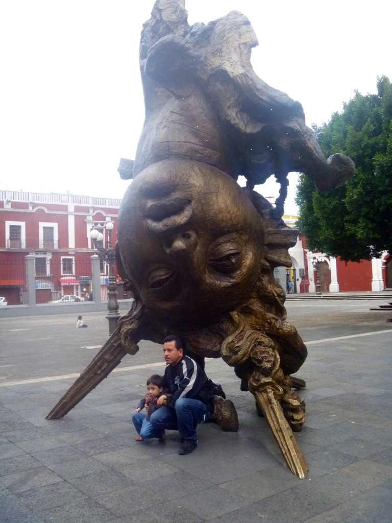
Finally, to show one more reason to visit Puebla. Pictured below is one of three massive bronzes by the Mexican sculptor, Javier Marin. This one is called Female Head, Chiapas. It stands in the plaza San Geronimo, and is enormously popular with visitors.
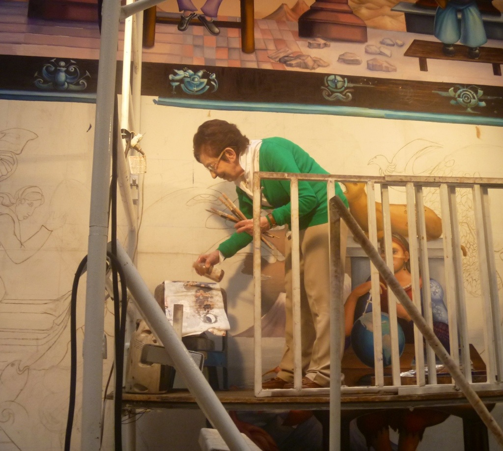
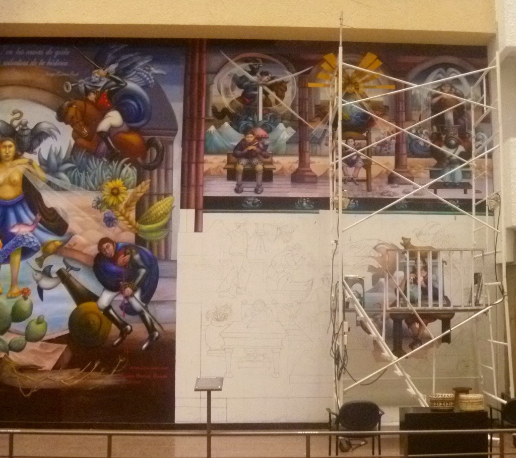
Carmen Cereceda carefully climbed up the metal scaffold in the lobby of a Mexico City office building. From a brown bottle she poured the solvent liquin on her palette of oil paints from the day before. She mixed a middle sepia tone and with long brushes began to paint the face of the sun. She is working on the third and final panel of her massive mural in the SAGARPA building. SAGARPA is Mexico’s Department of Agriculture.
By chance, I have a friend named Diego Dobler who works for this office. He arranged permission for me to see Maestra Cerrada’s work-in-progress. Cerrada worked as an assistant to Diego Rivera in the 1950’s. She has since painted murals in Canada, Chile, Cuba and Mexico. She is a lively little woman with a clear voice and bright eyes. I noticed she was wearing green eye shadow to match her sweater. I told her I found it amazing that she worked with Diego Rivera. “Amazing? Why?” she laughed. “He was quite the man. I worked in his studio for four or five months. Not on an actual mural; he was doing research and working on preliminary drawings. There were five of us. Two young men, three young ladies. He treated us like princesses; the boys- he would yell at them, ‘Flojo!’ You know what that means?- ‘Lazy.”
When I spoke of my love of Mexican art, she reminded me, “I am not from Mexico. I was born in Chile. Chile may be far in geography, but it is very close in culture to Mexico.” She told me after Mexico’s War of Reform, President Benito Juarez was running the country from a carriage; the capitol moving from place to place. Some people in a small Chilean fishing village said that’s not right and began collecting money. The idea spread to Santiago, and these Chileans raised a good deal of money and personally came to present it to Juarez.
“Then when we had that terrible dicatator, Pinochet, in Chile. Educated people found him unbearable and they fled in exile. Many came to Mexico. The highly educated were given positions here, at UNAM, the university. So Mexico and Chile are close.”
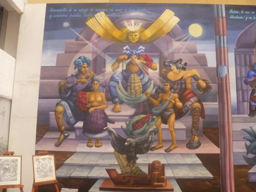
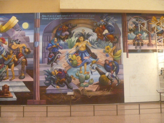
The Three Energies is the title of the section she is working on. She pointed out the symbols for wind, solar, and water power. She noted that many murals glorify petroleum, but she wants no part of that. She celebrates only the renewable and clean. The final section will show what she calls the primary energy: young people, educating themselves in revolutionary ways to tranform man, consciousness and society.
My photos don’t do justice to her mastery of the mural form. To see more visit Carmen Cereceda Bianchi on her Facebook page. While you are there, you might ‘like’ her and her work. I do.
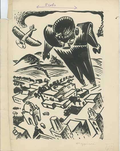
MEXICO, 1930. Before Iron Man, before Iron Giant, Mexico had TROKA. These illustrations come from the Vanguardia en Mexico exhibition at MUNAL, Museo Nacional de Arte, Mexico City.
The original illustrations were done in india ink by Julio Prieto in 1934. The quality of Prieto’s brushwork is evident in mural-sized reproductions of his artwork in the exhibition space. Visitors can don headphones to listen to the original TROKA radio dramas aimed at children.
The listening station is stylishly designed with wood and brass fittings to evoke the 30’s. Museum-goers seem transported by the experience.
According to the wall notes TROKA was the creation of author German List Arzubide. The giant android possessed the logic and intellegence to combat ‘religious superstition.’ …In 1939, a TROKA pantomime dance was created in which popular nursery rhymes and children’s folksongs were rewritten with rational messages. I’m paraphrasing, Spanish speakers can read the full details below.
In the 1930’s Mexico was deeply divided over the issue of religion. One little-known event that bogles the mind occured in Guanajuato. A Mexican Air Force pilot bombed the statue of Christ atop a mountain there. Some said it was pilot error. The faithful of Guanajuato built a much bigger statue which remains a pilgrimage site to this day.
Portrait of German List Arzubide by Jean Charlot, 1923. List was a true revolutionary, he rode and fought alongside Emiliano Zapata in the Mexican Revolution. He died in Mexico City in 1998 at the age of 100.
The exhibition continues at MUNAL until August 4. Viva TROKA!
This article originally appeared in “The Gonser Gazette” -the Friends of Kutztown Community Library’s newsletter.
Mural design superimposed on a photo of the Kutztown Community Library.
The Kutztown Community Library was selected once again this year to participate in Kutztown University’s “Designathon” for non-profit organizations. Janet Yost, Lisa Schnell, and I presented Kutztown U Communication Design students the tasks of creating a new mural for our library’s outside wall and a brochure to be used for promotion of a new upcoming children’s program.
The students, with guidance from several professors, had twenty-four hours (non-stop, no sleep) to complete the designs which included some very specific requests on our part. This was all done with no fee to our library. Their finished designs are simply fantastic as you will see when the final painting and printing are completed this summer.
KU CD Designathon team after 24 hours non-stop work. Kelly Arsi, Sean Miller, Torrey Smith, Ryan Gaylets, Prof. Elaine Cunfer, Margariete Malenda, and Zack Fogleman.
Wonderful as their work is though, I am even more impressed by the KU students themselves. They were polite and patient as they listened to our needs, enthusiastic about the process, and not the least bit daunted by the responsibility put before them. And worn out as those artists should have been at the twenty-four-hour deadline, they quite happily presented their finished products to us. They eagerly awaited our approval, which we gave them whole-heartedly. Some of them actually offered to help paint the mural for us this summer…..even though they will have already graduated.
In a world where there seems to be so much bad news, these KU students are the good news. They are well on their way to understanding how important it is to willingly donate time and energy to make a community a better place. I am happy to know that they, and so many just like them, will be an integral part of the future. Thanks to all of you dedicated parents and educators who have given them to us.
– Mary Jo Johnson, President Emeritus, Friends of the Kutztown Community Library
Mural detail showing homage to Keith Haring.
Editor’s Note: The break-dancing silhouettes pay homage to the style of Keith Haring, Kutztown, PA’s best-known artist. Turns out his parents are active Friends of the Kutztown Library, and the Harings gave their blessing to this use of imagery based on Keith’s signature style.
I met artist Maude White at Grit N Glory on NYC’s Lower East Side at an opening reception for Carrier Pigeon Magazine. Her medium is cut paper. She illustrated “The Girl Who was Struck by Lightning,” a quite peculiar short story by Chris Stanton. If there is a literary genre called Backwoods Surreal Noir, this story fits the bill.
Art: Maude White Text: Chris Stanton Carrier Pigeon Issue #9 Designer: Amanda Bixler
I’m a professor, so I naturally asked Maude where she studied. She told me she had never studied illustration. In fact, she only recently began taking classes at Buffalo State in areas that interest her. Maude’s artwork is quite wonderful. I tell my students one doesn’t need a degree to be an illustrator. Maude White proves that point.
I emailed her a few questions and apologized for the rather dumb one I asked her at the gallery.
“No worries about the college question! I went to a Waldorf School for my early, formative years. I think that influenced my art in many ways. Waldorf Schools place a very high importance on handwork and visual storytelling. Also, I come from a family of visual storytellers. My mother and my sister are both gifted toymakers, and my mother is a puppetmaker as well.”
Maude White at Grits N Glory
Who are your artistic influences?
“I am influenced by my mother’s art a great deal. When I was little she would make wool felt playscapes – little scenes of a tree stump in a forest-covered in plants and animals, a small garden scene with vegetables and apple trees, a playscape for the story The Three Billy Goats Gruff. It was these types of small, precious, complete worlds that drew me to working with paper. I like the idea of the stark contrast between the black and white paper, and the cut nature of the work makes my art more three-dimensional than paint on canvas. I have always been fascinated by small, hidden, secret things. I like the idea of looking in, or through. With paper cutting there are so many opportunities to create negative space that tells its own story, just by letting the observer become present in the piece, by allowing him or her to look through it. I like that.”
How did you become an illustrator for Carrier Pigeon?
“I met Russ (Spitkovsky, Editor-in-chief ) at the Book Fest at the Western NY Book Arts Center in Buffalo last summer. We were both vendors and our tables were next to each other. At the time I was making tiny carousel books with pop-out paper cut panels (a carousel book is a type of book that ‘pops’ out into a star shape). Russ and I got to talking and he expressed interest in having me illustrate a story for Carrier Pigeon. He sent me Chris Stanton’s ‘The Girl Who Was Struck By Lightning’ to illustrate for CP9. I never talked to Chris, but after CP9 came out he reached out to me via Facebook and expressed his delight over our collaboration. It was great, and I’m glad to have made that connection.”
“Currently I’m working on some large pieces, roughly 24 in. x 18 in. and very intricately cut. One is a giant hand, the other is an elephant. The hand will be exhibited at the Western New York Book Arts Center’s member show. Also, I am completing panels for a small 4 in. x 4 in. paper cut alphabet book. Each panel has the papercut letter and usually two things that relate to that letter. For example, ‘D’ shows a dragon blowing fire at a dandelion. ‘S’ has a snail sitting on the ‘S’ looking down at a ship. This has been a really fun project and the only ones I have left to draw and cut are WXY and Z.”
CP9, Carrier Pigeon, Issue 9, costs $25. Besides Maude White’s artwork there is much of interest, including linocut monsters by Bill Fick and a letterpress cover by Richard Kegler. I love Carol Fabricatore‘s illustrations for Ryan Scamehorn’s ‘Honor Among Thieves’ and the stunning portfolio of Alex Zwarenstein‘s figurative oil paintings. See more at www.carrierpigeonmag.com. As I’ve said before, $25 may be expensive for a magazine, but it is cheap for a work of art. My copy is signed and numbered #95 of 1000, and it smells like fresh ink. I once bought an 1894 copy of The Yellow Book, the London-based magazine art directed by Aubrey Beardsley for $20. Today that issue is on Amazon for $100. I believe Carrier Pigeon will prove as influential as The Yellow Book was in its day. I also expect the limited edition issues of Carrier Pigeon will similarly increase in value. As they say on Wall Street,“Past performance is no guarantee of future results.”
More Maude
Visit www.bravebirdpaperart.com to see more of Maude White’s work. You can purchase paper cuts or commission art. She also does felt jewelry. I asked Maude if she ever considered using a laser cutter. She told me she prefers a sharp X-acto knife, “It may sound weird, but I love to cut, ” she said, “I just enjoy the process.” She also shared one trade secret of her technique. She uses a silver colored pencil to sketch on the black paper before she begins cutting.
Ryan Bittle writes, “I have been influenced by the work of Neil Gaiman for over a third of my lifetime. I find his offbeat and eerie style fascinating, and I’ve made attempts at a few lackluster portraits, so I thought it was about time to make a good one in honor of all the inspiration Mr. Gaiman has given me over the years.”
Tessa Ports, is a graduating senior in Fine Arts. “I chose J. R. R. Tolkien because I’ve never been more amazed by the depth of someone’s imagination and their ability to dream.” With the exception of Tessa, the artists here are KU Communication Design majors, mostly juniors. All have had Illustration Techniques, the required sophomore-level traditional media course. Then they took Illustration 1 which focuses on digital illustration using the Wacom tablet.
For this project , students can use traditional or digital media. Erica Slough went digital and writes, “I chose Chuck Palahniuk because he has always been my all time favorite author. His books are pretty much the only books I ever read. I typically finish an entire book in days.”
The assignment insisted they choose someone other than an actor or entertainer as a subject. Many chose authors. Aubrey Cohen picked Maurice Sendak. She writes, “I chose to paint Maurice Sendak because his book “Where the Wild Things Are” is such a classic and I thought it would be fun to portray him like one of his beloved monsters.”
“I picked Nostradamus for his often stern look and the controversy that revolved around him. He struck me as a reserved man who was probably going crazy on the inside.” -T.J. Walston (below)
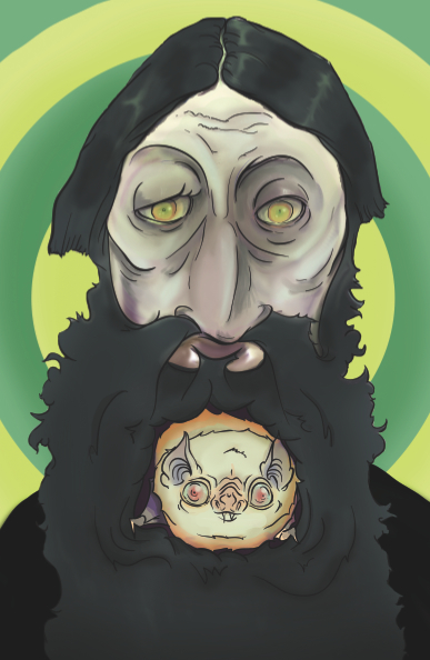
“I chose to do a digital painting of Rasputin,” says Hanna Stephey, “because his eyes are so distinctive and kinda creepy, I felt compelled to capture that creepiness. Also, I added an albino bat sidekick hiding in his beard, a la the animated film Anastasia.”
Rasputin @ Hannah Stephey, digital
These were not the only excellent portraits from this talented class. These were chosen to demonstrate excellence and diverse illustration styles. If you’d like to leave praise or constructive criticism, use the comments section. Thanks!
When I was a grad student I asked my teacher Marshall Arisman how to use the ancient lucigraph tracing machine in SVA’s illustration studio. He cocked his head back and laughed in my face. “You never used one of these? Good for you, I am not going to teach you!” I can’t find a picture of the exact model, but it had a big black bellows and a fan that sounded like a helicopter landing. Similar specimens can be found in Lou Brooks’ Museum of Forgotten Art Supplies.
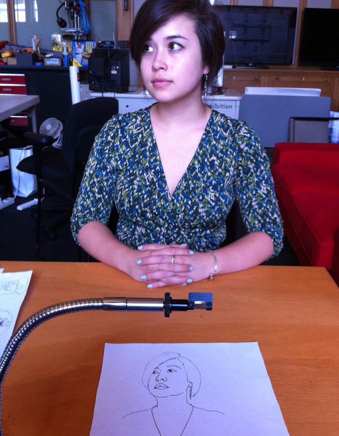
Prof. Pablo Garcia’s collection of camera lucidas.
Tracing devices, or optical drawing aids are not new. Camera comes from the Latin word for room or chamber, and obscura and lucida from dark and light. The camera obscura is the older and larger device. Aristotle knew of the device. It works with a pinhole or lens and projects a 2-D image on a surface. The camera lucida is a portable optical device that works in bright light.
Dürer’s woodcut of a draftsman using a drawing aid.
Fine artists often deny using such tools. Some illustrators are more honest. Norman Rockwell used Bosh and Lomb’s Balopticon, a projecting device with a 400-watt bulb. He said, “The balopticon is an evil, inartistic, habit-forming, lazy and vicious machine! It also is a useful, time-saving, practical and helpful one. I use one often—and am thoroughly ashamed of it. I hide it whenever I hear people coming.”
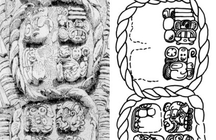
Copan Stela F (detail) by Catherwood and sketch from the “Maya Decipherment” blog.
I wrote about Frederic Catherwood when I was in the Yucatan in 2011. Catherwood braved disease, insects, snakes, and war to complete his illustrations for John Stephen’s “Incidents of Travels in Central America, Chiapas, and the Yucatan.” Catherwood hacked away jungle and rigged a camera obscura in a black tent in the tropical sun. His drawings, circa 1840, are so meticulously detailed that they enable epigraphers to decipher the glyphs today. Many such glyphs were lost to erosion or looters by the time photographers arrived decades later. The illustration above is from Dr. David Stuart of the University of Texas Austin’s Maya Decipherment blog.
The NeoLucida is the brainchild of two art professors: Pablo Garcia, who teaches Contemporary Practices at the School of the Art Institute of Chicago, and Golan Levin, Associate Professor of Computation Arts at Carnegie Mellon University. The NeoLucida Kickstarter was so popular it sold out within 16 hours.
They write: “Our first batch of NeoLucidas will also be our only batch—because, as we’ve explained, we’re doing this as a fun intervention, not to start a business. Once we’ve finished distributing the NeoLucidas, we will publish our designs, CAD files, and all of our supplier data with a liberal Creative Commons and Open-Source Hardware (OSHW) license, so that anyone who wishes can continue the project (including, potentially, commercially). Our design and other manufacturing information will appear on NeoLucida.com, Instructables, Scribd, and other appropriate sites. Sincerely, Pablo & Golan
Sorry I am such a slow typist. Had I posted this yesterday, you might have gotten in on the deal. But take hope in the fact that this is an open source provocation. Someone else will surely build on this idea. The video on the NeoLucida Kickstarter site is still worth a visit. It is a case study of a pitch perfect Kickstarter campaign. My favorite part is when Prof. Garcia earnestly explains “our suppliers require a minimum order of 500 prisms and thumb nuts.” Thumb nuts! The NeoLucida will come with a postage paid card to permit users to send their line art to an online collection. There may even be a book. I plan take my NeoLucida to Mexico and trace a glyph.
UPDATE: May 10. New limited edition of $40 NeoLucidas is slated to be announced on Kickstarter this evening at 6pm EST, linkhere.
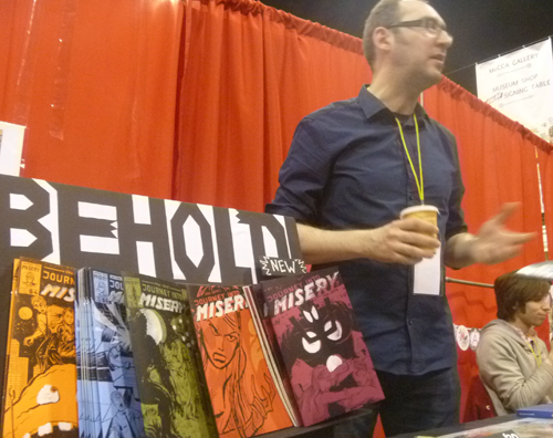
Paul Hoppe was at MoCCA fest selling prints and handcrafted zines. Born in Poland, he grew up in Germany and came to NYC on a DAAD scholarship. (DAAD is the German version of a Fulbright Exchange.) He got his MFA at SVA’s Illustration as Visual Essay program in New York City. Our Kutztown students were impressed by him. Jen Zweiger traded a copy of her very first zine with him. She says,”getting to meet and interact with international artist was a really profound experience.”
Paul Hoppe at MoCCA Fest 2013. photo by K. McCloskey
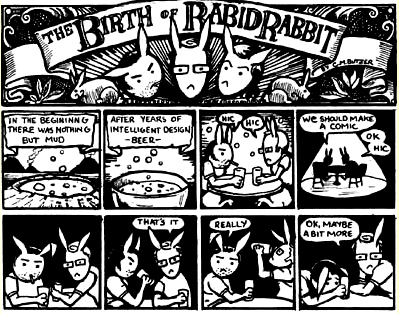
Nathan Hurst liked Paul’s advice to “network with a close knit group of trusted friends.” Paul told us how, in his final weeks of grad school at SVA, he and classmate C.M.Butzer realized they might never again have free access to a photo copier. They created and printed the comic anthology Rabid Rabbit which debuted at MoCCA 2005. It was a hit and SVA gave them a mini-grant to keep the zine afloat.
Paul said Rabid Rabbit grew faster than expected. They got submissions from all over the world. “A guy sent stuff from Australia, and we said Wow! Australia, That’s cool! We wrote to him, ‘You know we don’t pay, we aren’t making any money.’ He said that’s cool and so we printed his story, but mostly we were printing our own work.”
I told Paul how I once got a frank rejection note from Lawrence Ferlinghetti’s City Lights Press in San Fransisco. It said roughly, “Dear Author, Your work has merit; you should publish it yourself. We keep busy publishing books by our friends; try it with your friends! “ Paul said Rabid Rabbit worked on the same basic principle. They knew which classmates were both good artists and dependable, and those are the ones that got in.
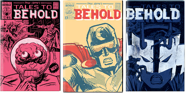
Paul is no longer involved with Rabbit Rabid, but he is still friends with his co-founder and co-conspirators. He is working hard on his nifty Beholder zines. He explained the series is “homage to super hero comics of the Copper Age.” Copper? I thought he was kidding. I’d heard of the Golden Age. I remember the Silver Age of the 1950’s and 60’s fondly. It seems there was also Bronze Age (70’s and early 80’s) and Copper Age (late 80’s) for comic books. Who knew?
Paul said his roots are in zines and “that’s what MoCCA is all about.” As he said on his own blog, “Income-wise, illustration prints and my graphic novel Peanut were the heavy hitters, (since they are more expensive). But I also sold more BEHOLDER books than any MoCCA before.”
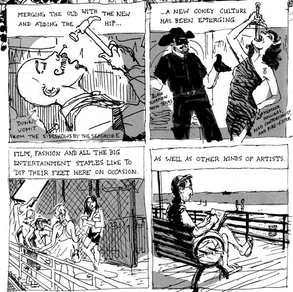
I remember where I first saw Paul’s work. Nonfiction graphic essays are one of my favorite things. I really enjoyed Syncopated: Anthology of Non-fiction Picto-Essays edited by Brendan Buford. It has lots of NY stories including an 8-page essay by Paul Hoppe on Coney Island.
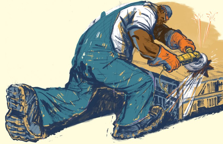
Paul has done all sorts of illustrations, ranging from editorial to advertising. His work for children’s books is energetic. The Midwest Book Review wrote of Metal Man, “The vibrant drawings of award-winning artist Paul Hoppe practically burst off the page.”
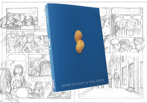
Paul’s latest project is a graphic novel for young adults, Peanut, written by Ayun Halliday. It is about a high school girl who fakes a peanut allergy to make herself more interesting. Publisher’s Weekly praised Halliday and Hoppe’s work, “It’s not easy being both hip and life- affirming, but this team has the secret formula.” The NY Times found elements of his cartooning style “especially brilliant.”
I’m not sure about the cover of Peanut, a photo of a single peanut on a blue field, not even a title! Paul is philosophical, “as an illustrator, sure, I would like my drawing on the cover. But as graphic designer I admit it is quite brilliant. It’s different, eye-catching and stands out in the bookstore. If that gets more people to pick it up, then I love the cover! ”
Paul Hoppe updates his Beholder site with a new page every Monday. Check out cosmicbeholder.blogspot.com Paul warns it is sometimes NSFW. I had to look that up. It means Not Safe For Work. I’m lucky I teach illustration; looking at comics is part of my job.
………………………………………………………………………………..
Sprechen Sie Deutsch?
Speaking of graphic novels, Prof. Lynn Kutch of Kutztown U has created a new site devoted to The German Graphic Novel. Primarily a resource for language teachers who want to introduce cutting-edge German Graphic novels into their courses, it offers illustrated reviews. Graphic novels of all sorts are classified under broad headings: Biography; Literary Adaptations; Horror; Crime; Modern Life. There are links to individual artists, writers, publishers, and in some cases, to German web-comics. Worth a look, even if you don’t read German, to see what is being published in Berlin and elsewhere in Germany.