My friend, César Chávez, a great young Mexican artist, is in Kutztown. He was the master printer for the ASARO collective back in 2006 when Oaxaca’s streets were filled with tear gas and protesters’ blood. After a teachers’ strike got out of control hundreds of thousands of people marched on Oaxaca and took over of the city. At least 20 people, probably many more, were brutally murdered by right-wing gangs and policemen. U.S. media covered the story briefly when Brad Will, an Allegheny College grad, was shot dead while photographing a march.
Things settled down by 2007 when I met César in the then clandestine studio of ASARO, or ” The Assembly of Revolutionary Artists of Oaxaca.” By day ASARO sold prints in the street, at night they stenciled or pasted their political art on the city’s walls. I curated one of ASARO’s first U.S exhibitions at Kutztown University’s Library. Despite a budget of $300, The Allentown Morning Call called KU’s show one the best exhibitions of 2007. The KU ASARO collection traveled to other schools like Ohio U., Marwen in Chicago, and UNC, Charlotte. Many other supporters spread the word about ASARO. Princeton University created a website of their ASARO prints. The best digital archive is at Massachusetts College of Liberal Arts’ Art of Dissent website.

In 2008, along with Dr. John Pohl of UCLA, I curated a large Oaxacan print exhibit, La Tinta Grita, The Ink Shouts, at LA’s Fowler Museum. The L.A. Times wrote, “Even if you know little or nothing about the complex political events that inspired it, the art’s technical skill and emotive power is hard to miss.” It was a big event. I got to fly out to California for the exhibition. Unfortunately, no ASARO artists were able to attend, even with official invitations. The U.S Embassy in Mexico City denied them entry visas.


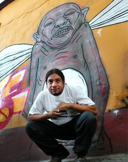
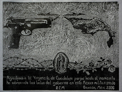
Kutztown University is fortunate César managed to negotiate the red tape. Though he has been a visiting artist in Spain and Japan, this journey to Kutztown is his first to the US. It is difficult for a young single male from Mexico to get a visa to come to the U.S. legally. His visa fees came to $320. Interestingly, Mexicans are charged fees that others, Canadians, for example, don’t have to pay.” Angel” mixed media drawing, by César Chávez

It is far easier for U.S citizens to visit Mexico. I’ve been back to Oaxaca every year since 2007. I’ve had the privilege of working the hand-cranked printing press beside César late into the night. He and I hung an exhibition of prints dedicated to the murdered women of Juarez at ASARO’s Espacio Zapata Gallery.
Born in 1979, César is one of ASARO’s senior members. I’ve watched him patiently mentor the younger artists of the crew. He calls me “maestro,” teacher, but the truth is César and his young compadres have taught me more than I can express about the power of creativity and community.
César Chávez: KU Residency: DATES & TIMES:
César Chávez Exhibit: Oct. 4-16, CVPA Student Gallery, Sharadin Building. Reception: Oct. 12, 3:30-6 p.m.
Eckhaus Event: Mexican Potluck Dinner & Oaxaca Videos. Oct 6 at 6. 157 W.Main St. Kutztown
Charla with language students (in Spanish) Oct 11 at 11. Defran 120.
He will spend much of his time in Sharadin’s Printmaking Studio. As a Visiting Artist, he will demonstrate relief printing techniques for Kutztown art students, as well as create a new print in the studio.

The Communication Design Dept. has been most generous in helping César’s journey. Dean Mowder and Prof. Evan Summer have also been supportive. Rohrbach Library and the Modern Language Dept. have lent a hand. Torrey Smith designed a super exhibition brochure. Thanks to everyone who made or bought the fundraising prints. You saved the day.


