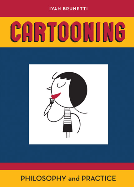
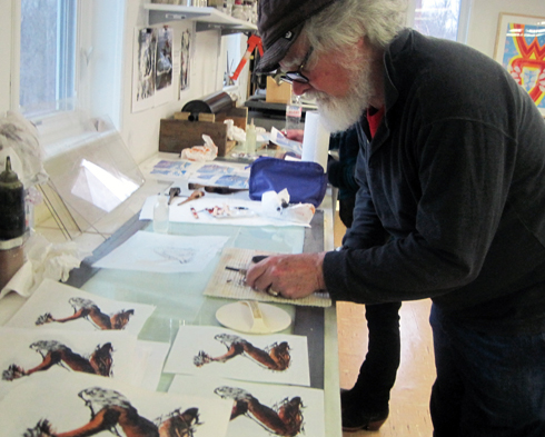
Ivan Brunetti’s Cartooning Philosophy and Practice is published by Yale University Press. Brunetti combines a lovely spare drawing style with an occasionally overwrought writing style. I do dearly love this little book, but at times find his writing style infuriating.
Brunetti’s prose slips into and out of quotation marks, parenthesis, often for no clear reason. I felt I was hearing a “sermon” and the minister (randomly) switched to a parrot’s “voice” every now and “then.” I am exaggerating slightly. Here is an actual sentence from Brunetti’s introduction:
With writing, I do not give the “form” any thought at all, since writing comes more naturally then drawing for me (I am a windbag by nature) and I could not a adopt a “style” even if I tried; however, with drawing, I still feel that I am confusedly “building” something by trial and error.
Brunetti’s illustrations, on the other hand, are a clean and spare. He has drawn for the New York Times,The New Yorker, and even for Scooby-Doo. He edited a “scholarly” (now, he’s got me doing it!) two-volume anthology of the modern masters of comics for Yale Press.
Cartooning Philosophy and Practice is a worthwhile text for a comics class at the high school or college level. It is the winner of the 2012 Will Eisner Award in the best book in the Academic category.
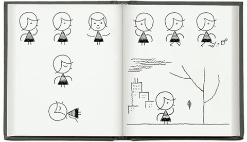
The text reviewed here last week Drawing Words/Writing Pictures is a much bigger, more comprehensive book and includes work from lots of artists. Brunetti’s Cartooning is a pocket-sized book that is illustrated exclusively with his own drawings. Comparing the two volumes is like comparing a Hummer limo to a Fiat.
If I had to pick one cartooning book to smuggle into a prison or carry on a road trip it would be Brunetti’s. His idiosyncratic voice either grows on you, or it doesn’t. (Ok, it grew on me.) His lessons are clear and good. To get a better idea of his style visit the Yale Press page where Brunetti shares one of his cartooning exercises in a brief video.
There are a handful of good books that will help the motivated student succeed at becoming a cartoonist. Drawing Words and Writing Pictures may be the best of the lot. This is an ideal text for a 15-week class in comics. It also has guidance for starting an informal collective class. It includes DIY suggestions for the stereotypical solitary artist, who the authors are gracious enough to refer to as ronin. There is a wealth of info on the narrative process, page design, lettering, pens, and even Photoshop scanning advice.
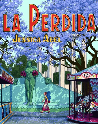
The book contains the perspectives from two remarkable artists, a gifted husband and wife team. Matt Madden is into “formalist” styles, working within Houdini-like constraints. Jessica Abel‘s La Perdida is one of the great masterpieces of the long-form graphic novel. From George Herriman to Robert Crumb, Charles Burns, to Kaz and John Porcillino, the book is crammed with a diversity of styles. Wide-ranging and inclusive, no matter what one’s preferred comics style, from manga to superhero to alternative, you will find something to like here.
In 2012 Abel and Madden created a second book: Mastering Comics. It has more info on color and web comics and up-to-date information about publishing and professional practices. The authors, who have both taught at SVA, have created a super web site: dw-wp.com, that serves as a resource for teachers and students. The site is especially valuable if you live in a part of world where can’t get your hands on their books. For an example of its riches, check out their instructions on how to make the mini-mini-comic they call a “foldy.”
Scott McCloud’s Making Comics came before the above books. McCloud’s 1994 Understanding Comicswas groundbreaking, a thoughtful overview of the field. McCloud’s books are also useful texts for serious students who have some background in thinking critically about the art form. Right now (Jan. 2013) Amazon has special deal, you can get both of the Drawing Words/ Writing Picture books plus a copy of McCloud’s Making Comics for $61.49. The set would make a good core for any comics creator’s library. That’s 3 books for less than I paid for my used Spanish textbook. There are a few more good books on comics that I will get to next week.
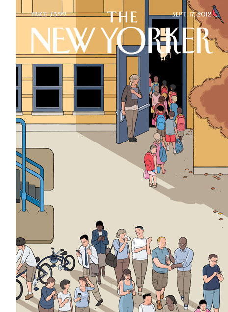
Chris Ware illustrated September’s back-to-school New Yorker cover with a scene of parents turning their backs on their children, immersed in their own digital devices. This week he did another cover that brilliantly reflects how the Sandy Hook Elementary School shootings changed the dynamic between parents and children.
On this 2013 cover our point of view is 180 degrees different. It is dark inside the school. We see the children’s dazed expressions. The parents outside are trying to stay connected as long as they can. Ware shares his thought process about these powerful images on the New Yorker’s culture blog.
“In September, I pictured, more or less, my daughter’s teacher and her class on a back to school cover that jokingly pointed to the free time parents would have now that their kids were back in class…something I saw every morning, and I thought it would make a sort of funny picture. In the wake of Newtown, it didn’t seem so funny anymore.”
Happy New Year. The WordPress.com stats helper monkeys prepared a 2012 annual report for the illustration concentration blog.
We had 39,000 views in 2012. The post that got the most views was a 2010 story about KU grad illustrator Amanda Geisinger working with Spongebob Squarepants. Next is a story about the folk art tradition of Kolam. That story gets a lot of traffic from India, presumably from artists who know more about it than I do. The post features Prof. Josh Miller before he came to Kutztown University.
The surprise search term that bring folks to this blog is “pigeon sketch.” I wrote about my project drawing pigeons at Vinnie Torre’s loft in Hoboken. Vinnie helped me refine the sketch above; he thought it looked too much like a street bird. Every day a couple of people arrive at the blog by googling “pigeon sketch.” I guess art teachers are asking students to sketch pigeons, but instead of going out to the park, these students are copying mine. I can upload more pigeon sketches, but kids, pigeons are not that rare a bird.
The detailed 2012 stat report for the blog can be found here.
Back in the ’80’s, when I told my pal Putka I was getting an MFA in illustration, he laughed, “What’s next? -a Phd in Wallpaper Hanging?” What’s Next?Looks like the answer is Advanced Comics…
Stanford is a great university with one respected graphic novel class. But suddenly, universities across the country are offering complete advanced degrees in comics. CCS, the Center for Cartoon Studies, in Vermont has offered a Comics MFA for several years. CCS is not to be confused with CCA, California College of the Arts in San Francisco which is launching a new low-residency MFA in Comics in 2013.
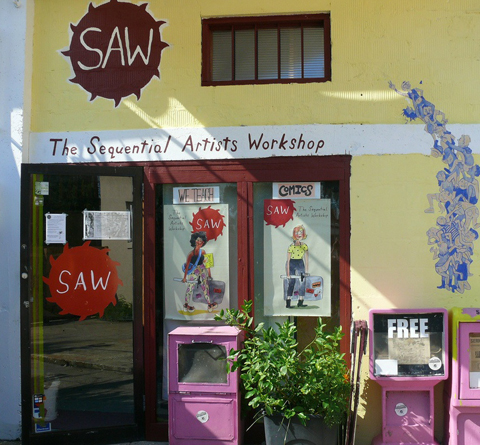
A curious new educational option has sprung up in Florida. It is called SAW for Sequential Art Workshop. Cartoonist Tom Hart who taught for a decade at SVA in NYC has relocated to a storefront on So. Main St. in Gainesville. There, with a group of dedicated faculty and students, he has begun an intensive comics course. SAW’s one-year intensive program is not an accredited MFA, but it cost far less, $3600.
Student show at Saw, August, 2012, used with permission.
A student told me this, “Another reason I chose SAW over a degree program is that SAW is very inexpensive, but provides the opportunity to work with really amazing faculty. And though there’s no degree, I believe that in the art world your portfolio is more important than having a degree. So the quality of the education is more important than the diploma.”
Any advice for young artists interested in making zines and comics?
Same student, who now wishes to be anonymous: “Do just that – make zines and comics! Make them and get them out into the world. Trade them with other creators, go to conventions, put them online – get your work out there. And, even more importantly, keep making work. It can get discouraging when it feels like no one is listening, but you just have to keep on going. Don’t get too hung up on your early work, either – your first comics probably won’t be great, so finish them and move on. Set goals by the project. If you make a mistake or don’t like the way it’s turning out, finish the project and then try not to make that mistake in your next one – but don’t get discouraged. Also, even if you think you are going to draw in the most flat, cartoony style, still take the time to learn traditional art skills because your drawing can always benefit from them. If you don’t want to go to a traditional art school, look for local figure drawing sessions or evening classes taught by local artists. Or, better yet, apply to SAW! “
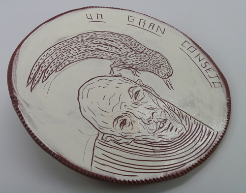
“Un Gran Consejo” or “Great Advice,” César Chávez, 2011
Our 2011 visiting artist César Chávez of Oaxaca, Mexico left a great impression on Kutztown University. He also left a number of plates.
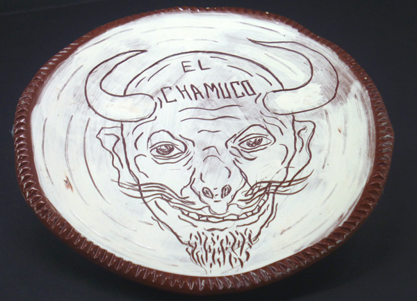
“El Chamuco” by César Chávez, 2011.
Ceramics Prof Jim Chaney formed a half-dozen red clay plates, then iced them with a coat of white slip, or diluted clay. He invited César to the ceramics studio to draw. Prof Chaney speaks some Spanish and once did a ceramics workshop at the University of Azuay in Ecuador. Even though César spent most of his time at Kutztown in the printmaking studio, he was happy to spend one very productive afternoon in the ceramics studio.
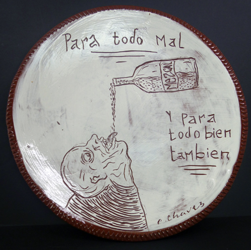
“Mescal” César Chávez, 2011
César is a happy fellow who often draws moody, morbid sketches of the human condition. The plate above suggests mescal, Oaxaca’s agave-based alcohol is “Good for Nothing and Good for Everything.”
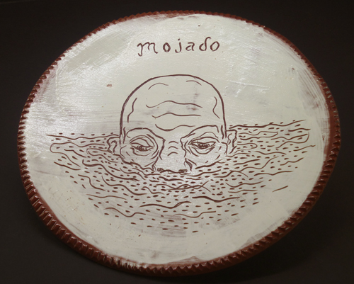
“Mojado” by César Chávez, 2011
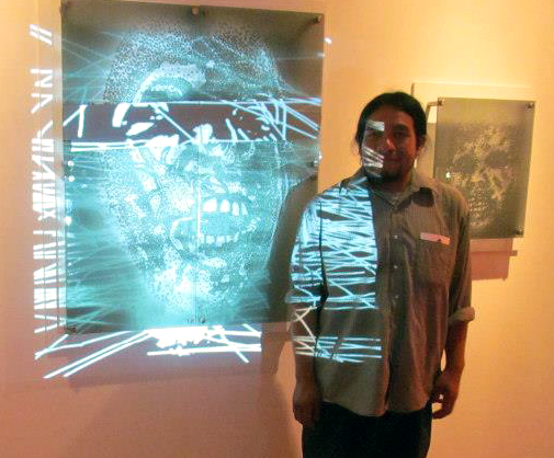
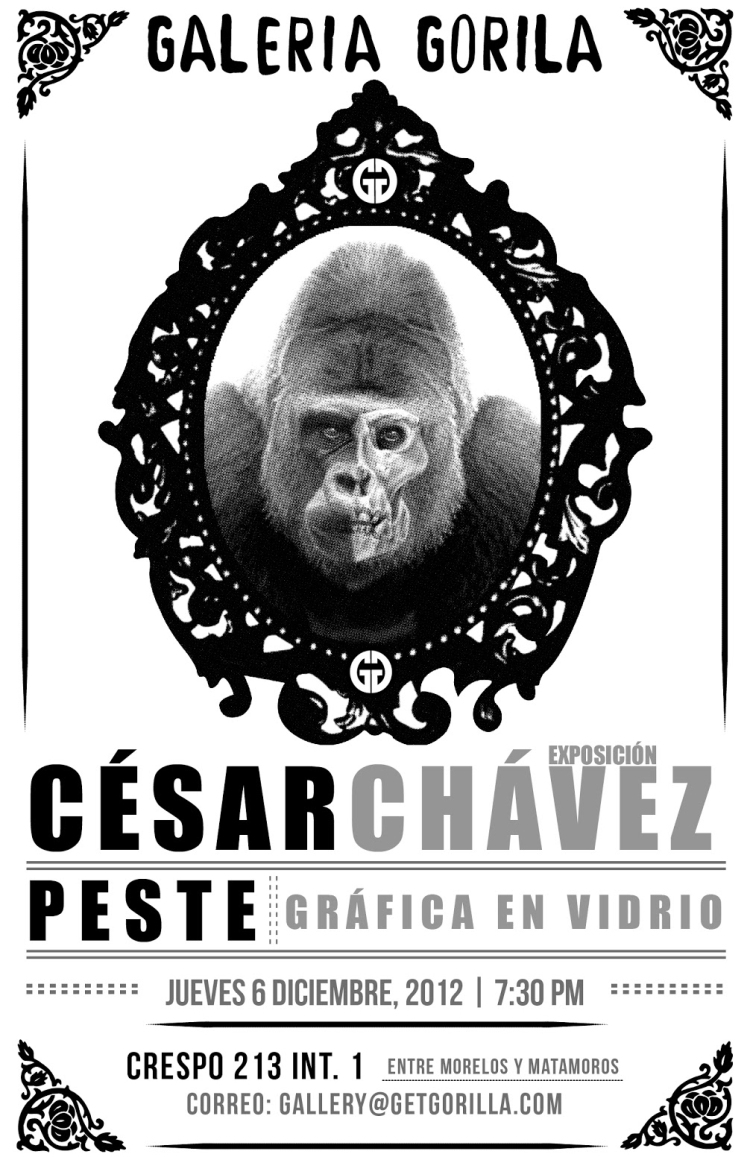
Interestingly enough, César is back in Mexico and working in another new material, glass. He has been working with artist Jason Pfohl who founded the international art glass and jewelry studio, Gorilla Glass, in Oaxaca. César’s one-man show “Peste” (Pestilence) opened at Gorilla Gallery this week. He is printing multiple impressions from etched and melted glass. I’ve never seen anything quite like it. César is also continuing his ongoing experiments in computer animation and image projection.
César Chávez, photo courtesy of Gorilla Gallery, Oaxaca, Mexico
César told Gena Mejia of the Imparcial newspaper that he is excited by the infinite possibilities of working in glass. It appears fragile, but can be a strong and very versatile material. If you can read Spanish the full story can be found here. César Chávez is an inspiring artist, a 21st century renaissance man, always searching for new materials in pursuit of his artistic vision.
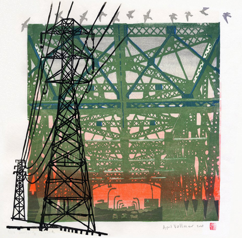
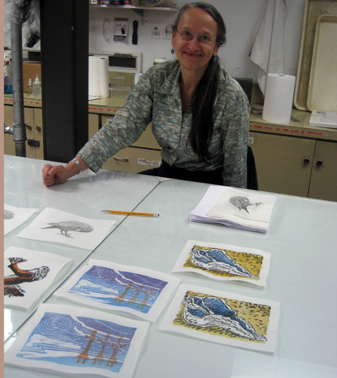
April Vollmer demonstrates how to carve registration notches on woodblock.
April Vollmer recently taught a two-day Moku Hanga workshop at the Printmaking Center of New Jersey. KU Prof Elaine Cunfer and I took the class along with five other students. I know a bit about Japanese prints, but had never tried my hand at the traditional Moku Hanga woodblock printing technique. April, a great teacher and printmaker, has travelled to Japan to perfect her skills. She has an extensive gallery of her prints online at aprilvollmer.com.
Moku Hanga is nothing like my prior printmaking experience. I am used to the down and dirty printing of Oaxaca or Tom Huck’s Evil Prints. Moku Hanga is far more refined. I came to class dressed in my ink-stained black shirt and raggedy painting jeans. I learned there is no need to dress like a hobo to print Moku Hanga. The pigments are water-based and do not stain clothes like oil-based relief printing inks.
April suggests beginners might start printing with tube watercolors, but a more economical color can be had by mixing pigments. She uses the pigments from Art Guerra. For wood and carving tools she recommends McClain’s Printmaking Supplies. The wood we used was shina plywood, imported from Japan. The shina and carving tools are rather expensive. A small, 8 by 10 inch, piece of shina ply costs $6.35. April says the expense is due to the currency imbalance between the Japanese yen and the U.S. dollar. If you have never used real shina ply, it is a joy to carve. McClain’s will send you a free sample; find details here.
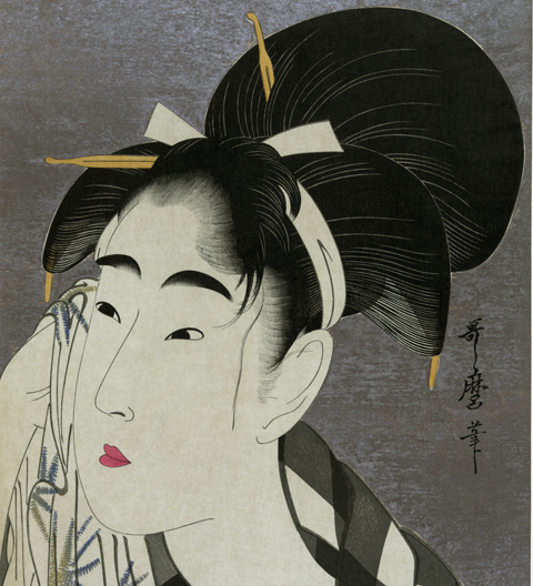
Ukiyo-e print by Utamaro, circa 1800, printed with mica background. (Wikipedia)
April showed us master Ukiyo-e prints by the likes of Morunobu and Utamaro before demonstrating her technique. One of the secrets of the art is cutting a precise registration corner and landing pad for the printing paper. The best paper, naturally, comes from Japan.
More of April’s tips: Your work table should be about navel level. Printing is not done with a press, but by rubbing the baren, a light weight disk, on the back of the paper. Printing starts from a balanced standing position with a quick burst of energy using upper body strength. April says she can print faster with a baren than printmakers who use a press. She claims she can print an edition of 25 in one morning and I believe her.
K. McCloskey making prints of St. Francis. photo: Elaine Cunfer
She also demonstrated the proper way to hold the paper, set up one’s workspace, and sharpen cutting tools. There was one student who had no prior printmaking experience; even he came away with successful prints. We managed to do an edition of two-color prints with a single block of shina by carving the second color on the reverse side. If you have the opportunity to study with April Vollmer, you can learn a great deal in a brief amount of time.
April Vollmer seems pleased with her students’ prints at Printmaking Center of NJ
For more insights into the history and current state of Moku Hanga (also spelled mokuhanga) check out April Vollmer’s comprehensive essay in Art in Print.There is also a brief (4-minute) documentary video filmed by Dempsey Rice of April Vollmer at work, here.
……………………………………………………
UPDATE: Dec.12, 2012: April Vollmer sent a note about the post above: “I hardly recognize myself your review is so flattering, but it is great to have someone describe the class. I always have fun, and people learn a lot. I always talk about the history, and how the technique fits into Japanese culture. I do hesitate about the refinements, it can be overwhelming. But my printmaking career (if one can call it that!) has been about making mokuhanga accessible, less precious, but without throwing out the baby with the bathwater. Good tools and good paper are such a pleasure, and actually much more affordable than, say, coated digital paper, computer software, etc. I paid $120 for my large soainomi (fan-beveled chisel), but I have had it for 20 years already!
Printmaking in NY is very different from Mexico, and that is completely different from Japan…The shina (basswood) plywood from Japan is good not only because of its even grain, but because the glue between plys is very thin and waterproof. Printing wet makes more demands on the wood than oil base does. Shina is also very lightweight which I appreciate, having to carry it around all the time!”
She also noted that she has met the legendary Tom Huck and went bowling with him when they both taught at Frogman’s Print Workshop in South Dakota.
Signage for Christmas Story at Broadway’s Lunt-Fontanne Theatre, NYC
I know the purpose of higher education is not job-training. Still, I must admit there is nothing that warms this professor’s heart more than getting an email with the subject line: Hey Prof, I GOT A JOB!
Ethan Ross, NY designer, KU CD grad, class of 2012.
Ethan Ross wrote to say, ” I have been working full-time as a Junior Designer at aka NYC. I interned here over the summer and they offered me the job. The company is located in the Theater District in Manhattan and exclusively does advertising for Broadway. Right now our biggest shows are: “Matilda the Musical” and “GlenGarry Glen Ross.”
Ethan designed posters, signs, and banners for Christmas Story, the Musical.The image above is peppered with quotes from Jean Shepard’s beloved holiday tale, notably, “Oh My God, I shot my eye out!”
Ethan got to do edgier design work for the new rock musical, BARE.
Ethan Ross’s poster for BARE, an Off-Broadway musical
Ethan describes Bare as an “Off-Broadway musical about teenagers attending a Catholic boarding school and trying to find their own identities. I am the lead graphic designer on this show and have worked with a creative director from the beginning. In addition to the poster, I designed a direct-mail piece and a series of illustrations that are being used on the show’s social media outlets.”
He has also been doing a lot of art for Bare‘s Facebook page. Bare opens this week, Nov 19, at The New World Stage, 340 W 50th St.
I wrote to Ethan asking how he fared during Hurricane Sandy. He wrote back, “Sandy didn’t affect me much, thankfully. I live in Marble Hill in the Bronx which is pretty far north and on top of a cliff, so I didn’t have to worry about flooding or losing power. The only inconvenience I experienced was when the subways shut down after the storm I was essentially trapped for a few days.” Clearly, Ethan has adjusted to life beyond Kutztown. We expect to see more great things from him.
“I’ve been called the father of the graphic novel, but I demand a paternity test!” -art spiegelman.
I caught art spiegelman’s “What the %@&*! Happened to Comics?” at Lehigh University. One of the most influential artists of our time, I knew him before he won the Pulitzer for his graphic novel, Maus. Even though we are nearly the same age, I was once his student.
In 1985, I took his comics course at the School of Visual Arts. It was the History of Comics, but included some drawing projects. I recall one interesting assignment. Each student in the class did a zine based on a different letter, picked from a hat. I got “S.” Then the 26 zines were wrapped together in a cover that evoked a Campbell’s soup can. He called it Alphabet Soup and he arranged for it to be sold at Manhattan’s Printed Matter.
art spiegelman, guest star on the Simpsons
I’d heard many of his one-liners in class. Still, it was great to hear him again at Lehigh. I brought my camera, but just as they dimmed the lights there was a “No cameras, No recording devices!” announcement. Luckily, I had my Moleskine sketchbook, which is a permissible sort of recording device, I suppose. I took notes of his comments and did the quick sketch above. I added color in Photoshop at home.
“Definition of graphic novel: comic book that needs a bookmark. ” -art spiegelman.
Nancy by Ernie Bushmiller
“In the period following world War II, Nancy was the most read comic, not because it was the best, but because it took more effort not to read it, than to read it.”
“My wife says I should take pride in my two great achievements, the first is Maus, second – Not permitting Maus to be made into a film.”
Roy Lichtenstein’s pop art painting Whaam, image from Wikipedia
“Lichtenstein did no more for comics than Warhol did for soup.”
Back in the day, I remember spiegelman always insisted his name be written in lowercase letters, like e.e. cummings. That’s why I am overriding spellcheck, for the sake of art, art spielgelman.
Saturday I took the early bus from Kutztown to New York City to deliver a print to a downtown gallery. I’ve shown my illustration work at the Society of Illustrators during their teacher shows, but this will be different. This is a juried “fine art” exhibition at Sacred Gallery, 420 Broadway. Emerging from the Canal St. subway station at noon I made my way east through the sidewalk bazaars of fake Fendi and Gucci. On Broadway I looked for a ‘Sacred’ sign. Looking up, through the railings of a fire escape, I found the words, “Sacred Tattoos.” Tattoos? A hoarse Chinese man stood by the doorway repeating, “Watches, Watches, Watches, Watches.”
I climbed the stairs past boldly lettered warnings. “Stairway Under Surveillance by Camera 24/7.” Another sign said, “Photography Strictly Forbidden.” I entered the tattoo parlor and a lean young lady glanced at me. She had short black hair and was dressed in black jeans and black t-shirt. Her only touches of color were the serpentine tattoos covering her forearms. She said, “You are here to deliver art?” The big flat parcel in my hands gave me away.
Vincent Castiglia’s blood collection tools and brushes
She pointed me toward a large, well-lit, gallery. On the walls was a one-man show by NY artist Vincent Castiglia. Mostly figurative, expertly rendered, nicely framed, the work was strong. The media was shocking. Everything was painted in pale reddish brown washes -of blood. I looked around at all four walls, blood, blood, blood, and more blood!
The artist uses his own blood. According to the gallery’s press release, “In the privacy of his studio, Vincent practices a kind of modern-day phlebotomy, siphoning the life force which contains his own psychic energy, while giving it an outlet and form. In doing so, he dissolves the barrier between artist and art in a most literal and immediate sense.”
Castiglia’s large blood paintings were priced in the thousands of dollars. On the other hand, he sells his hand-signed posters for the MTV horror film, Savage County, on his website for only $25. The poster is printed with archival Lucia inks. For $25, what do expect? Blood?
To see more of Castiglia’s art, head to his website. To learn more about Sacred Gallery, check here. The Art of Democracy print show opens at the Sacred Gallery, Sat. Nov 3. There is a reception 8-11pm. You are cordially invited. My print, below, will be there.


