Sweet Salvation

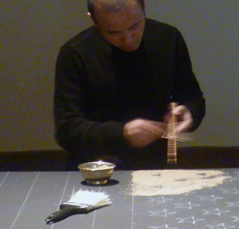
Jiawei Gong made an American flag from sugar at the Reading Public Museum. This art work, created in early June, will be on view until July 8. Tibetan monks traditionally use colored sand to create mandalas, often composed of circular shapes based on Buddhist cosmology. Jiawei is not a Tibetan monk, he is a Chinese-born Professor of Fine Art at Kutztown University. This is not a traditional mandala, nor a traditional stars and stripes. The 50 stars are white sugar. Dark and light brown sugar replace the blue field and red stripes.

Jiawei’s tools are authentic. He briskly runs a metal rod along a long fluted copper funnel filled with sugar. The right level of vibration sends sugar grains spilling consistently from the funnel’s tip. Jiawei allowed visitors, including me, to try our hand with these tools on a second platform. His wife Wen assisted him ably, but I found the process is not as easy as it looks.

Jiawei Gong assisted by his wife, Wen, working on Sweet Salvation.

I asked Jiawei about the meaning of the work. He told me to look at the words on the wall. I looked at the museum wall expecting to see a statement.  “Sweet Salvation” -is all it says on the wall. Jiawei, I think, wants each viewer to come away with their own meaning. Sweet.

More of Jiawei Gong’s work can be found at www.jiaweigong.com

Invite to Type Book Launch

Kutztown University Prof. Denise Bosler wrote our most popular guest post, Making it as an Illustrator.  She also knows a heck of a lot about typography and wrote the new book, Mastering Type, published by How. How is hosting her webinar, a virtual book launch, for Mastering Type on Tuesday, June 19 at 3pm. It is free, just register here.

I got an advance copy of the book. It is profusely illustrated with great work from designers around the world. For me it is exciting to see the inclusion of so many fine designs by Kutztown grads. There are award-winning works by star graduates: Jason Santa MariaSean CostikRoss Moody; and Amanda Geisinger.

Award-winning Middletown Lumber logo by Sean Costik

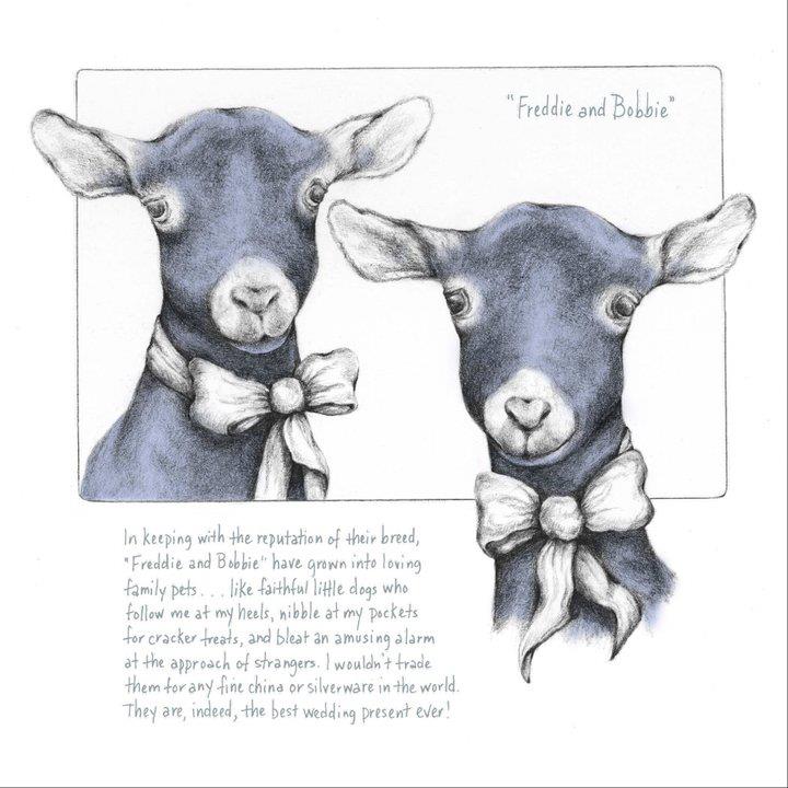
There is also art by recent grads including Cheryl Sheeler. The image below is from Cheryl’s visual essay on a most unusual wedding present – a pair fainting goats. This image was used in the book to demonstrate how hand-lettering can be an intrinsic part of an illustration.

Artwork © 2011 Cheryl Geiger Sheeler

If you can’t make virtual book talk, well, get the book, Mastering Type: The Essential Guide to Typography for Print and Web Design. There is a free online excerpt here.

STAN MUNRO Artist & Toothpick Engineer

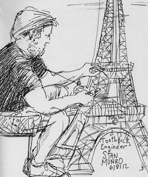
I met Stan Munro at the Reading Museum. He is an interesting guy. He was seated in the center of the museum’s lobby with a case of toothpicks and a container of Elmer’s glue. He was building the Eiffel Tower.

Stan Munro at the Reading Museum, sketch by Kevin McCloskey.

Families came to watch him work. Sometimes Stan handed wide-eyed kids wooden nickels he had individually handcrafted from toothpicks. Kids love his work. When Stan was in 5th grade at Wayland Elementary School in upstate New York, his art teacher gave the class a toothpick assignment. They were challenged to build a protective tower for an egg. Not everyone took the assignment as seriously as Stan. His tower, he says, “was basically a three-story pagoda form, about ten inches tall, built with lots of triangles, strong shapes.”

Maya Temple, Chichen Itza, Yucatan, Mexico

Some kids balanced books on top of their egg holders. Around the room eggs were cracking as Stan worked on. He finished his pagoda and placed it on the floor beside his desk. Stan put a book on top of his tower and it didn’t even creak. Stan piled on all his 5th grade textbooks. It still held. Then came an “aha moment.” With help from classmates Stan lowered his overturned desk onto his toothpick pagoda. It held. The crowd went wild.

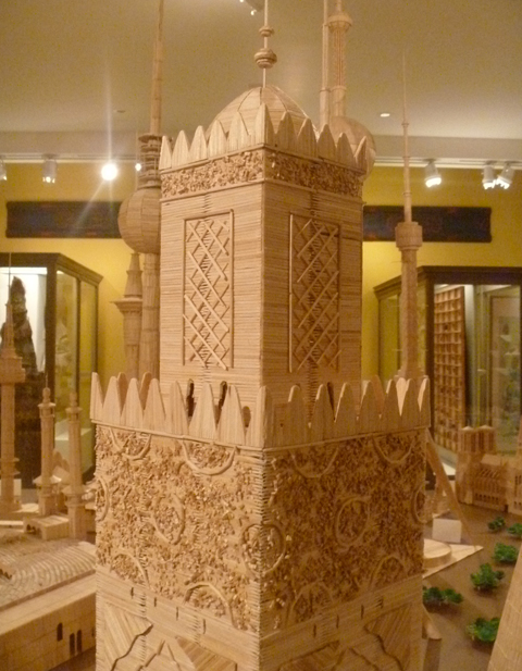
King Hassan II Mosque, Casablanca, Morocco (detail) by Stan Munro

That was over 25 years ago. Stan still remembers that moment as the highlight of his school career. Stan did not study toothpicks in college. He went on to become a journalist. He married a doctor, the love of his life, Suzi. One day, Suzi became very ill. She became bedridden with a rare kidney and liver disorder. Suzi was put on a waiting list for organ transplants. She was able to stay in their home much of the time, but needed specialized hospital equipment in the house, including a dialysis machine. Stan gave up his jobs to stay by Suzi’s side.

Sometimes he got frustrated. What could he do? Suzi had heard the story of Stan’s pagoda many times. She asked Stan to build her a toothpick tower of her favorite skyscraper, New York’s art deco masterpiece, the Chrysler Building. Stan remembers this as the most difficult thing he ever built. By trial and error Stan found the right sort of toothpicks (square with round ends) and the right sort of glue (Elmer’s).

“I ♥ Suzi.”

Stan also rediscovered the path of his life. He began building toothpick towers from around the world.  “Towers are easy,” he says. Next he began creating toothpick temples, sacred buildings, from all cultures. Somewhere on every piece Stan leaves his mark, not his signature, but “I ♥ Suzi.”

The Vatican by Stan Munro and The Raising of Lazarus by Tintoretto.

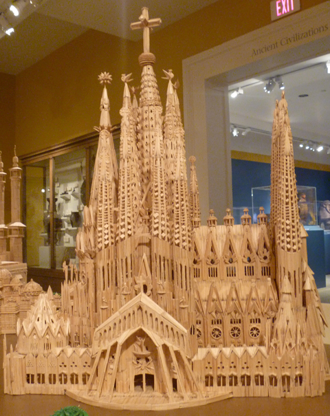
Stan told me he is most proud of his version of Barcelona’s Catholic cathedral, Sagrada Família, the Sacred Family. The architect Antoni Gaudí worked on this church from 1883 until his death in 1926. The actual Sagrada Família is still under construction. It may not be completed for years. Stan based his finished toothpick cathedral on Gaudí’s original sketches, even though present-day architects have been accused of altering Gaudí’s vision.

Toothpick World opened last week and will be on view at The Reading Public Museum through the end of 2012. There are toothpick towers and temples throughout the museum. The Reading Museum is to be applauded for the brilliant placement of the toothpick St. Peter’s Basilica in front of Tintoretto’s Jesus raising Lazarus. It is inspiring to see the myriad houses of worship side by side. The Little White Wedding Chapel in Las Vegas stands beside Mecca’s Grand Mosque. Jewish, Muslim, Protestant, Catholic, Baha’i, Maya, all coexist peacefully in Toothpick World. Watching Stan build the tower in the lobby I noticed how he controlled his breathing for the delicate placement of each gluey toothpick. His measured breathing is a sort of meditation. His towers, especially his temples, are visible manifestations of his meditations. Is it too much of a leap of faith to call these towers visible prayers?

Stan Munro’s Sagrada Família, Barcelona, Spain, original by Gaudí.

Stan is clearly a storyteller, a visionary, an educator, and a business man with a plan. Toothpick World, LLC, is a traveling exhibit corporation. I asked Stan if he thought of himself as an artist. “Artist? –No,” he said, “I call myself a toothpick engineer,” and he handed me his card.

Stan Munro’s business card.

In my book, Stan Munro is an extraordinary artist. By the way, he can travel more now because Suzi is doing much better. She got double organ transplants at the Mayo Clinic, and her surgeons say that her recovery is nothing short of miraculous.

For more info visit: www.toothpickworld.com

Take a Line for a Walk

“Whereas Picasso, Matisse, even Mondrian and Kandinsky concentrated on abstracting from perceived reality, Klee began with a point, extended it into a line and famously took it for a walk wherever it wished to go.” Bridget Riley from an essay quoted here in the London Times Educational Supplement.

Robin Landa, a design professor at Kean College in NJ sent me a copy of Taking A Line for a Walk: A Creativity Journal. It is designed by Modern Dog. It is got me thinking about the nature of blank books.

Blank books and sketchbooks like the famed Moleskine, for example, are not cheap. Walk into a Barnes and Noble and in the Remainders area you will find novels and nonfiction books for a fraction of the price of sketchbooks. These are hardcover books, tightly bound, some with high quality rag paper, – unread, unopened books. Some of these may be brilliantly written, but the publisher misjudged the market for the title, or the marketing department didn’t support the release. I’ve seen folks gesso the pages of printed books to turn them into blank books.

The Reader Experience as User Experience

Taking a Line for a Walk is a ‘not-quite blank’ book. It has just enough inspiration on each page that the reader, or user, in this case, is not faced with the paralysis a blank page can bring. There are prompts from great artists and designers like Stefan Sagmeister. Notebooks are very personal things, even before you make a mark in them. If you enjoy taking cues from other creative types, or if you prefer going in the total opposite direction from creative prompts, this might be the book for you.

WILCO buys Brian Shaw’s Art for Gig Poster

Brian Shaw graduated a few weeks ago, winner of the 2012 Don Breter Memorial Award for most improved illustration student. He drew a series of gig posters for his senior illustration class. He asked me how he might get them in front of the eyes of Wilco, one of his favorite bands. I didn’t know, but Scotty Reifsnyder, a successful illustrator and KU alum did a poster for Wilco once, so I asked Scotty to take a look at Brian’s work.

Brian writes, “This opportunity was a dream come true for me. Not only did I get to illustrate for a band, but for one of my all time favorites, WILCO! I never in a million years thought I’d get this lucky. I owe all my thanks to Kevin McCloskey and Scotty Reifsnyder for helping to set up this opportunity! Scotty was extremely encouraging and offered very helpful information to point me in the right direction. Perhaps the most helpful tip was to be patient and determined! Though you may not find the work right away, keep trying and eventually something will present itself.”

Wilco printed 145 limited edition, 18 by 24 inch, prints, all signed by Brian. Brian was paid a flat fee of a few hundred dollars and he got to keep the first 15 prints for sale. When those run out, they are available for purchase from WILCO’s store for $25.

Rock gig posters are a natural fit for Brian, “When I’m not drawing, I’m playing drums in my band, The Flintstone Club.” To see more of Brian’s illustration and design work, or to contact him about buying a signed print, visit his web site. 

Artwork for his own band, The Flintstone Club, © 2012 Brian Shaw

Nate’s New Graphic Novel is Free, but You Can Buy It!

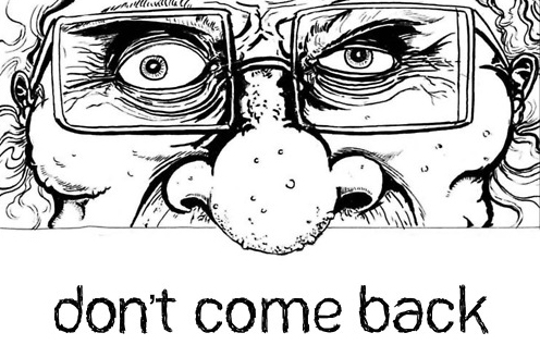
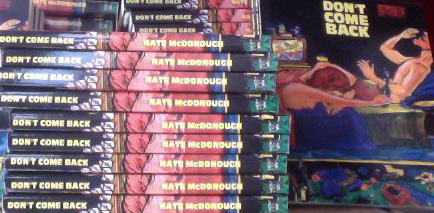
Pittsburgh cartoonist Nate McDonough’s graphic novel Don’t Come Back is quite interesting. It is nightmarish and convoluted in a good way. There are falling angels, dogs peeing in a cemetery, and one screaming chicken demon in the pizza box. There is death and resurrection. Don’t worry about me spoiling the ending. I’m not sure I figured it out. Another fascinating thing about Don’t Come Back  – All 160 pages are available online Free! Here, the entire book, Nate’s gift.

Nate raised over $700 on Kickstarter to get this project in print. In 2011 Publisher’s Weekly reported that Kickstarter.com was the third largest source of indy graphic novels in the U.S. Today it looms even larger. Yet Kickstarter is not a publisher, but a funding site that savvy entrepreneurs and artists use to essentially pre-sell creative projects of all kinds. I’ve contributed modest sums to 7 Kickstarter ventures.

Fresh from the printer, first editions of Don’t Come Back.

Full disclosure: Nate is a close friend of my son Daniel. Incredibly, I first met Nate, by chance, as he and I were gassing up at a Sheetz in Wheeling, West Virginia. Nate popped the trunk of his red 2005 Chevy cobalt and gave me a pile of his monthly zine, Grixly.

Have Coffee with Nate: Yinz near Pittsburgh? Don’t miss the Release Party for DON’T COME BACK. Weds, May 30, 7:00pm at Copacetic Comics and Lili Coffee Shop in Polish Hill.  Here is your personal YouTube invitation. Even if you can’t make it, next time you are in Pittsburgh visit this great indy comic shop and great indy coffee shop.

Q & A with Nate McDonough.

Nate talks about his art education, Pittsburgh, his zine, and how Kickstarter worked for him. He talks frankly about the dollars and cents of the project and offers advice for aspiring comics artists. Interested in doing your own project?

Continue reading “Nate’s New Graphic Novel is Free, but You Can Buy It!”

Angels & Demons Illustration Project

Angels & Demons is a book and a movie, sequel to the DaVinci Code. The title was inspiration for our final project in Illustration Techniques class. Most of these students are sophomore C.D. majors, not necessarily Illustration majors. This course involves mastering traditional media: pen and ink; scratchboard; watercolor; and for this final project, acrylic paint. Of course, the class asked to see past students’ work. Well, I mix it up to keep it interesting. Last year was “Rare Birds” so I had no “Angel and Demons” to show.

At the end of the semester students are running short on cash, so I treated them to the masonite and gesso. They had to provide the paint. Limiting the palette saved some money. I got two 4ft by 8ft sheets of masonite (about $11 each) from Lowe’s, cut into 12 inch squares.

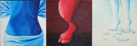
Project instructions: Your Angel or Demon should be largely monochromatic, with red or blue the dominant color. Close up, a telling detail, not full figure. Imagine the light is coming from the upper left. Angels or Demons can be either blue or red. No color code, but largely one or the other. Grading criteria: Originality, sense of mass, and consistency of light source. No points for originality if you lift a cherub from Rafael or devil from Bosch. Better to find a baby picture or photo of a wicked-looking person for reference. Even better –take your own reference photo of yourself or a  friend.

This was a two-week project and the results were fascinating when grouped side by side. We will do Angels & Demons again next year. If you teach illustration, feel free to use this. Let me know how it works!

One of our better angels by Bill Collier.

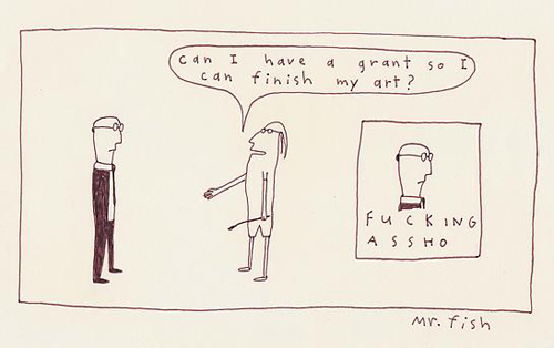
Mr. Fish Will Not Get Tenure

© 2012 Mr. Fish, used with permission

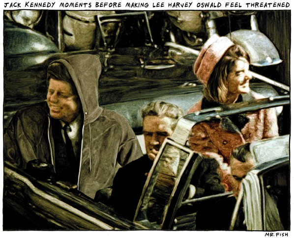
Mr. Fish recently came to the Kutztown University’s Rohrbach Library. He also visited my illustration class. Students are lucky to have visiting artists like Mr. Fish in the classroom. His topical artwork savages our social system. Biting social satire is not the sort of thing a tenured professor (like myself) is likely to get away with. It is safe to say Mr. Fish will not get tenure. An Ivy League college dropout, he could not even get hired to teach at a state university.

Mr Fish, photo by Kevin McCloskey

Even though this blog is unofficial, Mr. Fish’s work is so radioactive, I don’t think I should publish much of it here. It is a shame, as he gave me permission to use as many images as I like. Fortunately, my friends at Commonsense2.com, the progressive web magazine offered an outlet to share more of his work. If you are ready for a direct hit, visit Mr Fish’s own website, www.clowncrack.com.

His new book Go Fish is on sale at the Kutztown U Bookstore or from the publisher, Akashic Books.

Dylan Rush: Best in Show: Lucky Break?

JOE PA, detail of original pen and ink drawing © 2012 Dylan Rush

Dylan Rush, 19, a Communication Design sophomore at Kutztown University won Best in Show Award at the 2012 Hazelton Art League Open Exhibition. He drew a series of line art portraits of Joe Paterno in January for his first assignment in Kevin McCloskey’s Illustration Techniques class. Dylan calls the work “Joe Pa.” You will notice the central portrait is upside down and the glass is broken. Dylan explained that in his hurry to frame the artwork, he accidentally broke one of the frames. Dylan decided to hang it broken to conceptually reflect the shattering turmoil at the end of Jo Pa’s life. Note that in the final image Joe Pa has regained his upright direction.

The 2012 Best in Show award included a $300 cash prize. Dylan also sold the triptych for a nominal sum to a Penn State fan and it now hangs on the wall of a building on the campus of Penn State in Hazelton, PA.

5 questions about illustration for Matt Phelan

Matt Phelan is coming to Kutztown this weekend for the 2012 Children’s Literature Conference. Even if you can’t make the conference you might go to the KU bookstore to pick up his books at a discount. He is a prolific and popular illustrator. He writes as well. A piece of Matt’s original artwork from his award-winning graphic novel, A Storm in the Barn, was in the Dornish collection show last year at KU’s Miller Gallery. I emailed him five questions and here are his replies.

Art from Storm in the Barn, courtesy & © Matt Phelan

1. Do you recall an author or illustrator visit your elementary school when you were a kid?

Matt Phelan: I don’t recall anything that remotely cool happening at school. I don’t think author visits were a thing back then. It’s a shame because Lloyd Alexander (author of the Chronicles of Prydain and many other books I loved) lived in my town and might have been open to a school visit. Many years later, I ran events at a Borders store and I would invite illustrators in for signings mostly so I could ask them questions.

pencil sketch © Matt Phelan for cover of Around the World

2. Are more children’s books headed in the graphic novel direction, like your recent Around the World?

Matt Phelan: The children’s publishing industry is definitely interested in putting out more graphic novels for kids. The great thing is, like all of children’s publishing, they are open to many different kinds of graphic novels. So there’s room for superheroes, talking mice, and creepy historical fiction set in the Dust Bowl. I believe there will be more picture book illustrators like me trying graphic novels in the near future. It’s already happening with people like Dan Santat (“Sidekicks”), Jarrett Krosoczka (“Lunch Lady”), and multiple Newbery Honor-winning author Jennifer Holm (“Babymouse”) putting out fantastic graphic novels for kids. Eric Wight came from comics and animation and is now creating a hybrid of prose and comics for his Frankie Pickle young reader series. Innovations like that and the variety of stories makes me think that children’s publishing is the most exciting place for comics today.

3. Any advice for aspiring illustrators?

Matt Phelan: The only thing you have compete control over at the beginning is your portfolio. And that’s really the one thing that will get you work. Before you worry about mailings, contacts, or any of that marketing stuff, concentrate on making the strongest portfolio you can. Other than that, I recommend that illustrators take an acting class or two or at least read some books on acting. I studied acting in college and it has proven to be the most useful training I’ve had for my work.

"Niles" watercolor © by Matt Phelan from his blog.

4. Often students say they met/know someone who has written a kid’s book and wants illustration. I give them the standard warning that publishers prefer “unencumbered projects.” What do you think, are they better off coming up with their own original story?

Matt Phelan: Publishers do not want to see illustrations in manuscript submissions unless the author and illustrator are the same person. If you want to write, then submit a sketch dummy of a book you have also written. If you want to illustrate other people’s books, then all you need is a strong portfolio. I’d say that illustrating someone’s unsold manuscript (even if they offer to pay you) is time that could be better spent elsewhere.

5. Have you been to Ireland? or taken a trip abroad that’s influenced your art?

Matt Phelan: I actually went to Ireland on my honeymoon, Why do you ask? Does my work seem Irish? At any rate, I always bring plenty of sketchbooks on vacation. I think everything has potential to influence your work at some point. The important thing is to be open and observe as much as you can. Sketching forces you to slow down and notice. (I’ve included some Ireland sketches of one of the many walls of the Aran Islands and some sheep in County Galway.) I have taken some research trips for my work. I spent a week in Muskegon, Michigan which is the setting for my next graphic novel. Sadly, I didn’t have the time to circle the globe for Around the World. A missed opportunity there, I think.

Stone wall, Ireland, from a sketchbook. Courtesy Matt Phelan © 2007

Notes: I asked about Ireland out of curiosity after finding a web page where Matt explains the pronunciation of his Irish surname. If you haven’t read any of Matt’s work, I especially recommend Around the World. It graphically recounts three true stories of round-the-world voyages, by the reporter Nellie Bly, sailor Joshua Slocum, and bicyclist Thomas Stevens. It is like getting three good books for the price of one!

Courtesy Matt Phelan, http://www.mattphelan.com

More of Matt Phelan’s entertaining thoughts and lively sketches can be found on his own blog – planetham.